Paths of desire
When people are left to go where they like, they tend to do just that.
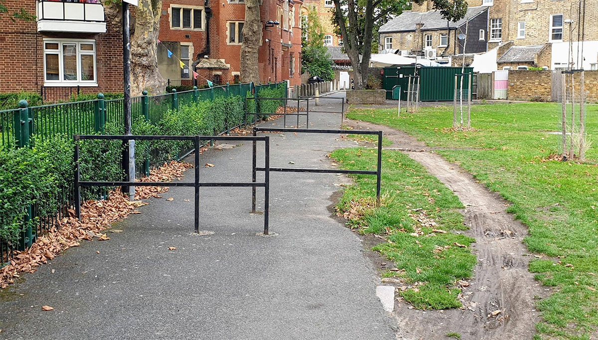
This simple fact is what the concept of ‘desire paths’ or ‘desire lines’ is all about; the natural path that evolves from the desire to take a certain route. This comes from architecture and planning, and it normally means ignoring a less useful one that is already laid out. There are examples of this all over; you’ll probably see some as near as your local park, or even your garden if you have cats or foxes in the neighbourhood.
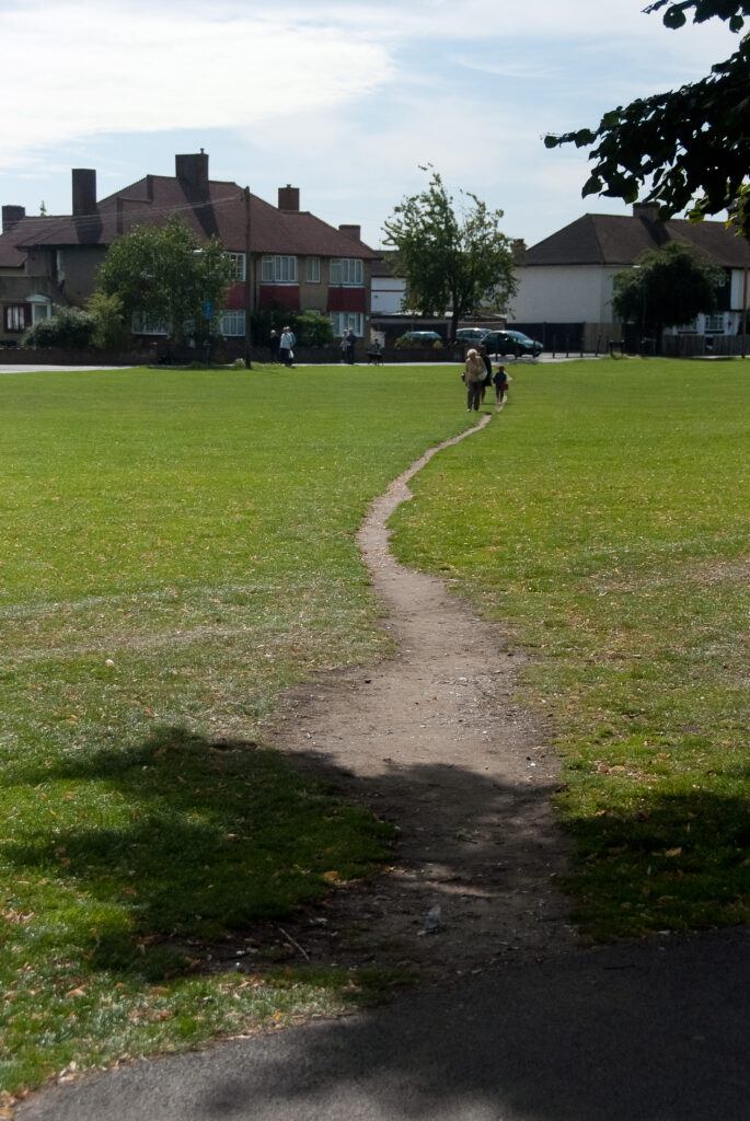
Going by online reports, college campuses seem to produce a particularly rich source of desire paths. The University of California at Berkeley tried to control the routes people took in a certain part of the campus, where foot traffic had worn a route between two paved areas. A wooden fence was placed as a barrier to keep people on the predesigned paths. This did help to an extent in terms of letting the grass grow back – but people did just walk around the ends anyway. This is a story told about many different universities, but this one seems more credible thanks to the series of photos with explanations shown at peterme.com.
What causes the evolution of desire paths is normally an existing path that doesn’t go straight to where people want to go. According to Le Corbusier, a man “walks in a straight line because he has a goal and knows where he is going.” While I disagree with his ‘Pack Donkey’ premise (as do others; see https://www.thelivingvillagetrust.com/le-corbusier/ for one comment) this remains a key observation: if an architect or planner puts aesthetics before this specific practicality their work will probably get subverted and ‘desire lined.’
Man walks in a straight line because he has a goal and knows where he is going; he has made up his mind to reach some particular place and goes straight to it.
— Le Corbusier
Allegedy, Broadway, in Manhattan, was originally a deer trail that natives turned into a well worn trail. When the Dutch arrived they turned it into a path, and later a street.
I’ve heard that in Finland planners will sometimes wait until they can see naturally-chosen paths in the snow in parks before finalising the paved walkways. Whether or not that’s true, it sounds like a great way to find out how people really want to move through a space, and it would be a lot faster than waiting for paths to wear into grass. It also sounds like a planning nightmare; imagine telling a council parks committee that you’ll get around to choosing where the paths will go, but not until it’s snowing and people are already using it…

Desire paths have played a part in the evolution of road structures in many towns and cities. Older streets, ones based on centuries-old routes, will often be at least partly positioned through desire path-like influences, although the issue of land ownership tends to trump this wherever it can. Desire paths in nature are everywhere, from deer and rabbit trails snaking through meadows or those cat and fox trails, to the gravity-driven routes of rivers.
How about another quote? “Do not go where the path may lead, go instead where there is no path and leave a trail.” Not Le Corbusier, Ralph Waldo Emerson this time. He wasn’t talking about desire paths or architecture at all, but it still sums this up admirably. As long as you don’t take it too literally and refuse to walk where anyone’s walked before.
To find desire paths in an open space you’ll need to spend time waiting and watching. Newly-seeded grass or a fresh snowfall can help show up where most people walk if the space is too new to show long-term wear. Where do they start from and where do they go? Can paths be laid that will support these?
A desire path isn’t only to do with physical paths. Magazine designers sometimes talk about ‘hooks’ and ways into a page. A typical consumer magazine is likely to have a generous handful of these in most spreads, there as bait for someone browsing through an issue. From there, the design task involves presenting the content in a way that works with the reader’s natural inclination to bounce through in a left-right, top-down direction. The idea is the same: mess with the user’s preferred, instinctive route at your peril.
This doesn’t mean we can’t shake things up and use different approaches to presenting content – we just need to understand the difference between adding interest and sparkle to a page structure and making something pointlessly awkward. Challenging layouts can be legitimate, you just need to know why you do that. Take the ‘Is it possible’ spread from Octavo 86.1, one of an eight-issue series of exploratory design magazines published in the late 1980s and early ‘90s. It is hard to know where to start reading, hard to know which part follows which – it is all-round hard to read. But that’s the point; it is a visual typographic challenge that backs up what the article is about. And, crucially, the target audience was type-aware designers, so it spoke to them on their own terms. (You can find more on Octavo and 8vo, the design company behind the magazines, from hamishmuir.com.)
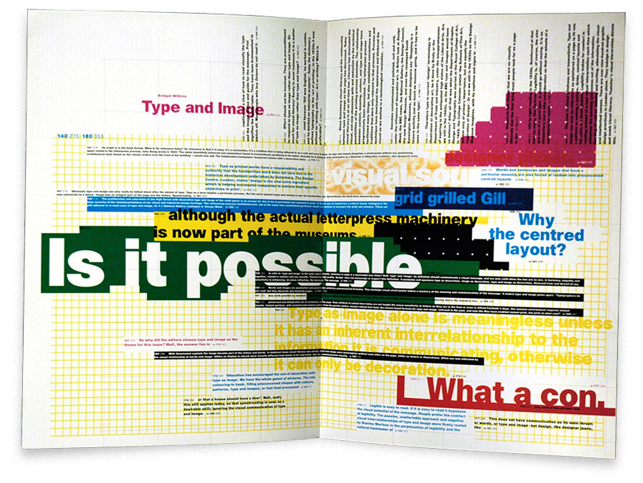
That’s an extreme example, but ‘structural dissonance’ in page layouts is about the visual dynamism generated by assymetric structures. This is an important part of editorial design, but it is no less important than understanding a reader’s natural desire path through a magazine spread. That’s how the imbalance and visual flow of dynamic layouts can really work for the user.
Tracking eye movements as someone browses through a page in print or on screen is one way to learn how people actually go through layouts. Understanding what makes people look at something, where they look next, and how long they spend at each point can be invaluable for refining a layout to make it more effective.
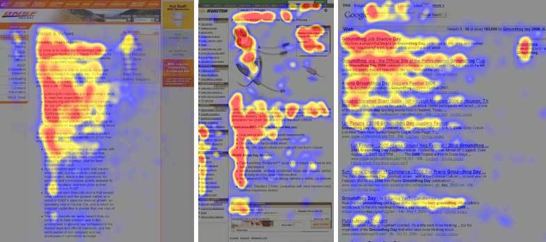
Elements of the desire paths concept can be applied quite effectively to page design, particularly online page design. The visual flow of a layout will affect how people look through it, but it should also work with people’s natural usage tendencies. A few years ago Jakob Nielsen used eye-tracking studies to analyse how people read web pages and found that an F-shaped page-scanning pattern is typical; see useit.com for the full details. Although it is a very interesting study I personally feel that his findings depend to a large extent on a certain general style of page design. Yes, I admit that kind of page structure is very common, but it should still be acknowledged as an influencing factor, something that could slant the findings. But within that, this shows the desire path that people tend to take. If you design web pages then think about this in relation to your layouts.
Some people present desire paths as a triumph of personal freedom over a domineering authority. I think that’s rather over-egging the pudding; too much Emerson and not enough Corbusier. The reality is just misguided designing, or sometimes simply that things have changed and new patterns of flow have emerged. The big point to take from all this is to understand the interests of whoever will be using whatever it is you create. Do this and you’ll be more likely to make something that works that much more naturally. Well, most of the time at least. We can’t get it right all the time, we just need to keep trying.
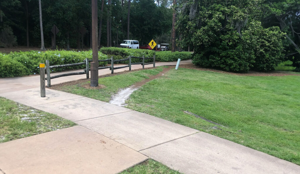
This 99 Percent Invisible article is worth reading: https://99percentinvisible.org/article/least-resistance-desire-paths-can-lead-better-design
And Reddit has a whole Desire Paths subreddit (of course): https://www.reddit.com/r/DesirePaths/
