Focaltone colour secrets
Sometimes, when you need to get something done, the simplest approach is to cut to the chase. Colour matching is a case in point. This stuff is important but it can also be annoyingly, sometimes mind-numbingly, complex. What I’m about to say may sound a trifle heretical, but hear me out. Forget science, forget abstract theory, and definitely forget trying to mix colours by eye on screen. I don’t mean stop profiling things, just apply a little common sense: if you know the colour you want to print, find out how it was printed and set up your work in the same way.
When I introduce the idea of colour control and print repro to design or publishing students I find it helps a lot to give them printed posters of CMY tint charts. Then, if they want to get a certain colour in their designs, they find the nearest match in the poster, mix their colour using the specified 10%-step percentage mixes of cyan, magenta and yellow sliders in InDesign, QuarkXPress, Illustrator or whatever, and get on with their work. Whatever their screen shows, they know beyond doubt what they’ll get in the final print. (What about black, the ‘Key’ ink in the CMYK set? That just darkens colours in a neutral fashion, not to mention complicating things in ways not directly relevant here; GCR, UCR and so on. Forget that for now.)

This is a kind of ‘reverse engineering’ for colour specifying and matching. It is a very practical way to work, if not particularly scientific. It helps people pick colours that work in the output process, using standard process inks, and know what the results will look like – and sometimes that’s worth more than all the ‘specials’ and custom swatches in the world. Grab yourself a process colour tint chart from somewhere and give it a try. Even charts in a generic book will help, although it works best if you get something printed on the same press and stock as your work will be. Eyeball it under reasonable lighting conditions and relax. This may seem all a bit low-tech for comfort, but the concept is sound and it is simple to use.
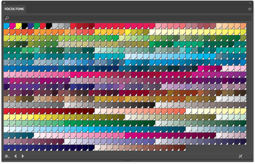
If this feels too much like going out on a limb you can combine this approach with an industry-standard colour library that works with regular process inks. The Focoltone colour system, for example, would be a good one to try. This is one of those names that you’ll see if you venture into the Color Mode list in InDesign, the Color Libraries in Photoshop, deep into the Swatch Library collections in Illustrator, or the Color list in XPress. Like DIC Color, TOYO and TRUMATCH, this is one of those colour sets that most of us vaguely remember seeing in the menus but never actually use. Take another look; some are actually worth spending a little time with, not least because they are specifically about colours made with just cyan, yellow, magenta and black process inks. Why is that a big deal? It means you never have to worry about whether the colour you choose can be reproduced in regular CMYK without going all dull and disappointing to the client. Well, not because of the limitations of four-colour process anyway.
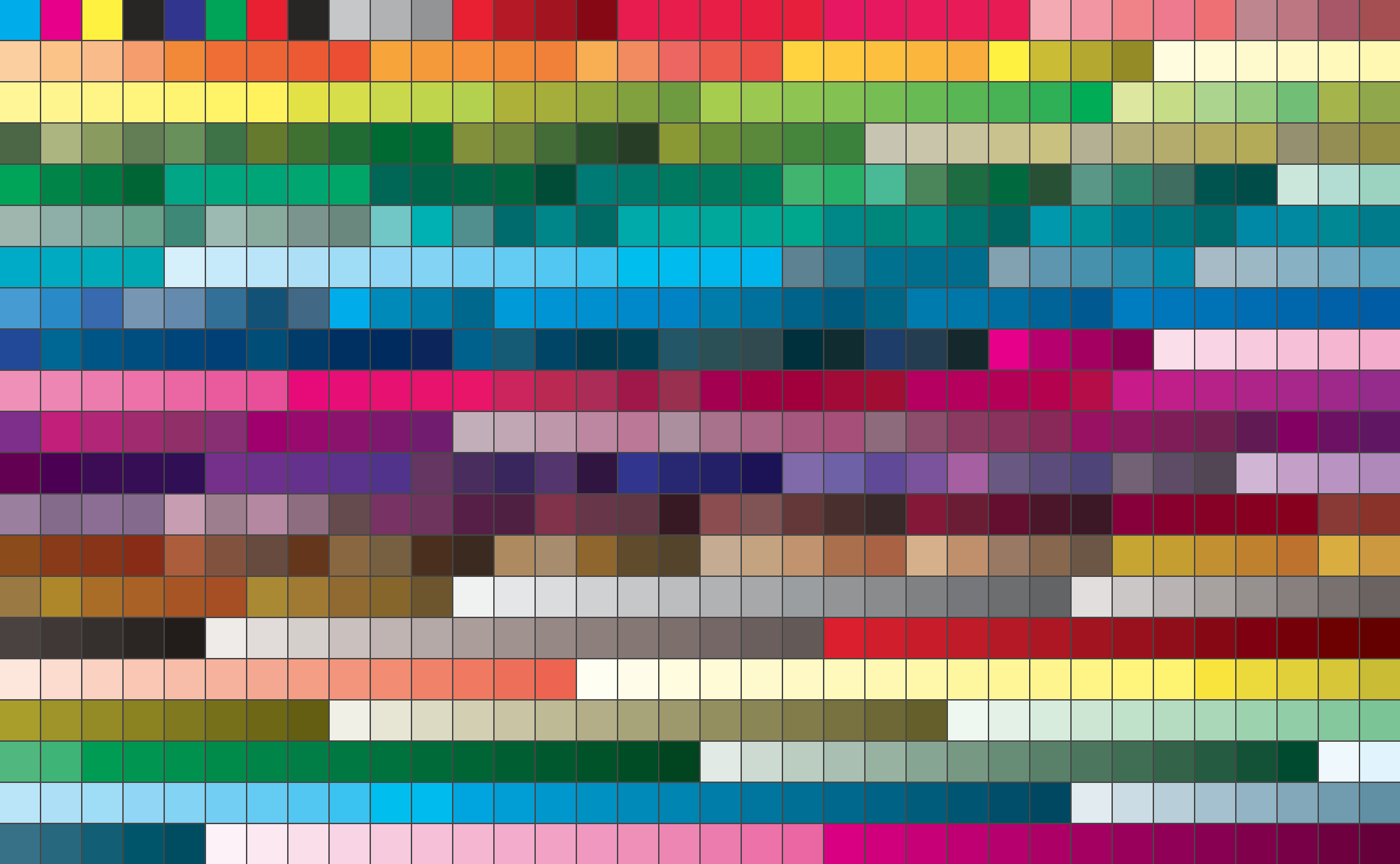
Focoltone stands for FOur COLour TONE – because it deals exclusively with the tones (alright, hues) that can be made in four colour process printing. It was patented in 1988 in Wales – yes, a home-grown advance in the world of print – although it is now owned by a ‘global print management company’, KiKUZE, in Singapore. What info there is on the focoltone.com site is obviously not updated regularly… Macromedia FreeHand, R.I.P., is no longer ‘leading graphic software’. But the process is a good idea all the same, and it isn’t hard to figure out or put to work in your layouts.

Where the Focaltone folks aim to make their money is through licensing of the colour libraries to the companies that make the tools you use and through sales of colour specifiers, swatch books and so on to you and me. Of course, if you have one of those CMY tint chart things you can check what some of the Focoltone colours look like from that and get a fair idea of some of the rest. Not quite the idea behind the scheme and it won’t really help with precise colour matching across the range, but it is another way to apply some practical common sense.
These colours can be used as spots or as regular four-colour separations. The advantage of using them as spots is that you get a solid print with no halftone dot patterns. Your printer needs to mix the colour as prescribed (all in clean 5% steps, easy to work out in a busy print environment) from their regular process colour ink tubs and use it as a ‘special’ when printing your spot-colour artwork separations. And if you need to print using regular four-colour separations instead the colours you pick should be exactly the same – other than being made from halftone screens and having the dot structure instead of being perfectly flat solids. Result: matching, same-colour output either way. Just remember to set your selected colours as spot or process, whichever way you want, before sending off your final documents.
A claim sometimes made about Focoltone is the lack of need for any trapping when working this way. That doesn’t make across-the-board sense, at least not as far as the more enthusiastic folklore goes; there’s always a way to mess things up if you try hard enough. It does mean you’re able to make colours by overprinting certain tints on others rather than knocking out separate shapes, which does avoid trapping issues when done right. Of course, this is simply how regular CMYK print works anyway, no magic stuff here. If you understand trapping and remember you’ll know how this can help. If not, you could still come a cropper in some situations. Spot colour use, for example, shouldn’t necessarily be set to overprint in every case.
Speaking of trapping, you all know how to do this when you make your final artwork designs, right? Step 1: ask your printer. Step 2: do what your printer says, whether the answer is ‘nothing’ or a set of specific steps. At least 95% of the time this will keep you out of trouble; nobody knows your printer’s equipment better than your printer, and if it does go wrong – at least you’re covered. What if the response is “I don’t know”? That’s simple too: find another printer. Like I said at the beginning, apply a little common sense and cut to the chase.


Yes Keith, a good summary. My father Gordon Phillips invented Focoltone and I for a year sold it across the UK to the trade.
IMO, it could have been a great success. But the marketing was awry. The company (not myself) attempted to sell the swatches and kits at a high price. But these were mass produced quite cheaply on a five colour Heidelberg.
What I found, and something you address, was that the less well understood moiré pattern was not something that the trade was aware of on a day to day basis. Like a lot of trades, they just did the same old thing every day. Designers did not see this as anything to do with them either. I was one of a few who graduated from the Print Technology degree course run by Watford College, and so I understood these issues. I also understood that to get the systems established as the ‘standard go to” colour system, (and away from Pantone), required giving away or selling at very low cost to ensure every single trade house and printer in the UK and probably Europe had a copy to use. In the event this did not happen, I left to do other things and Graphic Print went bust in the 1989/90 recession. They had bought a brand new 5 colour and this was unsustainable with falling prices.
I wish you well,
John P.