Art Therapy for design block: The CD Cover game
A creative challenge for you…
What do you do if you find yourself staring at an empty page, unable to get your creative juices flowing? Design block is no fun, and it happens to all of us on occasion. Fortunately, one of the best ways to shake people out of a creative slump involves a no-pressure, pure-creative bit of fun. I’ve found it is also a great way to get new students into the basics of working with type and images. One of the things most people daydream about at one time or another is creating a CD cover for a band, so we’ll do exactly that, following a few simple rules to keep things interesting.
Yes, I’m talking about the CD Cover Game. I’m sure many of you’ve ‘been there, done that’; it has been a bit of an Internet craze more than once over the last few years, and you’ll find CD Cover Game groups on Flickr, Facebook and elsewhere. It is very simple to play; all you have to do is get a couple of bits of text and an image and create your own CD cover design for a fictitious band or artist. The trick being that you have no control over what the band name or album title or even the cover image will be. But that’s good news: you’ve had the difficult brainstorming prep work taken out of the equation – all that’s left is the pure design part.

In the CD Cover Game there’s a particular way to do this that makes sure everyone starts from the same randomised playing field. You may already know how this works and just want the links to the design elements. But have patience, keep reading until you get to the ‘Update’ box – I’ve made life really simple!
First, go to Wikipedia, click the Random Article link on the left, and note the name of the article; that’s the name of your band or artist.
Next, go to quotationspage.com and click the Random Quotes link. Take the last four words from the very last quote (we could allow four or five), and that’s your album title.
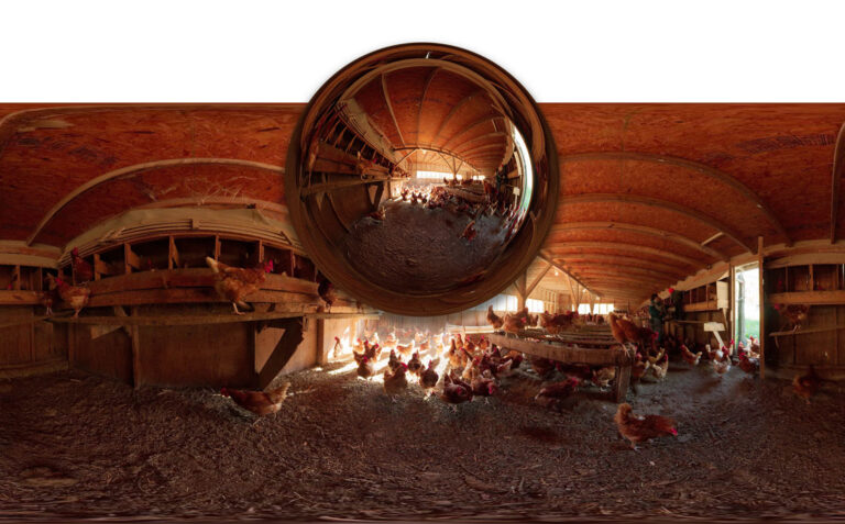
Finally, you need an image. The normal rules say that you should go to www.flickr.com/explore/interesting/7days/ and pick the third image, no matter what it is. At this point you have all you need; combine in your favourite layout application in whatever way suits your creative mood.
Some people like mixing the mood up by using Wikipedia articles written in different languages. German (http://de.wikipedia.org/wiki/Spezial:Zufällige_Seite) sometimes turns up spectacular industrial metal band titles, while Italian (http://it.wikipedia.org/wiki/Speciale:PaginaCasuale) often lends itself more to sensitive introspective groups, or lover’s rock at worst. But please remember, picking and choosing is cheating… unless the text is already the name of an existing band or album or is literally utterly unpronounceable.

But stop! There’s one small problem with this, at least if you intend to publish your results anywhere, including back on Flickr. You’re using someone else’s copyrighted image. Just because it is on Flickr (or found by using Google Images, etc.) doesn’t mean it is out there for anyone to claim and reuse. No, seriously, it doesn’t. There’s basic automatic copyright inherent in any image someone creates, and simply showing it somewhere doesn’t change that.) So, instead of the regular image search you should find a way to grab a random image that’s licensed through Creative Commons for reuse. You’d normally have to muck around in the Advanced Search page in Flickr, but fortunately there are other options.
There is a third-party site that shows a randomly-selected Creative Commons-licensed image from Flickr each time it loads. This (http://www.flickriver.com/groups/creative_commons-_free_pictures/pool/random/) is very helpful, but there is now an even better way:
UPDATE: I’ve created a web page that grabs these three items automatically: article name, last four words of the quote, and a randomly selected image that’s copyright-appropriate. Use the Creative Challenge Generator on theHelpful.com instead, then carry on reading…

One more note: as designers we need to take this more seriously than the average Facebook-wielding craze addict. Well, a little more anyway. When you’re grabbing your (Creative Commons-licenced) image, make sure it is big enough for the job. The size of a CD cover is 12x12cm, with an extra 3mm on each side for bleed, so the minimum pixel dimensions of your image, assuming you’ll use it to fill the cover, should be 1488px square. Call it 1500px for simplicity. That fills the area and bleed at the print-standard resolution of 300 pixels per inch.
In reality, as this is a meme-generating exercise rather than a true professional print project anything at least 1000 pixels across will look fine. You’ll be posting it on social media, not having it printed at 100% size in a high-end magazine. But it’s always, ALWAYS good to remember this stuff.

You may need to crop the image to the standard square record or CD cover format, but other than this just work with what you get. The creative work comes entirely from the way you handle the type, not from ‘mad Photoshop skilz’. This is hard-core graphic design, or, to put it another way, design-geek fun. It is also more than a little addictive. Well, who hasn’t wanted to design album covers? This basically gives you an excuse to play.
At this point most people turn to Photoshop, and that’s okay – although it really is not a good page layout package. Since you won’t be pushing pixels around in that image I’d much rather you used a proper DTP tool, meaning InDesign, Affinity Studio or QuarkXPress, or Illustrator if you prefer. If you only know how to use Photoshop you’re not much of a designer!

Make a new document and make it 120mm wide and tall. Illustrator offers bleed controls in the regular New Document dialog. With InDesign, use the More Options button in the Document Setup dialog (File > Document Setup if you’ve already closed this) to add 3mm of bleed all around. Or, in QuarkXPress, open the Guides palette, choose Create Bleed & Safety Guides from the popup menu and set the bleed gutter to 3mm. (This is slightly less obvious than InDesign or Illustrator, but it is part of a sophisticated set of guides-based controls.) You’re done with the setup.
Place the image on your page and scale to fill your page and bleed area, cropping off any excess if necessary. Now sit back and take a proper look at your image. Then look at your two bits of text again. Now scratch your head. But seriously, start thinking about how the type might work with the image content. Are you drawn to fitting the words into a convenient space offered by the scene? Or would you rather run the type across the front of the graphic, sitting on top rather than working cooperatively with pictorial elements? What about the hues in the image; could you pick out dominant or complementary (opposite) colours to use for the type? And what about the type itself? You’re totally free, so explore the darkest recesses of your font menu and those dusty collections somewhere on your hard drive. If that’s not inspiration enough, go to fontsquirrel.com and explore those dark recesses as well. Or try the refined elegance of faces such as Didot, set carefully to show off the letterforms.

Don’t forget overlay effects. Opacity can be fun, especially if you stack up multiple copies of your text boxes. QuarkXPress’s opacity controls are impressively fine-grained; you can control the transparency level of individual characters if you like. InDesign doesn’t go as far, but it makes up for this with a good range of visual tricks in Object > Effects.
Whether you have fun with graphic effects or go for the type purist approach, this exercise is a lot of fun. The fact that the band name, album title and image can so often be coaxed into feeling like a carefully-planned whole is quite extraordinary. Try a few different ones, then export them as JPEGs and publish them on social media. Now how’s that creative block doing?

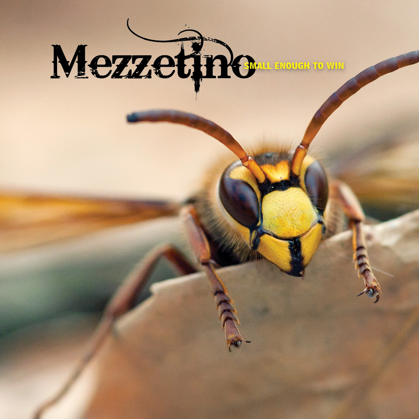
Cover design images from the following Flickr users (in order of use):
kaibara87
theiler
ka_tate
Brian Keathley
Puzzler4879
The U.S. Army
Maddy Lou
Nicholas_T
Use the Creative Challenge Generator on theHelpful.com to grab the band name, the album title, and the cover image. This entirely automates the process so you can get on with being creative!