Creative Design Briefs
In which Keith explores the answers to a question and finds confirmation in a particular typeface design…
I was asked an interesting question the other day. “Do you believe that creative briefs hinder the artistic mind?” This had the feel of a set question, and it turned out that this was the case; it was an essay topic, set to provoke discussion and debate, and I was being asked for feedback and quotes.
As with many challenging statements or questions, it is a good idea to think it through thoroughly before trying to answer. For example, the term “artistic mind” might seem to imply a fine artist, but a creative brief is something that visual designers deal with. And this throws us straight into the debate of how you define and differentiate a fine artist and a designer.
The distinction is in some ways huge and in other ways tiny, but it is important. A graphic designer or any similar creative professional spends their time coming up with creative solutions for problems or challenges. This is because graphic design and the various related creative industries are all about creative problem solving, but a fine artist doesn’t generally approach their art in this way. They generally work from the inside out, and the reason is simple: they aren’t approaching an external problem and coming up with a creative answer. They are more likely to talk about ‘synthesizing’ and exploring abstract ideas or feelings. I don’t have anything against that, but I have to admit I prefer tackling a more external challenge. When it comes to design I greatly prefer Saul Bass to Matisse or even Roy Lichtenstein, partly because I know he was tackling a project brief.
Defining a creative brief is a good idea too. In most fields it is the outlined instructions for the designers, with suggested research areas, the purpose of the design, and some discussion of the direction the work needs to go and who the target audience might be. It isn’t something that’s generally brought to the first meeting’s brainstorm, but it also isn’t a prescriptive list of instructions or a how-to recipe.
Dealing with the question might be a little more straight-forward if we rewrite the original just a little: “do project briefs of any kind hinder the creative mind?” My feeling is no, not if you’re any good at what you do. It is very important to recognise that the work that a designer creates has a job to do. However subtle it might be, it isn’t just a self-focused artwork with no practical reason for existence. Part of the whole challenge of producing a creative solution lies in whatever restrictions the project brief might impose, balanced against the aims and objectives that it outlines. Dealing with all this is a fact of life for a creative professional. In fact, it is practically the definition of commercial work.
You could go as far as saying a creative brief should be a visual designer’s reason for getting up in the morning. If they can’t take a brief and start coming up with creative solutions then they’re not in the right business. Yes, we all know that sometimes a client may not understand a good solution to their problem or challenge when they see it, and sometimes they may not even really understand the problem itself. That’s just a hazard we have to deal with. It is always the responsibility of the ‘artistic mind’, the creative professional, to see the brief, recognise the underlying point, and come up with an appropriate – and hopefully creative – answer. That was the genius of Mad Men’s Don Draper, the creative director who would see through a client’s descriptions, pull out the real underlying points and problems, and boil that down into the brief that would be devoured by his design team. Life’s not really like that, but it doesn’t hurt to have that particular quality of Don’s held up as an example. (We’ll gloss over some of his other qualities if that’s okay with you…)
What really excites me about a fresh design brief is having a new set of challenges to get my teeth into. I never got the crossword or sudoku bug, and computer games are fun for a while but I always end up walking away, but I love the puzzle of working on a new design project. The briefs are not always that great, but a good one can be a source of inspiration. Sometimes – okay, often – a client’s brief will have a number of restrictive aspects. A certain annoying paper stock, limited number of colours in the print run, too much text or perhaps too little text, virtually no time, no photo budget… the list goes on and on. But, within reason, the hindrance that is the essence of the creative challenge is a key part of what makes it interesting. I totally agree that the hindrance that comes from miscommunication of the challenge itself is a pain in the ass, but learning to see the difference and get past it is part of creative professional development. See the brief, recognise the fundamental points and needs, and design the answer.
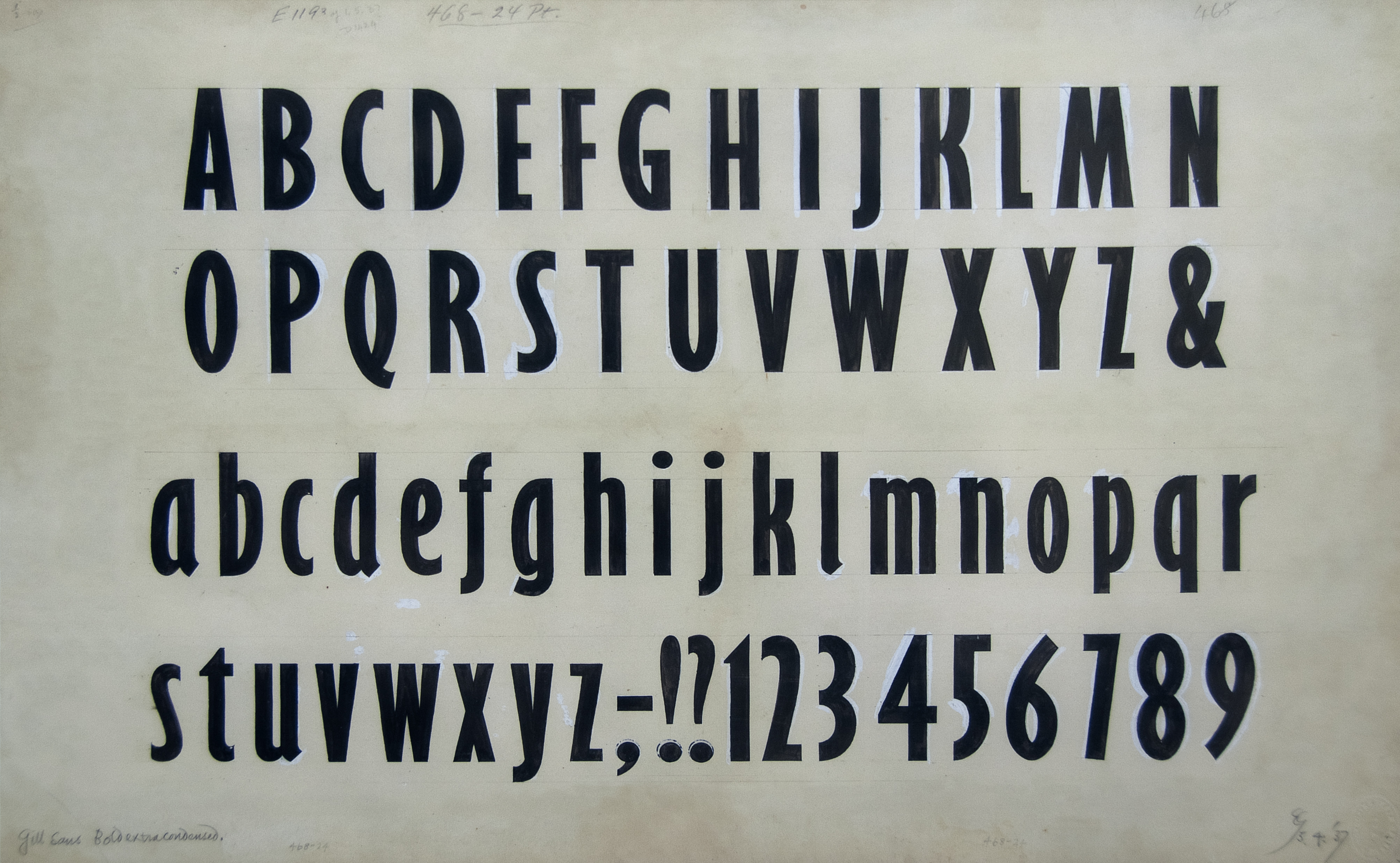
One of my most prized pictures hanging on my wall at home isn’t a painting or a photograph, it is a limited edition print of Eric Gill’s original drawings for Gill Sans Bold Extra Condensed, a quietly dramatic display font design that was drawn up in 1937 before being refined by Monotype’s drawing office. Gill Sans was a type design that Gill created for himself (so no client brief) to solve a typographic problem (a classic external challenge). He was attempting “to work out the norm for plain letters” by creating a fool-proof alphabet (see Gill’s Essay on Typography, 1931), and in doing so created the font family that has been called ‘the Helvetica of England’. Gill Sans Bold Extra Condensed is a design that goes against two pet hates he wrote about ten years earlier; particularly bold and particularly compressed typeface designs. But despite his dislike for over-bold, over-compressed type, he saw a need for this as a display font and created it. Gill was a creative pragmatist, and I think he would agree that the restrictions in a design brief can be a source of creative invention.
Once a design is finished, understanding what it is meant to achieve isn’t always easy, especially when it is taken out of the original context. Each year I see design student shows, and one thing that strikes me again and again is how the work is presented; without any detailed reference to the original assignment brief, and often with barely a title. When presented like that for the viewer’s conscious consideration, a bit of graphic design work is likely to need some explanation. That’s not a flaw, it is just a fact. If anyone is going to make a meaningful assessment of a design in these conditions they will need to know something of the brief, something of the challenges and restrictions that were given. Someone could stand next to it and talk at whoever comes near, but why not just boil down the assignment brief into a note that can do the job more passively?
But what about the original question? It is worth noting that a fine artist can be a creative professional – a professional visual designer – and vice versa. What makes them one thing or the other is more to do with what they’re doing and why they’re doing it, and that can change from one project to the next. So be careful with those labels and preconceptions.