There’s a handy saying that I learned many years ago: “when in doubt, leave it out”.
It was said about writing, encouraging people to cut out superfluous waffle, and it is something that’s well worth remembering. It could also be said about designing, particularly when it comes to page layout design.
White space, sometimes called negative space (well, not all pages are white, right?) is the term for the empty parts of a layout. It isn’t just an excuse for some blank space that the designer couldn’t be bothered to fill; white space is used to make the visual impact of the visible design elements – text, pictures and other graphics – more effective. It helps control both the page entry points that a reader goes to when they first see a layout and the route they’re likely to take as they read.

One of the instincts people have when they first start making layouts is to fill the page, almost no matter what. It takes a certain confidence to leave something empty and to use that as part of the design, but that’s a skill that needs to be developed. It’s hard to overemphasise the value of this ability. It makes it easier for readers to find their way through a page’s content by giving a sense of hierarchy and relative importance to different elements, by adding visual dynamic tension and implied movement, and by providing a sense of pace and rhythm to the reading experience. So no, it isn’t about designers being too lazy to bother filling up the page. Not as a rule, at least.
Using layers in your DTP tool of choice can be useful, although we all know it takes effort to work that way too. If you put different elements onto different layers you can do the mental ‘step back’ and see how the overall arrangement hangs together by hiding and showing things. Use this to set up different treatments and do a bit of mixing and matching.
This idea of using space or emptiness as part of the overall structure isn’t exclusive to page layouts. It is understood in photography and painting (themselves forms of two-dimensional layouts), architecture, and even music.
In musical terminology ‘white space’ (no, not white noise) is sometimes used to describe silence in a composition. That’s a fairly simple application of the idea. But if you stop to think about the layering of tracks in a mix and the regular procession of a simple beat, you could stretch the idea of negative space to include, for example, the rhythmic holes created in a musical pattern by syncopation or similar treatments. Take away some of those elements and you’d end up with a structurally altered song – which can be sometimes good, sometimes bad, but always interesting.
The first time I heard ‘When Doves Cry’ by Prince, back in 1984, it sounded to me like the song was missing part of the mix. I loved it, but the sparse production wasn’t like much else being released at that time. I was reminded about this stripped-back mix sound by a web site I came across recently. StudioMultitracks.com lists (or used to, at least) a number of different well-known songs from various genres, each split into the individual tracks that normally go together to make the complete song. Most of the time it isn’t done through mucking about with EQ sliders and squashing frequencies the way the now-dead Audion MP3 player worked. These often do seem to be the pre-mixed studio tracks from major singles such as David Bowie’s Golden Years and Outkast’s Ms. Jackson. Listening to the isolated tracks is a sometimes spooky experience – utter silence where you’d normally hear the rest of the mix – but it helps show exactly how they’re put together. Just as usefully, they show how a good song is more than just the sum of its parts. Play two parts together if you can get things synced well enough, and you’ll hear the song in semi-finished but still cut-back form.
The StudioMultitrack site doesn’t list these any more, so try searching on YouTube for “studio multitrack”. There’s even more there than had been listed in the StudioMultitracks site. Here are a couple to start with:
 In life drawing, one technique that’s taught is to look at the shapes made by the spaces left between and around the objects in the scene. Rather than just looking at the model’s arm, for example, also look at the empty shape between the arm and torso, and make sure that’s drawn accurately. Learning to see and account for the empty spaces, looking at what’s not there as well as what is, can really improve your control over the drawing process. There’s a lot more to life drawing than that (frequent practise being the real secret) but this is one of the fundamental principles.
But back to page layouts: how do you choose where to use white space in a design? That’s something I can’t tell you. It depends on a ton of different variables, from the content you have to play with through to the audience, and the tone of voice you want to present.
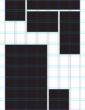 But there’s one thing that will help you do this in a structured way: use grids. Don’t just throw things onto the page and push them around without some kind of structural scaffolding set up to give it a bit of spatial logic. I wrote here about grids back in 2010, but the quick-fix secret is to set up more columns and rows than you think you’ll need. Twice as many is a good start. A three-column grid may be what you want for the main content, but with a six-column grid you still have three to play with (by using two columns at a time) and you also have half-way choices for where things sit. And, just as importantly, where you might use a bit of emptiness. A nine or twelve-column grid may start to feel cluttered, but it gives you even more positioning choices without having things floating aimlessly ‘off grid’. One final thing to think about: if you use an odd number of columns you’ll be forced into having an asymmetrical arrangement, which is often a good thing. That is a very simplistic thing to say, so please take it as something to experiment with rather than as hard-and-fast advice, but by using a grid with (a) more than the minimum required number of columns and rows and by (b) going for an odd number of columns you’ll find white space easy to include in your designs. Making it work well is another thing. That’s down to you.
“Thirty spokes meet in the hub,
but the empty space between them
is the essence of the wheel.
Pots are formed from clay,
but the empty space between it
is the essence of the pot.”
—Lao Tse, Taoist philosopher – from the Tao te ching
