Typefaces dress our words and tell the reader what kind of thing to expect. Like clothes, the typefaces we choose help say things about the words before anyone even begins reading.
The thing is, while we all have our favourite bits of clothing, things we feel particularly comfortable or confident in, we don’t wear the same things day in and day out. And we don’t have a wardrobe full of nothing but duplicates of the same outfit and wear the same trousers, shirt, shoes, jacket, everything, every single day. (Okay, maybe sticking to the same thing is not such a bad idea with socks; my odd socks collection has become larger than my pile of matching pairs, which defies common sense.)
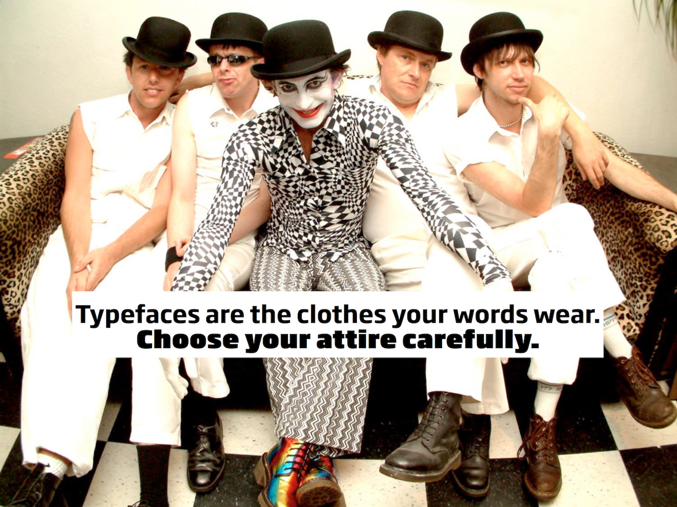
What about office wear? Even if you wear a suit every day the odds are you have a couple of different jackets, and you don’t wear a shirt and tie or a formal skirt on your days off. And then there’s the fairly common ‘dress down Friday’ – or ‘dress up Friday’, as my web hosting company prefers. No, we like to have a bit of variety in what we wear, even if it is within certain parameters. We use what we put on as signals for both a measure of individuality and for how we want or expect to be seen and treated. Suit? Serious, means business. T-shirt printed with an obscure joke? Casual, not so bothered. We don’t generally think much about it directly, but bright or dark, colourful or neutral, accessorised or plain – what we wear all helps build the message we want to give out about ourselves.
So why do we keep going back to the same old typefaces, again and again? Is it because we lack the confidence to make different choices so we go for the same safe ones again and again? Or do we simply never really think about it, reaching for those familiar fonts because we never really stop to consider what else might be in the typeface wardrobe? Familiarity is important. But with typefaces, stretch yourself a bit, try out different ones, see what different looks you can achieve while getting your message across. The key to this is understanding what impression a typeface gives and selecting something that is appropriate to the message. It is easy to get this wrong if you simply go for what tickles your fancy without considering all the factors.
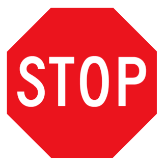 Take the Stop sign, the red and white octagonal road sign that tells drivers to come to a complete halt before proceeding. This sign was standardised for many countries some decades ago as part of the Vienna Convention on Road Signs and Signals. (Possibly the best-ever example of ‘boring but important’!) Exactly what font is used depends on where in the world you are, but the word is always set in a clear, no-nonsense sans-serif. Wikipedia’s article on stop signs lists a dozen different ones, and this doesn’t touch the non-Roman alphabets. (The names are generally technical and functional – DIN 1451, Transport, Allerta, Clearview, Transport, and the stutter-inducing Trafikkalfabetet – but ‘FHWA Standard Alphabets for Traffic Control Devices’ is amusingly verbose. All these typeface designs are functional, clear and quite similar, although only one, Frutiger, has general name recognition.)
So what would happen if a different style of font was used? If you change just the typeface, nothing else, how much does this hurt the message? Let’s try it and see…
Princetown’s 45-degree angles might be seen as appropriate, given the octagon shape of the sign itself. But really, this kind of typeface is associated with US sports team names more than anything else. The outline stroke also interferes with quick legibility, a bit of a problem for roadsigns. Trajan is a classic design based on lettering from the Trajan column. Authorative? Yes. But not powerful in the way that’s required. Scripts may be nice sometimes, but here they’re just silly.
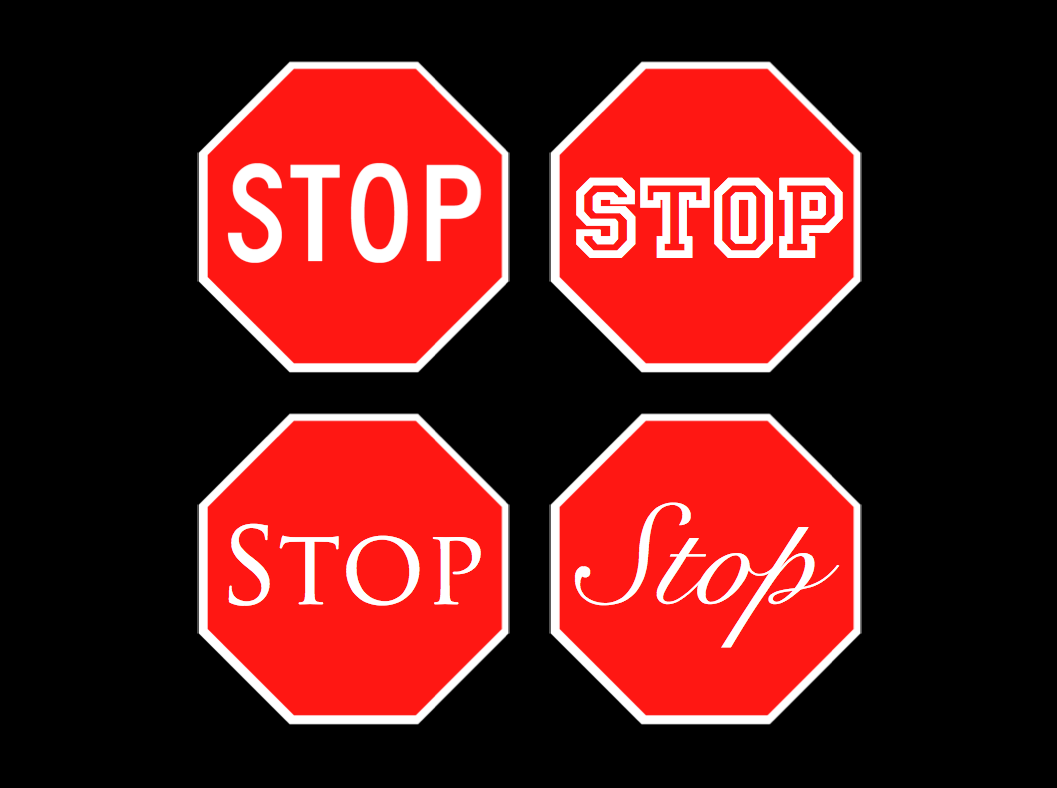
For the Stop sign the existing font is hard to beat. But even so this shows how a simple change of typeface can dramatically affect how something feels and works. Take an evocative word, something that has strong associations. ‘Party’, for example. What kind of font choices make it something you’d go to, and which ones paint an image of boredom or the wrong age group? Look through type designs you don’t normally consider and see what messages they give. Can you use them to back up or clarify messages in your own designs?
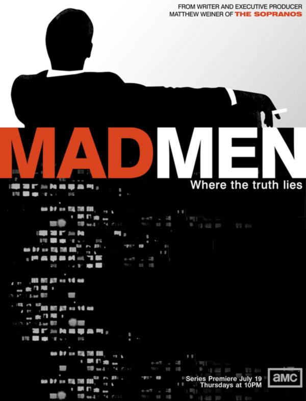 Don’t forget to think of where a particular font came from. That’s often a key factor in deciding which to use. The titles and posters for the Mad Men TV series used Univers, a font which was released in 1957 and became a big hit in advertising in the Mad Men era. Univers would have been a strong choice for the Mad Men artwork anyway, purely for its clarity and strength, but the design’s provenance and early uses made it ideal.
If you’re beginning to feel a little unsatisfied with the fonts you have now then go get more. Yes, right now. Buying fonts is a good way to ensure a decent quality, but there are many equally brilliant free fonts too. Try dafont.com, fontsquirrel.com, or do some digging with ‘free font’ searches. Back in pre-OS X times installing many fonts at once could cause a number of problems, but these days the main issue you’re likely to see is an annoyingly long font menu.
The Mac has always been great for type-curious designers, with hundreds of thousands of commercial, shareware and free fonts to choose from. Unfortunately, so far this typographic nirvana hasn’t repeated in iOS. In my ongoing experiments in using the iPad for serious work I’ve hit a typographic brick wall. I don’t mean to be ungrateful; now with iOS5 we have a total of 58 font families – not just 58 individual fonts – on both the iPhone and the iPad, listed at iosfonts.com if you’re interested. That’s an impressive tally, and it should help extend the boundaries of things like the so-called web-safe font range. Of course, compared to what’s available to use in Mac OS X, Windows and even Linux, this is just scratching the surface. But that isn’t the problem. What gets to me is the inability to install new fonts. Sure, if you make your own apps you can embed custom fonts in them, but those aren’t available to other apps. Even if they were, learning Objective C and making your own software would be a fairly extreme solution.
I don’t agree with those that say the iPad is really for consumption, not creation. But Apple isn’t helping matters by locking out the incredible range of fonts that desktop computers can use. Broad and expandable font choice is the route to many designers’ hearts, and at the moment the iPad doesn’t go there. Its font wardrobe is a little like Steve Jobs’ public sartorial choices; effective and well-pitched for certain tasks, but ultimately somewhat limited. If I want free type choice to fine-tune a visual message I need to go to my Mac. That’s not exactly a hardship, but I hope one day I’ll have the same freedom on the iPad too.
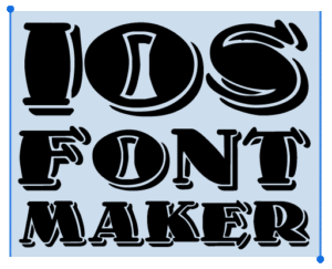 NOTE: since I wrote this article I developed a Mac application, iOS Font Maker, that converts font files into a format that can be installed in iOS and are then available to any iOS app that works with text. It’s free and pretty simple to use.)
