Color perception: more than meets the eye
Color plays a crucial part in how we perceive things, so understanding its emotive effects is fundamental to creating effective designs.
How do you react to colour? The hue of things has a surprisingly strong affect on how we perceive things and even on how we feel, both physically and emotionally. It is thought that both the ancient Egyptians and Native American Indians used coloured light and coloured objects to treat illnesses. Whether that works in the straight medical sense is debatable, but it is clear that colour is deeply important to our feelings.
Some of our reactions to colour are specific to our social environments; these can be different – sometimes surprisingly so – in different parts of the world. Other responses seem to be more fundamental, probably because they come from universal constants; the blue of a calm sky, for example. As designers we should know all this implicitly, but as busy people we often take this sort of thing for granted and forget to factor it into what we make or do. So how about a little exploration into colours and their meanings? It won’t take long, I promise.
Red is the colour that attracts the most attention, which is why it is used for warning signs around the world. However, it has a variety of different cultural meanings. In China, for instance, red represents good luck and success. In sub-Saharan Africa, on the other hand, it represents holiness. It is said to increase the appetite, although it also isn’t particularly restful – hence the use of red in fast-food places but not regular restaurants.
The pure, full-strength on-screen red is rather bright, so for a slightly less brash, hyped-up feel try reducing the brightness just a little. #CC0000 is a good start as this matches the two-colour print red of 100% magenta and yellow fairly well. Photoshop claims that this equates to 13% cyan and 4% black as well, but ignore that.
Add white (or increase the brightness) and red becomes pink. This is a colour normally associated in the West with girliness, but it is said also to produce feelings of energy loss and general tiredness. (It’s worth noting here that pink, in a sense, isn’t a colour at all; it’s simply pale red… the way blue with added white or brightness is pale blue, green with white is pale green, and so on. We’ve come up with a special name for pale red, but that’s all pink is: the exact same wavelengths as ‘regular’ red, just lighter. So in a sense pink doesn’t actually exist!)
When converting a colour image to monochrome, red turns to a slightly darker tone than most expect. Simply put, while the hue may be eye-catching, tonally it still absorbs a fair amount of light and that’s what you’re left with. To control this, use Photoshop’s Black & White conversion controls. Choose Image > Adjustments > Black & White and try the Red Filter preset, then tweak the sliders yourself. This will often produce a slightly punchier and less muddy image than the basic greyscale conversion. It leaves the image in colour form, too, so add the greyscale step afterwards if you really need a proper single-channel end result.


Blue is said to be the least appetising colour, probably because that’s the colour of many moulds. But it has many other associations and implicit meanings too. One of the most common responses is that it is a cold colour, but it can also imply peace and tranquility, truth and trust (‘true blue’), cleanliness, conservatism, security and loyalty. It is often seen as a technology-related colour – IBM’s nickname since the 1960s has been ‘Big Blue’ – and, more seriously, it is also associated with depression. Blue is claimed to lower the body temperature and pulse rate and reduce the appetite, although I don’t know of any medical studies that back this up. As far as cultural associations go, blue is linked to immortality in China and soap in Columbia. In the Middle East it is considered to be a protective, lucky colour; the Turkish good luck eye symbol is largely blue. It is the colour of the Conservative party and similar right-wing political groups across much of the world, but, curiously, since 2000 blue has been the colour of the Democrat party in the US; red is now the defacto colour of the Republicans.
Green is a relaxing colour, gentle and easy on the eye. In TV studios the back-stage areas where guests wait before going on-air are called ‘green rooms’. They normally really are green, too, although makeshift equivalents at festivals tend to be green in name only. Curiously, green is widely considered to be bad for magazine covers as it tends to hurt newsstand sales. I have to admit I haven’t researched this myself, but I do know there have been virtually no green-dominated MacUser covers ever.
Yellow is the colour of untrustworthiness and cowardice in the West, and it is often associated with illness, but in some parts of the world certain yellow hues are linked with holiness. Yellow rooms are said to increase anger levels and make babies more likely to cry – so think again before painting the new baby’s room that sunflower yellow! Or maybe just be skeptical and do it anyway; not all these claims have the same level of scientific research to back them up.
Purple is the colour of royalty and of passion. ‘Purple prose’ is a descriptive term for a kind of writing that is so over-the-top that it draws attention to itself beyond what it actually deals with; it is indulgent, passionate and extravagant. Of COURSE purple was Prince’s favourite colour!
And then we come to brown, that strange composite of other colours. At school you probably learned that if you mixed the three primary colours together (that’s red, yellow, blue; simplistic reflective primaries) you generally got a murky greyish brown. The implied meanings of brown include solidity and genuinness. It is the colour of wood, leather, rust and brick, a large percentage of human hair around the world (although black probably trumps it there), most skin tones, the lowest denomination coins in most currencies, and waste products of various kinds. It implies natural aspects, while in fashion it is found everywhere from dresses and suits to military uniforms.
But mixing up your own brown when you’re creating designs for print can be harder than you might think. Most print work is done using four-colour CMYK process inks. Whether you’re matching a logo, wood or earth tones, or skin tones, mixing up a brown requires some proper understanding of how colour works and what makes brown brown.
Judging a brown on screen, accurately, can be at least as difficult as with any other colour, even with a calibrated and freshly-profiled screen. (You do profile your screen, don’t you? I mean, more than just that once last year, right?) On screen, what looks like a choice brown with just the right zing – or whatever the right word for brown might be – won’t necessarily look that way in print.
So how can you make a brown that works just the way you want in print? Simple: stop believing that brown is made from those three school-primary colours. In a process colour environment a clean brown is made from two colours and black. Mix different percentages of magenta and yellow together and you’ll get varying shades of orange, from full Jaffa fruit blood to cheap pine. More yellow gets you a sharper, lighter hue; swing towards the magenta instead and you get a warmer, richer result. Then add the darkening powers of black, and you quickly slide into the brown territory.
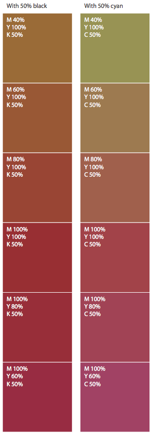
What we consider to be a ‘clean’ brown is a relatively warm hue, not neutral at all. If you use cyan instead of or as well as black you’ll pollute the colour, making it greyer and dirtier rather than darkening the existing hue. If that’s what you’re after then fine, but remember that cyan is the colour that tends to dull things on press. Anything related to skin tones risks feeling a little flat and unhealthy if it contains much or even any blue in the tan or brown. For rich, clean browns, light or dark, avoid cyan like the plague; work in MYK only – magenta, yellow and black. Take a look at the sample swatches shown here. All use set mixes of magenta and yellow, but one set uses a 50% black tint to darken the colour while the other uses cyan. The difference between the colours is remarkable, particularly when the magenta and yellow aren’t both at 100% strength.
Colour can be a powerful part of design if used well, but it is important to know both the implied meanings and the right ways of working with and producing it. Oh, and don’t forget the issue of what people perceive if they have any form of colour-blindness. This affects roughly 8% of men and half a percent of women – but that’s a topic for another day.