Helvetica: still pulling its weights
Helvetica is the world’s most popular typeface. Not everyone likes it, often precisely because of this, but it’s everywhere you look: shop signs, clothing labels, corporate logos, packaging of all kinds, the iOS interface – and now of course Mac OS X itself. One of Yosemite’s many changes was the booting out of Lucida Grande as the system font in favour of Helvetica. Or rather Helvetica Neue, a newer, subtly redesigned version of the font design.
Helvetica was drawn by Max Miedinger and released in 1957, the same year as Adrian Frutiger’s Univers. (Helvetica started life called Neue Haas Grotesk, but in 1960 it had been renamed with an adaptation of the Latin name for Switzerland, reflecting its role in modern Swiss design principles.) There’s a truism, based on relative differences in character shapes and underlying structure, that Helvetica is for modernists and Universe is for humanists – but both quickly became very popular with designers looking for clean, modern type designs that wouldn’t push too much of their own personality into the mix. For whatever reasons, it was Helvetica that slipped into the role of ‘default typeface’ for so many printers and signmakers. For the best part of two centuries printers used to say “if in doubt use Caslon”, but from the 1960s onwards Helvetica has had that spot.
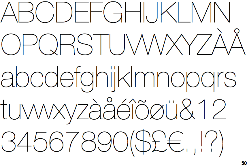
Ever since it first appeared Helvetica has been tweaked and adjusted both to help it work better in the different typesetting systems of the day and to provide a range of different type weights. It was an uncoordinated evolution, which meant that the different variants didn’t all sit particularly well together. You’d even find that one cut of Helvetica Regular would be slightly different from another, if you compared across hot metal, photoset and other production technologies. In 1983 the type foundry Stempel AG released a complete reworking of the core design with a broad range of widths and weights, all developed consistently from the central ‘Regular’ design. The family was called Neue Helvetica, later reworded to be Helvetica Neue. If you swap old-school Helvetica for Neue you’ll see a slight shift in character spacing, but the differences in character shapes won’t be obvious without scaling things up to at least headline sizes and perhaps laying one version on top of the other.
(By the way, the ‘Neue’ part of the name leaves most people floundering when they first see it. The correct way to pronouce ‘Neue’ isn’t “new”, it’s more like “noy-a”, but this sounds more Belfast than German to my ears. I find it simpler to play the ignorant English speaker and go with “new” in most circumstances.)
Along with the subtle improvements in clarity and consistency, one of the great things about this new ‘Neue’ family was the use of the numbering system to identify weights, widths and styles. This is the same system that Adrian Frutiger created for Univers, back when both type designs first appeared. The logic is simple: ’55’ is Helvetica Roman, the standard weight (neither bold nor light) and width (neither expanded nor condensed). The tens part of the number rises as the weight goes up: 65 for Medium, 75 for Bold, 85 for Black, and 95 for the ultimate Extra Black. At the other end of the scale, 25 is Ultra Light. The ‘ones’ part of the number handles two things: width (3 is wider than 5, 7 is more condensed) and style (odd numbers are upright, even numbers are italic).
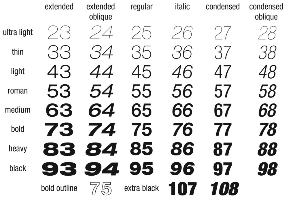
As with Univers and the handful of other large type families that use this naming system, it makes things extremely clear once you know how it works. So… why don’t the versions that come with the Mac OS use this numbering system? It’s hard to say for sure, but my guess is that it’s as much to do with hiding the fact that – while you do get a reasonable eleven different variants – it’s not the complete set. The full Helvetica Neue family has a rather massive 51 different members, but licensing the full set would have been a massive and for most users totally unnecessary expense.
Type designers have been weighing in with their opinions of Apple’s switch to Helvetica Neue as Mac OS X’s system font. Tobias Frere-Jones has said that Apple “might have made a mistake” with this, and Khoi Vinh laid into iOS 7 for it’s use of Helvetica Neue – to be fair, mainly for its initial use of the ultra light weight, since swapped for slightly less anorexic styles. Most typographer’s opinions seem to be along the lines of ‘Helvetica? As an operating system’s core display font? Preposterous!’ I don’t agree, although I admit that it’s taken me years to come around to the idea of using Helvetica in my own designs.
One thing’s certain: without Retina displays this would be a fairly questionable choice of system font. At the sizes used in menus and other interface elements, Helvetica simply isn’t that well suited to the coarseness of old-school chunky pixel grids. In the early days of the Mac the system font for menus and the like was Chicago, something loosely similar to Helvetica but drawn with crude 1-bit screens in mind. Mac OS 8 switched this to Charcoal, then with Mac OS X the system font became Lucida Grande. This was the first Mac OS system font to be taken from print roots, but it was still about ensuring legibility on low-res displays; one of the original ideas behind the Lucida family was to survive low-res output from faxes and early desktop printers.
Helvetica’s never been great at small sizes on older displays, but the print-like dot pitch of today’s screens do it justice. I write mostly in Helvetica Neue Light at 10pt (at 125% zoom, so effectively 12.5pt), and I find it as clear and comfortable as type made specifically for screens (Espy Sans, Geneva, Verdana) were on pre-Retina displays. Equally importantly, it’s as comfortable to read on screen – for me, at least – as it is in print; the big divide between screen and print legibility is all but gone.
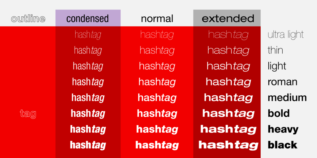
If you’re still of the feeling that Helvetica is overused, take a look at the full range of weights available and see what you can do with some of the lesser-used faces. Of course, with it the new ‘font of Mac OS X’ as well as the iOS system typeface Apple may be leading us to a stage where it will feel just too ubiquitous for anyone to bear, but remember that one of the things that made the family so popular in the first place was its versatility. Try Light or Thin instead of the regular, ah, ‘Regular’. You should even try the skeletal Ultra Light, although please only set very large or the strokes will all but vanish. And do look seriously at getting more faces; Apple’s freebie eleven are useful, but it’s just a small percentage of the full set.