No natural affordances in iPad magazines
No natural affordances: big problems with digital magazines.
The world is going crazy for digital design and publishing. And I have to put my hands up and admit that I’m a fan and a part of that. Creating layouts for the iPad is exciting; there’s a sense of liberation from some of the traditional restrictions of print, plus the software tools are shaping up fast. It is too early to describe them as ‘mature’, but they’re almost all based on mature DTP foundations in some way or other. We know how most of it works already.
Thankfully, we seem to be avoiding the issues in web publishing developments that produced the decade-plus standoff between programmers and designers. Thanks to the iPad there are currently no platform differences, no browser variations, no competing non-standard ‘standards’, and no having to settle for designing to that lowest common denominator, Internet Explorer. And thanks to the emerging robust design and production tools we can get on with designing content for tablets without swapping typeface reference books for programming language guides. But no, it isn’t really quite that simple. There are fundamental principles of design that apply across different media, but there are also many things that simply don’t translate from print to screen. Ignore this at your peril.

While chatting recently with someone involved in one of the major iPad publishing products he said something that encapsulated the difficulties we’re facing in designing digital magazines, whatever the delivery platform. This was the deceptively simple statement that “we take for granted the natural affordances of a stack of paper.” Which is an understated way of pointing out that practically everything that we take for granted with printed magazines doesn’t exist, not automatically at least, in digital mags. We know how to use a physical magazine, we know how the cover works, and we know where the table of contents is. (Unless it is a major fashion glossy, in which case it’ll be buried somewhere in dozens of pages of ads.) More fundamentally, we can tell without conscious thought where we are in a magazine – near the front, the middle, the back – simply by how it feels as we hold it. We know how to turn the page, we can keep a finger in it while closed to hold out place, or fold over a corner for later. None of us have to be told how to do these things, they are all simply taken for granted.
But digital magazines? Ugh. Sometimes it feels not only like we’re all trying to reinvent the wheel, but also like we’re then trying to attach those wheels to an anti-gravity-equipped hovercar. Take the BBC’s Top Gear magazine, for example. This is a print-based product, but there’s a Flash-based ‘page turner’ sample online, offered as a taster. Because people may not know that they can grab and drag the page corner to ‘open’ the magazine, this virtual version tries to tell you – using one of the corniest, ugliest methods around. There’s a crude page curl effect applied to the bottom corner, with cropped-off shadows and the word “Click” (in what looks suspiciously like Arial Narrow, the bodger’s choice) pasted on top at a 45-degree angle. Graphic ouch. Also, because the thing has its own real (fake) dynamic page curl the total fake-ness of the initial one is made painfully obvious. But the worst thing, from a detail-obsessive point of view? A single click doesn’t do anything; it takes a double-click or a click-drag to turn the page.

I don’t mind that digital magazine interfaces are ‘pictures behind glass’, a concept that Bret Victor rails against in a recent article at http://worrydream.com/ABriefRantOnTheFutureOfInteractionDesign/. There were probably similar complaints about not being able to see the person speaking when radio was invented, and again about the unnerving ‘head in a box’ when video (okay, TV) first threatened to kill the radio star.
Did you know people first thought phones would be used to listen to West End stage productions? It can take time before we understand the way big changes will fit into – and change – what we do. Each medium is different, and when a new one comes along we need to become accustomed to using it. Digital magazines are here to stay, no question about it. But we do need to develop conventions, norms and general understandings of how these things work and how we should expect to interact with them.
In a project I’m working on at the moment I’ve been attempting to work through practical examples of some of these challenges. For example, if there’s a section of a page that is scrolled – within the full page – by swiping sideways, how does someone then swipe the whole page sideways to get to the next one? How do they know where to tap and slide? One part of the solution was employing a bit of skeuomorphism (as discussed in Digital Skeuomorphism) in the form of a shadow simulating a piece of paper sitting over the main page. While working on this particular point I found that I’d made something that was oddly biased towards left-handers. The area that readers could touch to slide to the next full page was on the left. Without any cues or clues to persuade them otherwise, right-handed readers tended to swipe with their dominant hand, and they didn’t tend to reach across the main content to try it on the left. Left-handers, on the other, er, hand, tended to start with that side, and as a result they didn’t have as much trouble. I don’t have hard empirical evidence for this, but I noticed the tendency again and again while doing a number of ‘hallway tests’. In the end I resolved the problem with a simple set of arrows arranged in a game controller-like diamond: up, next, down, previous, with individual arrows removed from specific pages when they weren’t relevant.
These were placed on the left in the same lefthander-friendly area, but the visual clue they gave meant that the uncertainty was – almost entirely – eliminated. And, fortunately, this was managed without introducing too much of a jarring, distracting amount of visual clutter. This worked… but notice that I had to resort to adding controller elements to the design, which I was trying to avoid.

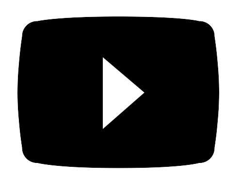
Another challenge is how to indicate that tapping on something will play video content. The ‘play’ triangle, superimposed on a slightly inflated rectangle (à la YouTube and old-fashioned TV screens) seemed logical to me, but it turned out that some (okay quite a few) people thought it was a ‘next’ button. And the circle and arrow arrow graphic I made to tell readers to try rotating the iPad? That came across to some as an undo/redo or go back button. You live, you learn, you try something new.