Comic book and showcard fonts
One of the first projects I used to give my Magazine Publishing students involved creating an eight-page graphic novel, done in teams of two.
They could use any story they like, anything from a re-imagining of the Jonathan Livingston Seagull story to their bus journey to college.
The main focus of the assignment was production and project management, but it involved a load of different creative and practical decisions too. One of which was, if type was to be used, how it needed to be handled.
Going for fonts that are comic-friendly isn’t a requirement, but if a classic comic or graphic novel feel is wanted then that’s a good idea. A number of candidates come as standard with Mac OS X, and there are a few additions with iLife and iWork too. But are they actually any use?

Starting from the top and ignoring anything that’s not hand-drawn or casual enough, we get Bradley Hand, installed with iWork and iDVD. This is based on the handwriting of its designer, typographer Richard Bradley, who created a number of other handwriting-based designs. It’s useful, but it is a little rough-edged, as if drawn on rough, scratchy paper. More importantly, the character widths of the capitals are really too wide for the task.
Brush Script is too, well, ‘scripty’; it doesn’t have the hand-lettered personality feel that’s needed. Chalkboard is an Apple-supplied design that’s disturbingly close to the widely-vilified Comic Sans. Put side-by-side there are differences, but you’d be forgiven for struggling to name them correctly otherwise. Given the looks you’d get you should steer clear of this for almost everything, let alone a graphic novel. (Another reason for avoiding both of these is the capital ‘I’, which has a crossbar. That’s a no-no in comics other than when used on its own.)
The slightly ragged Chalkduster arrived with Mac OS X 10.6. It is too rough for general dialog and body text, although it could do well for certain emotion-laden headlines. And then we come to the bête noire of the typeface world: Comic Sans itself. (No, not La Bête Noire, which is a 2002 Croatian/Serbian comics publication, or the 2005 Bête Noire comics anthology.)
Comic Sans was created by Vincent Connare in 1994. He never meant it to be used outside of a product called Microsoft Bob, a fairly disastrous attempt to make Windows 3.1 more friendly to novices. Instead, it made it into the help sections of 3D Movie Maker, found its way into font packs, then Windows 95… it eventually cropped up everywhere like mushrooms. It has been massively overused and misused, and the backlash (see bancomicsans.com) has been loud for almost as long as the font has been around.
Some say there’s been a backlash against the backlash, but the recent comicsansproject.tumblr.com (redesigning major logos using Comic Sans) and vimeo.com/17450666 (where Comic Sans itself has a foul-mouthed rant – very slightly NSFW) are built on massive doses of irony. Whatever you think of the font, it brings so much baggage now that you should steer completely clear of it at all costs.

Anyway, back to the list of standard script-like fonts… Marker Felt is useful and it sets quite efficiently, but its weight makes it a bit much for regular dialog. Noteworthy arrived with Mac OS X Lion, and it’s actually pretty good for this – better than the blueprint-derived Tekton, the only other possible candidate that comes as standard. But when it comes to graphic novel typesetting, none of these actually feels like the real thing.
So, basically, if you want convincing graphic novel or comic fonts you really should look further afield. Two of my favourite places to browse for possibles are Blambot.com and ComicBookFonts.com. The Blambot site has a wonderful breakdown of the traditions and grammar of comic book lettering and balloons; this is definitely worth a close look whether the project is meant to be something that follows tradition or not.
Curiously, lowercase is normally only used in comic lettering for grunts and non-word sounds a character makes, or perhaps for whispering. The integration of meaning in the visual aspects of the type – telling the story with the type as well as the words themselves – is an important part of how graphic novels work. There are different type needs in different parts of graphic novel layouts. For example, custom dialog typefaces give words the visual spark that can back up what’s being said – or shouted, growled, spat, whispered, murmured, and so on.
The fonts section of the Blambot site groups designs into dialogue, sound effect, ‘design’ fonts (headline display styles), and symbol fonts for non-verbal needs. ComicBookFonts does this as well, splitting things up into balloon lettering, custom voices, sound effects, display lettering, and a selection of dingbat and clipart fonts. Get ready to use your credit card if you like these; while some of Blambot’s fonts are free, none of the ComicBookFonts selection appear to be. That’s actually pretty standard for this field, as purpose-made comic fonts have a pretty small market. Again, if you really like some of these, be ready to pay.
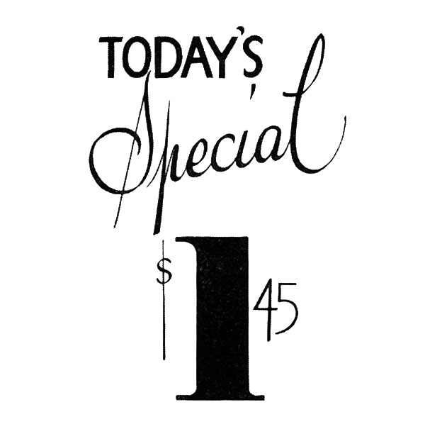
More general casual lettering projects and large display headlines normally need font designs that are a little less explicitly hand-drawn than these. Rather than sticking to comic book collections, look at showcard fonts instead. These are derived from the kind of hand-drawn signage that tells you about the latest prices or deals. Many of these evoke a strong early 20th-century Americana feel. The Show Card Writing page at Kaufmann Mercantile’s blog has a lot of information, including the fact that Woodie Guthrie started out doing sign writing rather than playing music to earn his room and board.
You can get started with some of the designs at fontspace.com/category/showcard/. I particularly like 1998A (http://www.fontspace.com/listemageren/1998a), although I don’t know where I’d use it. It’s also worth getting Jim Parkinson’s Showcard Gothic, from ufonts.com/fonts/showcard-gothic.html and elsewhere.


Mind you, showcard fonts are meant to be hand-drawn and just a word or so at a time, with the odd cheeky swash thrown in here and there. Use ready-made typefaces if you like, but have a go at painting your own, too. Get some very large sheets of paper or a roll of wall lining paper, some fat brushes with soft bristles, and mix up some black poster paint. Sketch the sign in pencil or thin pen first, then go for it. And then try again. And again. You’ll only get better with practise, so don’t give up.
Don’t forget to proof your pencil sketch first. It is teeth-grindingly easy to get so caught up in the process that you forget a character or misspell something. This is easy enough to do on-screen (anyone remember MacUser’s famous ‘Photshoop’ cover line?), and it is ten times easier to do when building each character by hand.
You can scan or photograph your finished showcard lettering and use Illustrator’s Live Trace feature to turn the bitmap image into a scalable vector graphic. It would take a lot more work than that to turn that into a real typeface, but it is quick to produce a headline graphic ready for print. That’s a technique I’ve shown to my students, so I expect to see it turn up in a number of final graphic novel projects. Assuming I explained it well enough, of course.