Zapfino is one of the most spectacular typefaces you’ll ever get to use. It’s a calligraphic tour de force, a typeface designed by the prolific Hermann Zapf, the man responsible for Optima, Palatino and a great many other well-known fonts. Zapfino is specialit’s a swash-rich design with a range of styles and options beyond almost any other font, and it has responsive features that make it surprisingly natural in feel.
The origins of Zapfino go back to a design that Zapf created in 1944, a calligraphic treatment of a short treatise called (junggesellentext), written by the influential book and magazine publisher Hans von Weber. Zapf had tried to create this as a working typeface in 1948 when he became artistic director at Stempel AG, but the technology of the time – hot metal typesetting – was just too limited for the design’s exuberant and overlapping swash strokes. Despite this, Zapf remained interested in creating more sophisticated typesetting abilities.

Around 40 years later, he was approached by David Siegel (coincidentally the man behind the development of colour support in the early Mac OS) to create a font with a large number of stylistic variations. Zapf suggested developing the lettering from his 1944 design, and the end result was the release of Zapfino by Linotype in 1998.
One of the key quirks of Zapfino is its almost casual disregard for the baseline that’s normally the foundation point for every typeface. Different characters sit slightly higher or lower than the baseline, the regularising aspect being the opti-cal centre of the type body. This, along with the expert strokes of the characters themselves, is the heart of the design. What adds its unique style is the ability to swap out different letters depending on the context: which letters happen to be nearby.
The first release of Zapfino achieved much of what Zapf was interested in, but it didn’t initially have the ability to perform the smart ‘contextual substitutions’ for which it’s known today. Later versions were ‘enhanced with Apple Advanced Typography and OpenType technologies’, as Wikipedia puts it, to allow automatic use of differ-ent glyphs according to context. And Zapfino was adopted as part of the Mac OS core font set. Yes, if you didn’t realise, you already have this amazing font, and you can go and try it out right now.

In any app that supports AAT, as you enter words using Zapfino, the specific appearance of certain letters can and will adjust, swapping in and out alternatives to create a strikingly fluid and natural appearance. It’s not simply to do with the immediate neighbour characters, either; even certain combinations of nearby letters can, I’m told, produce this automatic customisation. The piece de resistance is what happens when you type ‘Zapfino’: the text changes from a letter-by-letter setting to a swash visual identity. Frankly, the first few times you do this it feels like sheer magic.
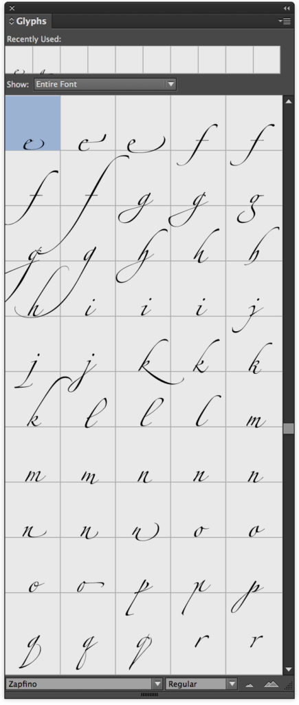 The next step is to explore the options available, taking charge of precisely which character variants are shown. Unfortunately, finding apps that allow this isn’t easy. Support for AAT in most software is at a fairly basic level, and in many cases it’s non-existent. Try setting Zapfino in Word, for example, and there’s no magic at all. (The letters are still beautiful, but there’s no contextual resetting.) Adobe InDesign does some of the tricks, but it seems impossible to make it acknowledge the existence of Zapfino’s stylistic sets. You can at least browse its 1,400-strong set of glyphs from the Glyphs panel, but it’s a clunky way to work.
You’d expect Apple’s Pages and Keynote to champion this feature, but it’s sadly missing here, too. You do get the automatic contextual substitutions, but other than turning off default ligatures (Format > Font > Ligature in Pages), there are no app-specific controls. Even worse, open the OS X Font panel, pull out Typography from the cog icon pop-up menu, and you’ll see all the myriad options Apple makes – but none of them work. Try it and the Typography palette gets confused and hides most of the options. Beggars belief, doesn’t it?
In fact, the only two apps I could find on my Mac that support not just character substitution but also manual control of Zapfino’s stylistic alternates were TextEdit (yes, really – try selecting Zapfino in it and typing ‘Zapfino’) and Softpress Freeway (update: Freeway is now discontinued, proving progress sometimes fails). Both have supported this kind of rich, sophisticated type control since the year dot, and still provide fully functioning control, via that Typography palette hidden within the Font panel.
Unfortunately, this leaves me with a bit of a problem if I want to do some serious Zapfino design typesetting, especially if it’s for print work. My options are (a) browse through the Glyphs panel in InDesign, hunting and pecking for each character version in turn; (b) set the type in Freeway, which does have great desktop publish-ing features, but will render the result as a bitmap graphic meant for web use; or (c) set the type in TextEdit, Apple’s free text editor.
Weirdly, my preferred option for print work ends up being the one that was probably least obvious: TextEdit. Trust me, it makes sense. If I want to set more than a couple of words in Zapfino, I don’t want to act like a hot metal type-setter and hunt for every character as I go. I can set and refine it in TextEdit with relative ease, then print to PDF and place the result into my page layout as an image. The PDF contains nothing but vectors, so there’s no issue with resolution. It’s crazy that I have to use this workaround, but until Adobe fixes InDesign’s support for stylistic alternates, at least I have a working method.

2 Comments Add yours