“Are we sitting comfortably? Is this thing on? Friends, Romans, countrymen! Oi, you in the back!” The odds are that, sooner or later, you’re going to have to stand up in front of a group of people and talk about something. Practically everyone hates doing this kind of thing, especially the first few times. As we’re all creative types here (checks the invite list) I’ll assume that you’ll either be showing some work to a client or doing some teaching. Keep it simple, relevant and visual.
I have a cardinal rule of presenting: only ever talk about something you know really well. Seriously, just say no to delivering something that’s new to you, or at least make time to learn it first. The worst example I’ve seen of this was from Apple, funnily enough. A 1990s press briefing on ColorSync went badly wrong when it became clear that the presenter knew the subject no better than us, didn’t really know the presentation content, and was also, perhaps, slightly hungover to boot. Or maybe just paralyzed with terror. I’ve never forgotten the car-crash horror of that afternoon, and I was just in the audience. With that in mind I have a few suggestions on presenting. Take ’em or leave ’em, just remember they’re the result of a lot of time standing in front of a big screen.
Heard the phrase “death by PowerPoint”? It can just as easily be death by Keynote, so keep it interesting and avoid the classic trap of too many words on screen. There are so many problems with putting up slide after slide crammed with words and bullet points. First of all, it’s bo-ring. Second, you’ll easily slip into the trap of reading out what’s on the screen rather than just talking to your audience. Treat the slide as the header for what you want to say, not a script.
Bullet point lists aren’t automatically evil, but if you want to really make an impression then stop and think what’s going to be more effective: half a dozen lines of text that say the same thing you’re saying but a bit shorter, or a pithy visual or attention-grabbing phrase that sums up the gist of what you want to say while you get on with saying it? I’ll admit lists can be fantastic for helping you organise your thoughts. If you imagine each slide in a presentation being like a paragraph, bullet points are the boiled-down words and phrases that sum up those paragraphs. My feeling, though, is that they’re usually best kept as your own memory-jogging presenter notes, they’re sometimes useful for handouts, but they’re generally too dull to actually put up in front of everyone.
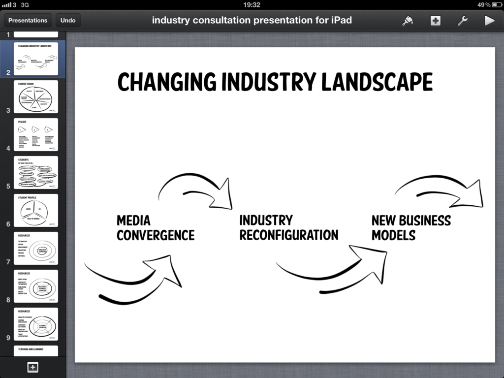
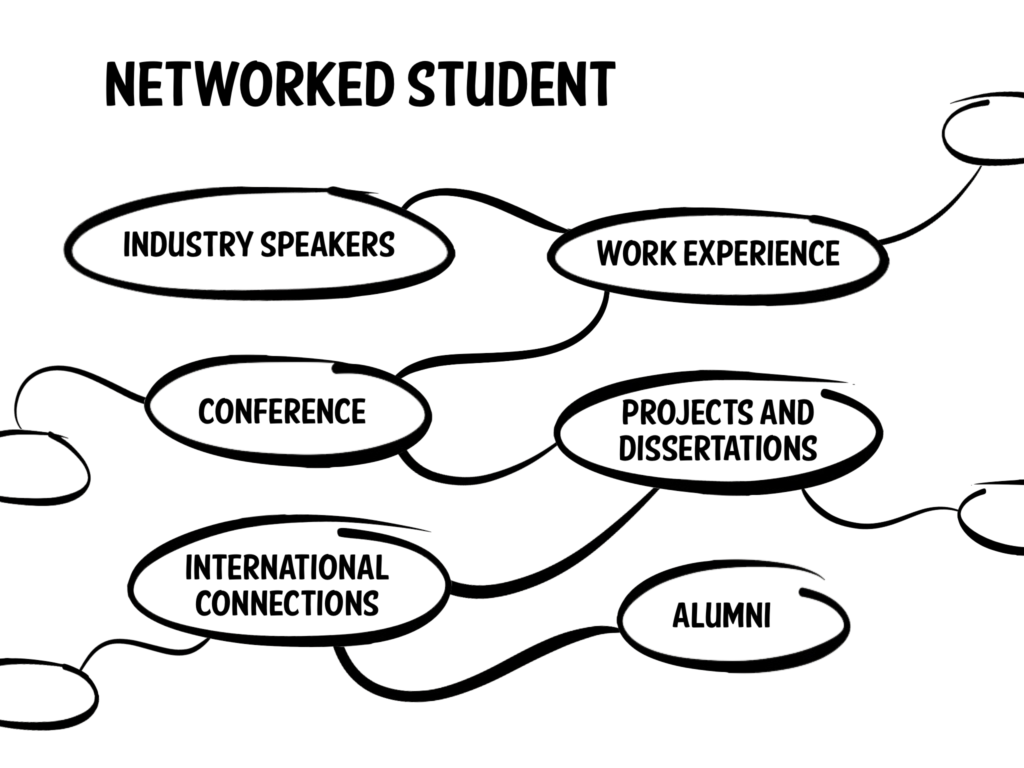
When you present to a group of people you’re going to show as well as tell. Use graphics, but please run screaming from clipart; that’s as bad as wearing second-hand trainers to a black tie event. You don’t need to spend days on artwork; last month I themed a set of slides with simple brush-style strokes made in an iPad sketchbook app called Paper. Quick and easy, even with emailing the graphics to myself.
Don’t, for the love of God, get sucked into the madness that is special slide transitions. Just like with video editing, your audience should never really notice these. You’re not Quentin Tarantino or Steve Jobs; it won’t be anything but a distraction. The default straight cut is fine, trust me. A simple wipe or dissolve if you must. If you get the urge to do anything else just step away from the controls.
There’s a newish approach to presenting that’s actually rather brilliant if you need to keep a lid on timing, especially if there are a few of you presenting things. It’s called Pecha Kucha, the ’20×20′ format. This involves showing twenty slides for twenty seconds each, and talking while they roll – full details are at pecha-kucha.org. You can’t control the slides once you’re under way; no speeding up, slowing down or pausing. This means you really have to know your slides and what you’re going to say. It’s a challenge if you’ve never done it before, but it’s only six minutes in total. It keeps you sharp and on your toes, and, best of all, it absolutely scotches the possibility of overrunning. (I once gave a brief talk on type at the British Library. I meant to do five minutes but slipped to almost ten. It was fine, luckily, but I’ll try a Pecha Kucha-like approach next time.) The one possible bit of extra control you can use is doubling up on a slide to give yourself more time – another 20 seconds – on it.
Pecha Kucha isn’t right for everything. The most obvious mis-fit would be when you have a long talk to do. Doing a 45 minute lecture like this would need 270 slides and a superhuman gift for timing. I know I don’t have the latter and I really don’t fancy preparing the former!
Once you’ve put together your presentation and you’re comfortable with what you’re going to say, there’s the small problem of exactly how it’s going to be shown. Projector, probably. But what’s going to be plugged into it? Are you going to use whatever computer might be there? I have a small maxim that’s worth remembering: ‘Only trust someone else’s computer as far as they’ll let you throw it,’ especially if it’s a PC. You can’t be sure your typeface choices will survive, movies may not play, and even embedded graphics can sometimes fail to show. If you have to rock up with just a memory stick and crossed fingers, always have a fail-safe PDF version of your presentation on there as well as the obligatory PowerPoint document. That will at least lock down the type and graphics, even though you won’t have custom transitions (tsk!) or automatic progression.
If you can plug in your own MacBook you get to dodge all those problems, and you can also use Keynote rather than the industry-standard PowerPoint. But it means you take on some responsibilities too, such as having the right monitor adaptors (VGA, DVI, HDMI?) and managing battery life. At a Le Web conference a couple of years ago I didn’t realise the power socket by the lecturn wasn’t live, and my laptop’s battery was on its last legs. Fortunately it survived the talk and only gave out during the Q&A, but it could have been so much worse.
These days I prefer using my iPad whenever I can, but this brings its own problems. There’s a limited set of fonts on iOS, so if I want to use something more interesting – Soho Gothic or American Purpose Casual, for example – I have to prepare the slides on my Mac, convert them into PDFs or bitmaps, rebuild the slides, then send the final less-than-easily-editable version to the iPad. It works, but it’s a real pain in the ass. Last-minute tweaks mean juggling my laptop and iPad and transferring files, when it really should just mean tapping away in Keynote on the iPad. Should I just stick to the fonts on the iPad? Oh, come on – I like Gill Sans and Didot, but there’s only so much of a short font list I can take. Anyway, type choice is an important part of visual communication. I’ll keep praying for font installation and management options in iOS, but until that happens I’ll keep working this way.
Parting words: it always helps to be obviously excited by or at least interested in whatever you’re showing. You need good visuals, but presenting is also a kind of confidence trick: project confidence and interest and you’ve won half the battle.
