ASCII and emoticons
The peculiar art of making faces with type.
Lol, ;–)
If you’ve never used either of the above in an email or text, you’ve either avoided the Internet altogether or you really are a bit of curmudgeon. A text-only medium blocks the non-verbal, unspoken emotional indicators that give a richer context to our communication. The quizzical tilt of the head, amused tone of voice, sarcastic stresses on certain words, it all gets stripped out. That’s why emoticons – emotion-conveying icons – are so popular and, well, so damn useful too. Sure, overuse them and you’ll seem like a 14 year-old kid with a twitchy mobile, but avoid them completely and you risk being regularly misunderstood in today’s pared-down communications media.
There are countless emoticon variations. Most follow the same model, but the left-handed smiley (c; adds a slight cartoon feel. I remember a programmer friend who had stand-up hair and a ready smile. He really did look a little like =:-), although he had more character. No, really! Okay, sorry about the pun…
Emoticons are as old as they are clever. The first documented use of the classic :–) is from 1982, by computer science undergraduate Scott Fahlman, but in the 70s Plato system users were using complex overstrike effects to build composite graphic-like emoticons from multiple characters. See platopeople.com/emoticons.html for examples. But using collections of raw characters to get an emotion is much, much older than that. The #@$! of comic book swearing and endless variations on the theme have been used for almost as long as the modern form of comics themselves. Going back further, Ambrose Bierce suggested the ‘snigger point’, \__/, in 1912, and more than 50 years before then the National Telegraphic Review and Operators Guide listed <3 and :* as shorthand for ‘love and kisses’. Those teen text favourites are considerably older than I ever thought!

I had also thought that making actual faces from characters was a relatively modern twist, but it turns out that in 1881, 130 years ago last March, Puck magazine published a set of type-set faces expressing joy, melancholy, indifference and astonishment using basic type characters. I find it particularly interesting that the Puck designs are not quite the same as the emoticons that are used for convenience. In basic communication these things are meant to express something in the line-by-line flow of unstyled text, an ASCII data stream as punched in by any keyboard or keypad. But as That unnamed Puck typesetter showed, that’s not where things have to stop. Take a look at the type shapes in different typefaces, turn them around and arrange them in two-dimensional space rather than the single dimension of a text editor, and you’ll soon see facial fragments. Push them into different groupings to build up different faces with different emotions. You can’t send these in SMS, but they can be fantastic attention-grabbing and emotion-setting graphic elements in the right creative project.

The use of type to create portraits is powerfully attractive; you’ll see it crop up again and again. There’s a delightful feeling of whimsy in this kind of graphic, particularly in the creation. I did this myself for a major college project, a rather long time ago. I had been utterly mesmerised by a recent TV advert for the Royal Mail that used pure graphic animated type set to a haunting old Italian romantic song. The designer was Oliver Harrison, a fresh graduate from St Martins, and the advert was essentially the short animation he had done as his final major project at college. This was made with overlapping exposures of carefully-set pieces of type, bringing the words of the song – Amore Baciami by Nuccia Bongiovanni – elegantly to life. The award-winning commercial was called Letters of Love, and it was used, of course, to promote posting amorous missives on Valentine’s day. Harrison also revisited and developed the concept in adverts for Marie Clare magazine and experimental shorts.

I got in touch to ask him about his likes (rum babas, super 8, Tennyson) and inspirations (enigmatic), and the upshot of my work was a typographic portrait of Harrison, enhanced with lines from Coleridge’s poem Khubla Khan. ‘His flashing eyes, his floating hair’ featured prominently, although to be fair to my subject it was the long hair that kicked that off, not any alarming stares.
If you want to see Oliver Harrison’s original animation (and I strongly suggest that you do) it’s below. Then go to his site, www.oliverharrison.com, and browse his other work.
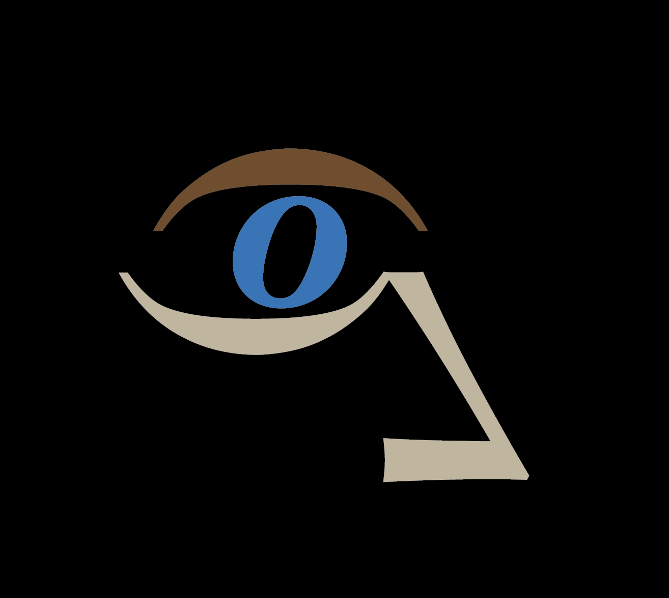
Amore Baciami was a pivotal source of inspiration for me at the time, and it still grabs me. As for my type portrait of Harrison, there may be something in a dark corner of the attic, but right now all I can find are sketchbook roughs and fragments of film positives. The simple brooding shape at the top of this article is a rebuilt graphic as the original Aldus FreeHand 2 files were lost on floppy disks many years back. But a quick search online will turn up many other (better) examples of this sort of thing.

What reminded me of all this was a recent EditorialDesign.org talk where Peter Grundy, one of the pioneers of infographic design, showed some of his work. It began with the original graphic identity for Grundy & Northedge, created by Grundy in 1979. This was a typographic portrait of the two design partners, and the Grundy’s face design has remained a part of his own visual identity through to the present, as shown by the pink-backed ‘Grundini’ book cover.

It isn’t hard to get started with making these type-face (sorry) designs, but it is the fine-tuning that will get to you. Refining the appearance of these things can take serious time; shift just one element a fraction to one side or give it a very slight tilt and the emotion that the overall composite graphic conveys can be radically altered. Keep duplicating things and tweaking the copies so you can compare the changes, and if you keep a sketchbook (we talked about that, remember?) then keep printing things out and sticking them in there.
Any application that lets you move and rotate individual characters is fine. Illustrator is best, but both InDesign and QuarkXPress are also very suitable for this kind of work. You’ll need to get intimate with the details of individual letters from different fonts, so dig into your collection. Anything from fine book typefaces to brash display lettering can be good. I find that bolder weights tend to help build stronger results, but look for inspiration everywhere including flamboyant script designs.
One thing to establish from the start is distortion: do you do it or not? If a character doesn’t quite do what you want, do you stretch or reshape it until it does? My heart says no – I hate distorted type as a rule, it is a kind of abomination in normal typesetting – but okay, this is an extremely non-standard use of type. Basic rules don’t necessarily apply. Still, try to achieve things using just scale and rotation and through trawling through different styles, weights and typeface families first. I’d bet that the results look better and feel more professional – and you’ll have the buzz of that extra level of creative achievement as well. And that should bring a :–) to your lips.


A fascinating joy ride and I don’t think anyone would have thought of how far the emoticon goes back. I particularly like working in the constraints of a typeface. And I think the faces in particular.
Thanks for all the 🙂
Greg