Olympic logo design hits and misses
Olympic host city logos come in various forms, not all to everyone’s taste.
Note: this was written in the summer of 2011, a full year before the London 2012 Olympics happened. Other than minor editorial adjustments this is the article as it appeared in MacUser magazine at the time.
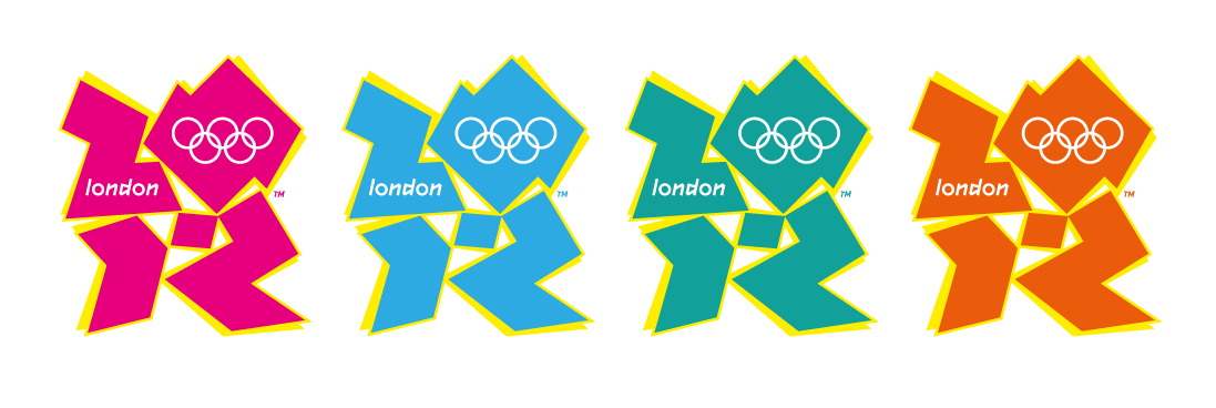
Got Olympic fever yet? No, me neither, and it isn’t because we still have a year and a bit to go. The event will be a series of amazing achievements, but ‘That Logo’ is a massive buzz killer. The papercut graffiti in shocking pink, burnt orange or a couple of shades of blueish is like a bad 1980s breakdance album cover. When I first saw it I wondered if it was the joke choice of the Wolff Olins design ideas presentation and the committee went for it anyway. We all know the dangers of including unloved alternatives in a design presentation, don’t we? The client almost always likes the wrong one. But anyway, that’s done and dusted, there’s nothing we can do about it now. What really surprised me, once I started to dig a bit, is how poor many other Olympic event ‘host city’ logos have been too.
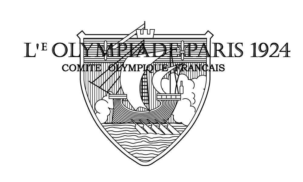
The Games started in 1896, but the first half dozen didn’t have anything resembling any kind of logo; they were essentially illustrated posters. It wasn’t until the 1924 Paris Olympics that the idea of an event-specific emblem showed up. It wasn’t exactly prime logo material – far too illustrative for my tastes, and the type legibility is highly questionable – but it does mark the start.
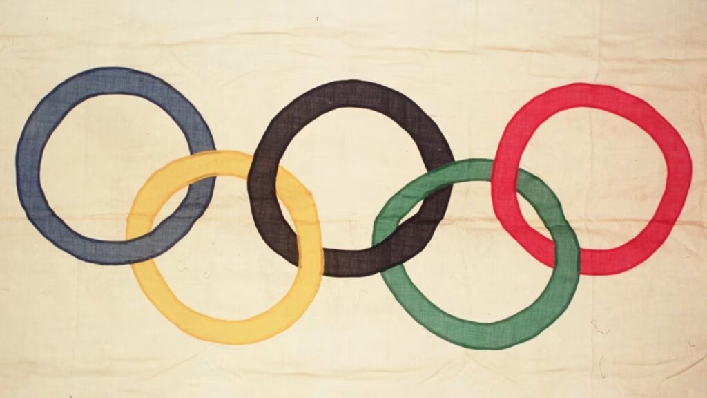
The Olympic rings design is actually an impressively strong and long-lived graphic logo. The rings symbolise the ‘five inhabited continents of the world’, and the colours – blue, black, red, yellow and green on white – are supposed to be the colours that were used in the various national flags of the time. This was created in 1912 by Pierre de Coubertin, but they weren’t actually used until 1920, on the first Olympic flag among other items. (Oddly, the original Olympic flag flown in the 1920 games disappeared by the end of the event. It wasn’t until 1997 that a US competitor from 1920, Hal Prieste, owned up to stealing it for a dare. He returned it in a special ceremony at the Sydney Olympics in 2000 and got a plaque in the Olympic Museum thanking him for ‘donating’ it. So kids, the moral of the story is…)
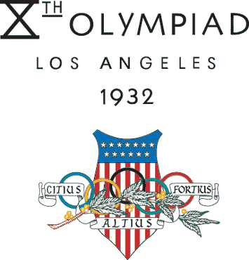
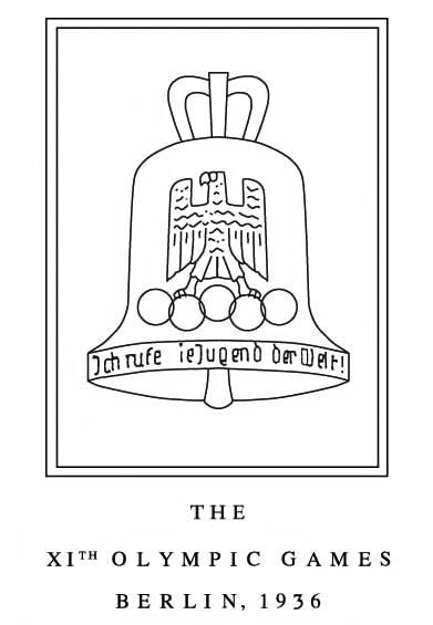
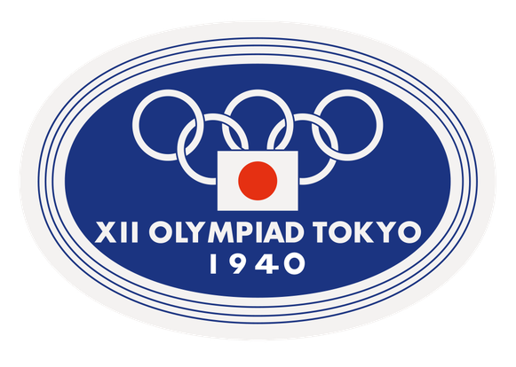
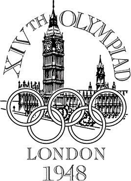
Anyway, after a shaky start the rings became a recurring theme; Los Angeles 1932, Berlin 1936, London 1948, and so on. There was a Tokyo Olympiad planned for 1940 and graphic designs were developed. Unsurprisingly, it never took place, but the planned logo would have been the first to have a relatively graphic rather than illustrative feel. The logos for the 1932, 1936 and 1948 events were all really illustrations and layouts with type rather than strong graphic emblems in their own right. London’s 1948 effort was particularly cheesy, being a sketch of the Houses of Parliament overlaid with the rings and a highly questionable choice of type.
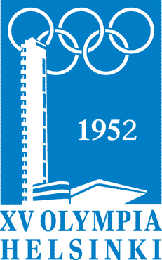
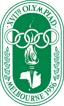
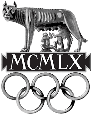
The logos for Helsinki in 1952 and Melbourne in 1956 were – well, okay, they were old-fashioned, but at least they were actual identities. The one for the 1960 games in Rome was bizarre, a pseudo-3D illustration sculpture affair that didn’t even mention the host city by name. It is probably best to pass by that one without even a backwards glance.
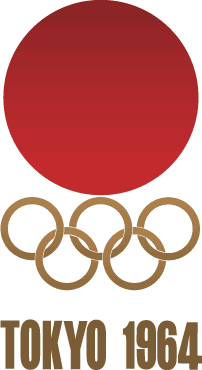
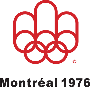
After this the host city emblems started to resemble properly considered logos, although not always terribly successfully. Tokyo’s 1964 effort is safe, but to the point of dullness. The 1968 Mexico graphic is very much of its time and an interesting exercise in graphic line work, but the ’68’ has legibility issues with the overlaid Olympic rings. Munich’s spiral design in 1972 was interesting, but it lacked both the Olympic rings (the only one to do that since 1920) and any other relevant characteristic. Montreal’s 1976 logo is also dated, but for my money this is still one of the strongest of the lot. The simple yet strong design puts the Olympic ring graphic idea into centre stage while still being clearly something distinct.


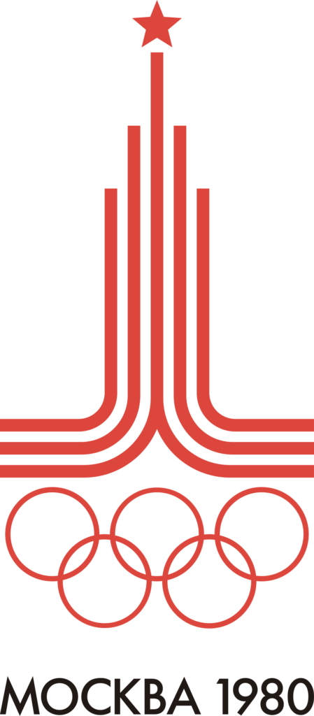
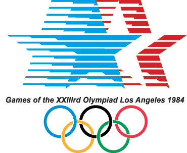
There’s something definitely Soviet about the 1980 Moscow Olympics logo; it’s a striking bit of graphic design that evokes architectural grandeur and focused ambition, although it’s a bit cold. Very tall too, which can make it a little awkward to use. The logo for the following event in Los Angeles is, well, very 1980s. It’s a bit of a busy muddle too. Not every instance used that sentence-like strap line but it is very common, and many versions include a copyright notice and ‘TM’ trademark stamp built into a logo immediately under the stars! Very odd (and not legally necessary; see The Copyright Symbol article for details).
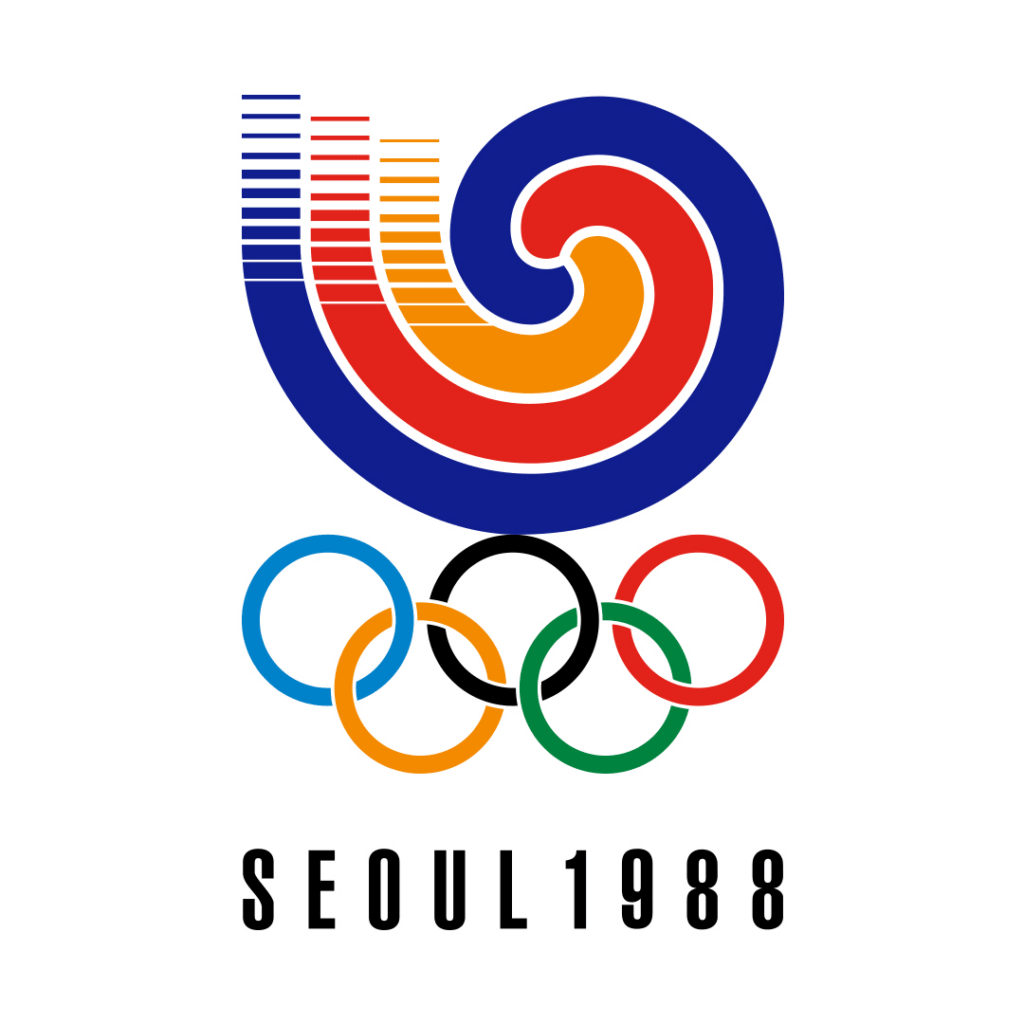
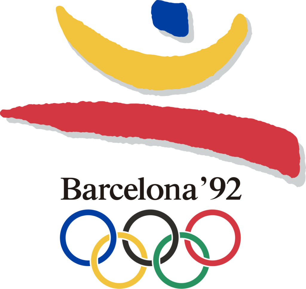
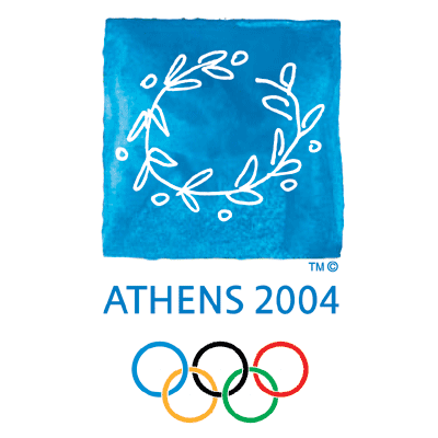
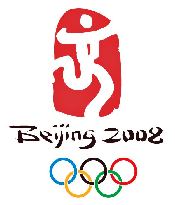
From the tri-coloured swirl of 1988’s Seoul event and the brush strokes of 1992’s Barcelona effort onwards we’ve seen almost nothing but variations on the arty, folksy, casual theme – and there’s a reason for this. The trouble with events of this stature is that it takes a lot to shift a visual theme once it takes hold. The committee nature of every part of the Olympic hosting design and pitch process tends to favour revisiting aspects of whatever ‘worked’ before, even if that was actually derived in part from what came before it, and so on.

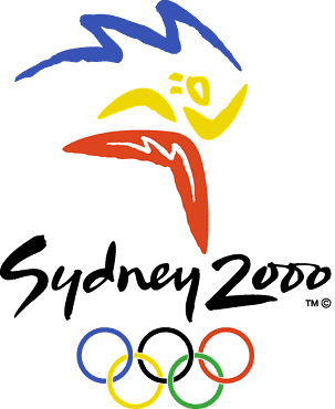
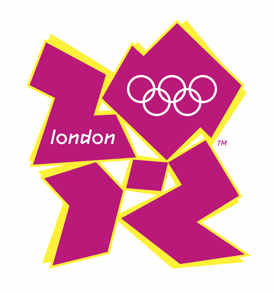
In one sense the London 2012 logo could be seen as a shaking off of this problem… but in reality it is just another kind of folk art-based graphic, executed in a rather questionable manner and with some rather iffy colour choices. Unlike the last few designs it doesn’t even pretend to be friendly and approachable – perhaps in order to better capture the nature of the city? Yet it is still infected with the naïve bug, trying – and maybe over-succeeding – to look casual, effortless and almost incidental. The shoehorning of the word “london” and the Olympic rings into the shapes avoids having to stick those items into a strapline outside, but it really is quite poorly handled.
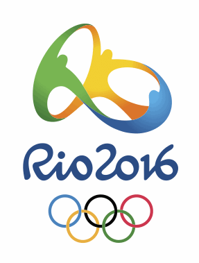
Will the folksy graphic Olympic logo meme continue? Thankfully it appears not, although Rio’s design for the 2016 Olympics still hangs onto a fairly organic aspect. This design has come in for a fair amount of flack, but in fact it is a much more professionally-designed identity than our 2012 effort. Not only does the main illustrative graphic work very well with the typographic shapes drawn for the “Rio 2016” label, it has an exuberance that is in keeping with the event. It uses the colours of Brazil’s flag, and it has been pointed out that there are interesting similarities with Matisse’s painting The Dance. I’m not calling it perfect; the geometric simplicity of the Olympic rings beneath do clash with the otherwise organic shapes of the artwork. But it is heartening to see something actually quite good used for once.
It is fascinating to see how each event has been handled through the years. It is a hugely challenging process, creating a graphic identity that is so incredibly public and emotion-laden. The criteria-for-consideration includes capturing the ‘spirit of the games’ as well as some essence of the city itself – real or imagined. It is a brief that probably puts off more top design agencies than actually end up pitching. The London 2012 effort spawned a large number of alternatives by people who couldn’t bear the wannabe graffiti tag. You’ll find a ton of them by doing an image search for “London 2012 alternate logos” (bit.ly/2012alternativelogos) – some good, some bad, some just silly, but all a reaction to the official design. So perhaps we should thank the design agency instead of slating the design? After all, it has raised the profile of graphic design far more effectively than any half-hearted, inoffensive doodle. That’s not to be sneezed at – although I still find it odd.





One Comment