Keith Martin presents Fun with Flags: the evolution of the Catalan Estelada
“Hello. I’m Keith Martin, and welcome to Keith Martin presents: Fun with Flags”.
No, hang on, I promise this won’t be like Sheldon’s infamous vexillology video podcasts… even though one or two of my students have compared me to Sheldon.
I’ve always found national flags fascinating from a graphic design sense. They are meant to represent some aspect of their country, often something pretty obscure, admittedly, but with a lot of political history and formalised symbolism. This means that flags are, in effect, the graphic identity of their countries. They are the visual branding that declares a certain allegiance, a group identity, and so on. Depressingly, this is often linked with aspects of xenophobia, but that’s more a result of how flags are sometimes used than what they were intended for. Having said that, it’s curious that two of the most powerful examples of national graphic design were out-and-out enemies; brand competitors of the ultimate kind. It’s also fascinating (okay, to me) how these designs have been a part of the evolution of the Catalan Estelada – but now I’m getting ahead of myself; let’s start at the beginning…
The American ‘star-spangled banner’, while a little complex in its content and symbology, is a visually arresting, slightly circus-like but unarguably memorable design. The phrase ‘red, white and blue’ could apply to flags from many different countries including the UK, France, Chile, Cuba and Vietnam, but despite this it makes most people instantly think of the US.

The old Soviet Union’s hammer and sickle design was a powerful visual counterpoint. Its symbolism is easier to grok; the union of the workers (hammer) and peasants (sickle) with the Communist party above as a star, on a red background that was symbolic of revolution long before the rise of Soviet Russia and the 1923 adoption of this design.
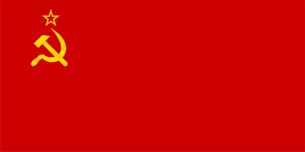
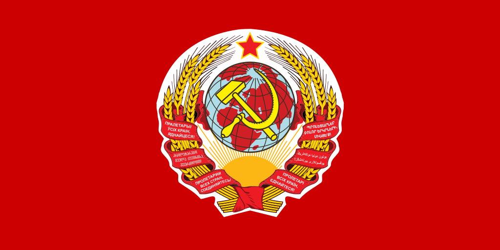
Curiously, this was the second official Soviet flag design, succeeding the first after just four months, and an unofficial design used briefly during the summer of 1923. Both of these short-lived designs were far weaker than the final one, despite using the same core red/yellow colour scheme.

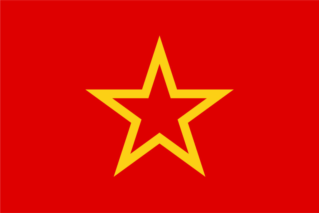
Have you heard of the ‘Red Army flag’ design, with the star shown front and centre in an otherwise plain red field? This is an unarguably powerful graphic. But did you know this never actually existed? Along with a number of other fake flag designs of Russian territories it was the invention of Oleg Ivanovich Tarnovsky in the early 1990s – yes, after the fall of the USSR. Soviet ground forces never actually had their own flag, instead using the regular Hammer and Sickle flag.
Anyway, when the cold war ended and the USSR dissolved this West/East US/Soviet graphic design power play was ended. The tricolor flag design adopted by the Russian Federation shortly after the fall of the Soviet Union was actually the one used by Russia before the October Revolution of 1917, so it’s more a triumph of tradition than imagination. It is, amusingly, another of the red, white and blue set, and it’s nowhere near as strong, graphically speaking. (Yes, the top is white – it isn’t just a bit shorter than most.)
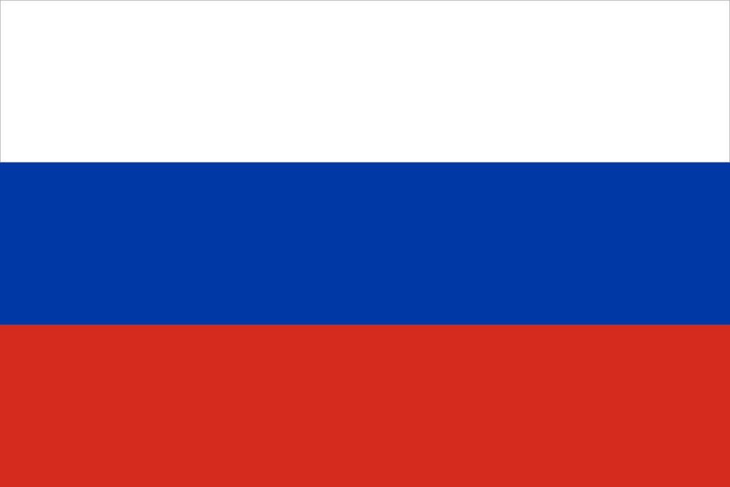
It’s not every day that a new flag design appears. Like the current Russian flag, the design I’ve been noticing recently isn’t exactly new. However, it is part of a movement that may well end with the emergence of a new independent state. Or perhaps re-emergence would be more accurate, as it’s a centuries-old argument that’s coming to a head. Yes, I’ve finally come around to the Catalan connection!
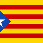
Catalonia is the region of Spain that includes Barcelona. The ‘Estelada’ is its flag of independence, as opposed to the official regional flag the ‘Senyera’ or ‘les quatre barres’ (the four bars). That’s the base for the Estelada design, which puts a blue triangle with a white star over the stripes.

Somewhat American sounding, you say? Yes, but not in the way you think. It gets a little convoluted…
The Catalan Senyera – not the Estelada, I mean the plain red and yellow stripes version – was the national and maritime flag of Catalonia from before it was a region of Spain; there are illustrations of it flown on ships from as long ago as the fourteenth century.
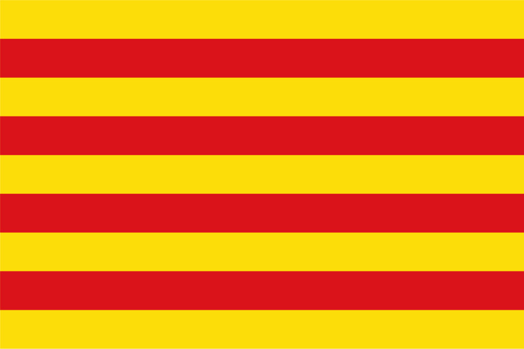
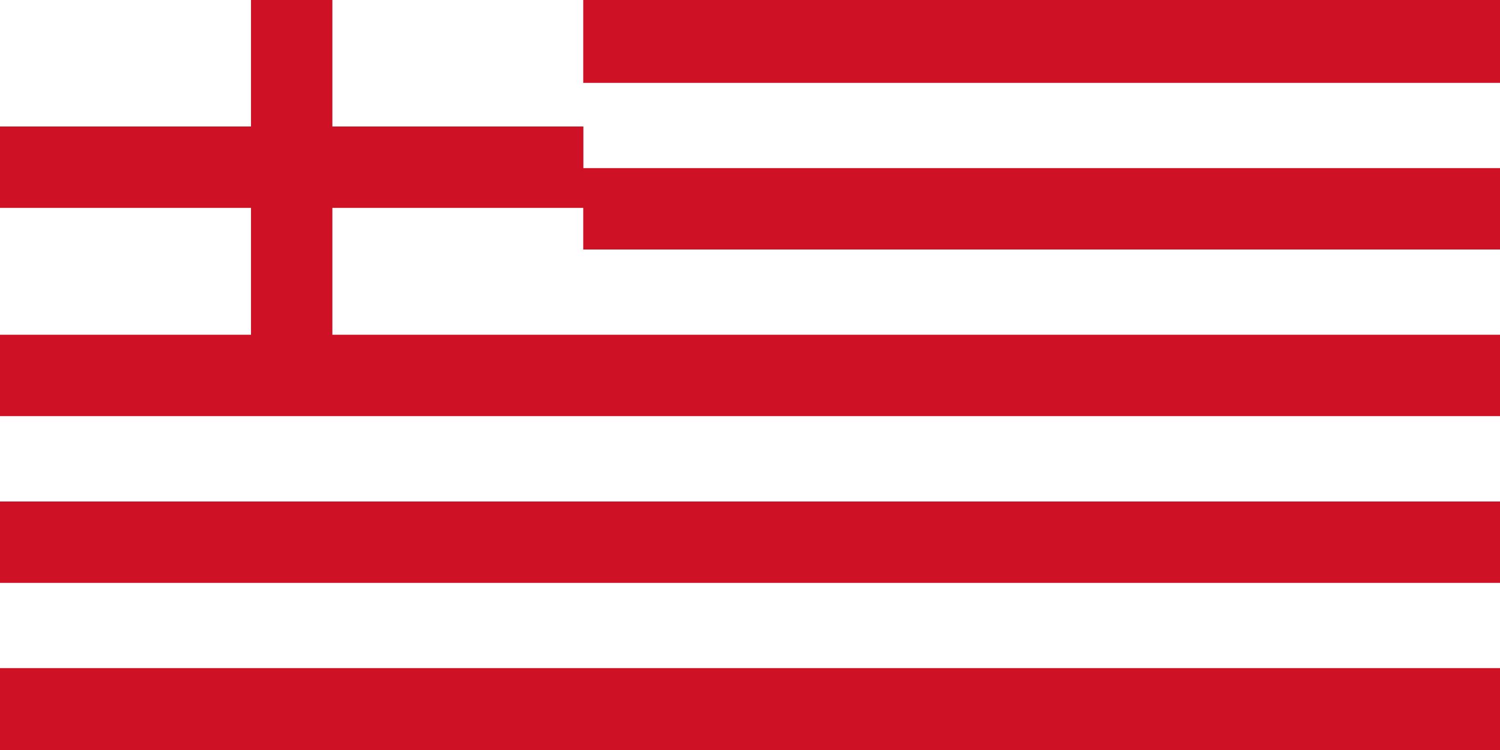
Around 1600 this was used as the design basis for the British East India Trade Company’s flag: red and white stripes with a St George Cross and then later in 1707 the composite Union Flag in the upper-left, that part modelled after the Royal Navy’s Red Duster flag. This was also used as the first naval ensign of America, the ‘Continental Colors’, from 1775 to 1777, albeit with the small Union flag part as a square rather than a rectangle. See below.
If I was writing for Buzzfeed I’d say you wouldn’t BELIEVE what happened next – because the British East India Trade Company’s design was used in 1767 by the Sons of Liberty, the group behind the Boston Tea Party that destroyed the tea being shipped in by that company. The flag design, which was referred to as the ‘Rebellious Stripes’, was created by removing the Union Jack and flipping the stripes vertically, but those were returned to horizontal in 1773.

However, this wasn’t ever the official American flag. In 1777 the Continental Colors design was altered; the blue field with white stars was added in place of the small Union flag section, and the American ‘star-spangled banner’ as we know it was born. Since then it’s just been about the details; it’s always been red and white stripes with some arrangement of white stars on blue.
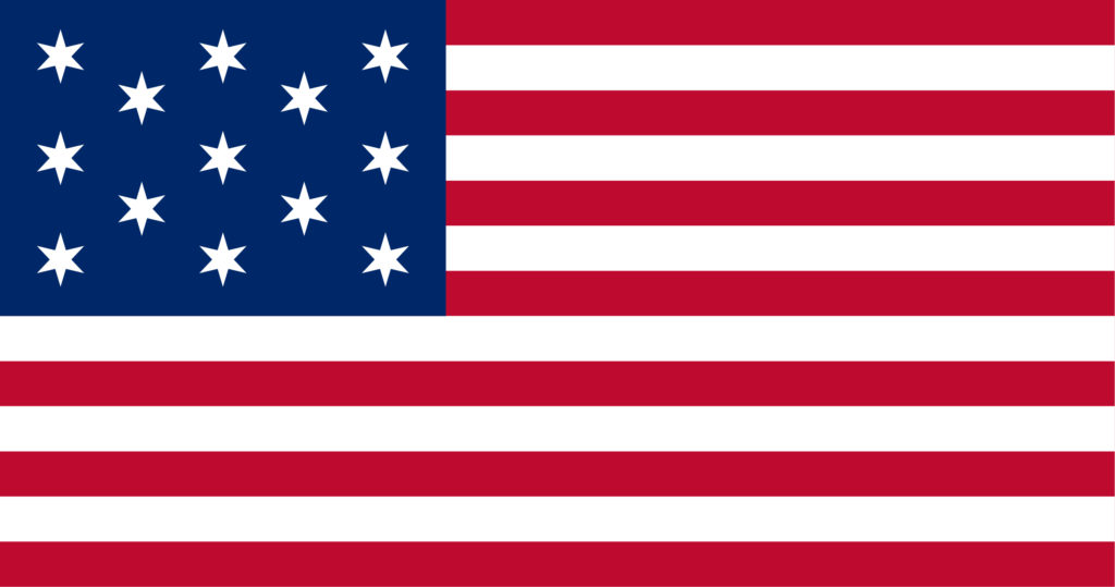
Since then some form of stars and stripes combination has appeared in flags again and again around the world, for example with the Cuban and then the Puerto Rican flag.
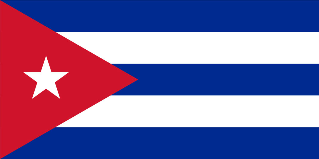
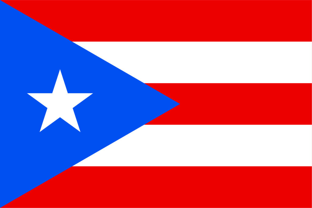
The Puerto Rican flag was designed by revolutionaries in 1892 by flipping the red/blue colours of the Cuban flag (and brightening them) but keeping its design structure. It was banned by the Spanish and then, faintly ironically, by the Americans until 1952.
The convoluted loop-back happens here, as Catalan’s Senyera-based Estelada is said to have been designed with reference to the Puerto Rican white-star-in-blue-triangle design, while at the same time reflecting aspects of the American star spangled banner. As far as we can tell this was done in 1918 by a group calling itself the Pro-Catalunya Committee, headed by the Estelada’s designer Vicenç Albert Ballester, in the midst of a wave of new nation-states created by the League of Nations.

There were concerted efforts to get support from France and from US President Woodrow Wilson but, thanks in part to Spanish efforts and despite the flag design and lobbying, Catalonia – for better or worse – remained part of Spain. But the flag evolution wasn’t quite finished. Although the red, yellow, blue and white Estelada is the best-known version of today’s Catalan symbolism, in 1969 a Marxist branch of Catalan independentists created a version of the flag design that used a red star and coloured the triangle yellow.
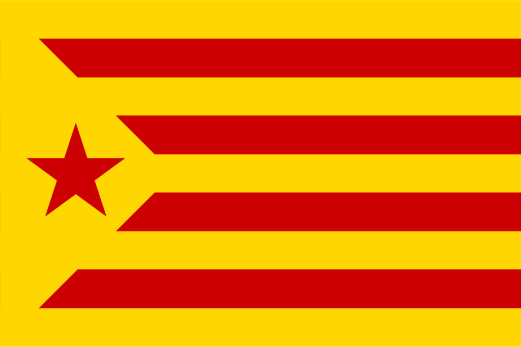
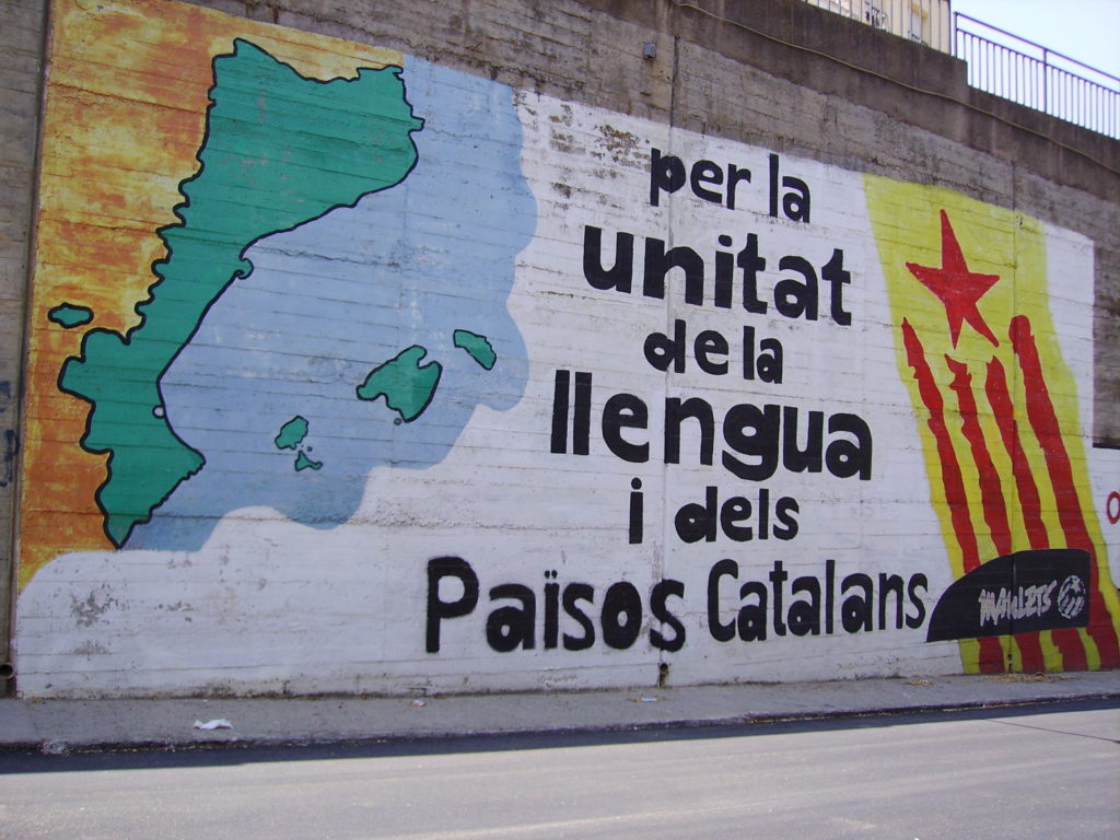
The red star on yellow links conceptually to the red/yellow stars in the left-wing Soviet and Red Army flag designs – despite the flag design’s actual roots being more in the right-wing US flag. This version of the Catalan flag exists today, but the leftist origins are largely forgotten and the red-star design is used where a simpler version is needed.
All this building of connections may seem a little forced, but note that flag design is almost maniacally rooted in symbolism, tradition and precedent – despite so often being representative of revolution and change. It’s also quite hard to pin down the truth completely, so do your own research before placing actual bets. There’s some interesting stuff in a Powerpoint document found at www.cch.cat/pps/vm_apu_08.pps, but note that it’s written in Catalan and, unfortunately, set in Comic Sans. Ouch.
As of the time of writing the Estelada isn’t exactly banned by the Spanish government, but it represents a long-unwelcome (to the Madrid-based government) separatist political movement. In graphic branding terms it’s also an exceptionally strong design that easily outdoes the official Spanish ‘la Rojigualda’ flag. That may not seem politically important, but it does help rather a lot when it’s used as a rallying call.

I’m not a flag collector as such, but I am tempted to get hold of a decent sized Estelada, both because of its graphic design strength and for its development history. However, it turns out it’s not easy to do if you don’t speak Spanish or Catalan, so if anyone out there can help I’m all ears!
And that concludes today’s episode of Fun with Flags. Bazinga.
NOTE: I wrote this column in 2014, and I was quickly contacted with positive comments and generous offers of help; I was sent a 5x4ft Estelada by Jaume Avellaneda M and a beautiful original ‘Estelada’ art print by Sal Mullen. And more recently a graphic correction from Víktor Bautista i Roca. Thanks everyone!

