Espy Sans Revived
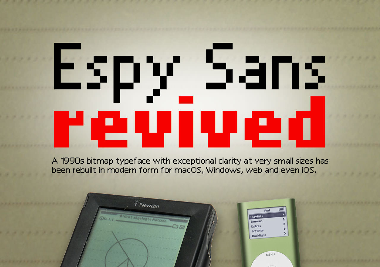
Back in pre-Mac OS X times, in 1992, Apple created a bitmap font called Espy Sans and used it in its Apple Help application, in its mis-timed eWorld service, and as the system font in the Newton. Espy Sans was the last bitmap-only font Apple would produce. It was crafted for use at specific pixel sizes on screen, and it was – even more than Verdana, although without the typographic pedigree to back it up – exceptionally clear at those sizes.
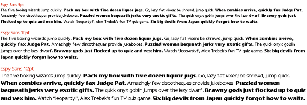
If you never used any of those things you probably haven’t seen this font. It wasn’t ever made available generally; it never appeared in the Fonts folder inside the System Folder. If you wanted it you had to crack open the Apple Help application with ResEdit (that generation’s developer/hacker utility of choice) and move it into a standalone font suitcase file yourself. I did this, naturally, as I loved how it looked as a screen font and wanted to use it in my own SuperCard applications, but it was anything but common.
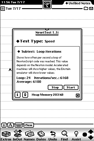
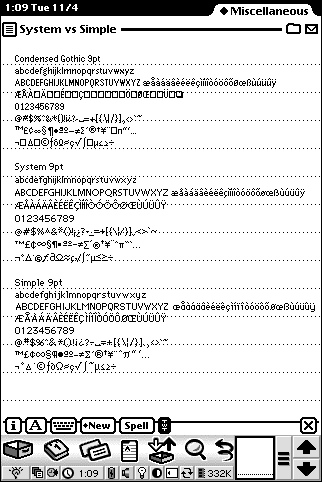
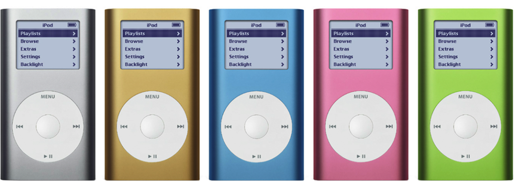
Fast forward seven or so years and the death-knell of bitmap-only fonts was sounded. Mac OS X ushered in Quartz, which was Display PostScript under another name, and all the old-fashioned screen-only fonts were moved to the ‘tired’ list. It was adapted for use in the iPod Mini family for a while, but Espy Sans itself, along with lots of other bitmap fonts, was no longer usable.
Despite this it hasn’t quite disappeared – almost, but not quite. It isn’t supplied by Apple any more, but it’s been rebuilt two or three times as vector approximations and once as a pseudo-bitmap using vectors to make the block shapes. Nu Sans from scootergraphics.com is a full-blown reimagining of Espy Sans with curves; it’s good, but it’s not really a faithful rebuild. Epsy Sans (note the spelling difference: Epsy not Espy) is an earlier incarnation; clever, but the same deal. There’s some history about Espy Sans and a set of links at lowendmac.com/backnforth/2k0601.html, but the links appear to be dead or point to a broken compressed archive.
Finally, there’s the Isaac Espy Sans System Font from splintered.co.uk, a proper attempt to remake the exact pixel shapes as PostScript paths. It’s not on that site any more, but it can be downloaded from https://fontstruct.com/fontstructions/download/626983. Great idea – but unfortunately it isn’t exactly the same: not all the characters are based on the original bitmap designs because it was recreated from random samples of the typeface in use. So the original fonts don’t work, they’re nigh-impossible to find anyway, and there’s no proper, complete and accurate equivalent available? That sounds like a challenge!
I’m never one to shrink back when it comes to obscure type-based projects, especially when I have more boring work waiting. The problem of not being able to use pure-bitmap fonts in Mac OS X is something I thought I’d got over years ago. However, looking at Espy Sans again brought it all back. So I reached for Fontographer (yes, it still lives!) and got to work.
Making a fake bitmap font is a little odd. Normally, type design involves curved lines at least some of the time. Here, in order to end up with pixel-accurate, er, pixels, I need to draw outlines of the actual bitmap character shapes – blocks and all. The points need to be placed exactly where the pixel corners will be, and this is different for each point size. Doing it this way – replicating the actual blocks using outlines – isn’t strictly necessary; I could just make custom bitmaps for each size and use one-size-fits-all (literally, in this case) vector letter shapes. The problem there is that any size not covered by the bitmaps would be rendered from the outlines and not look quite like a real bitmap design. If I’m going to obsess over recreating a specific type design I may as well do it right. Right?
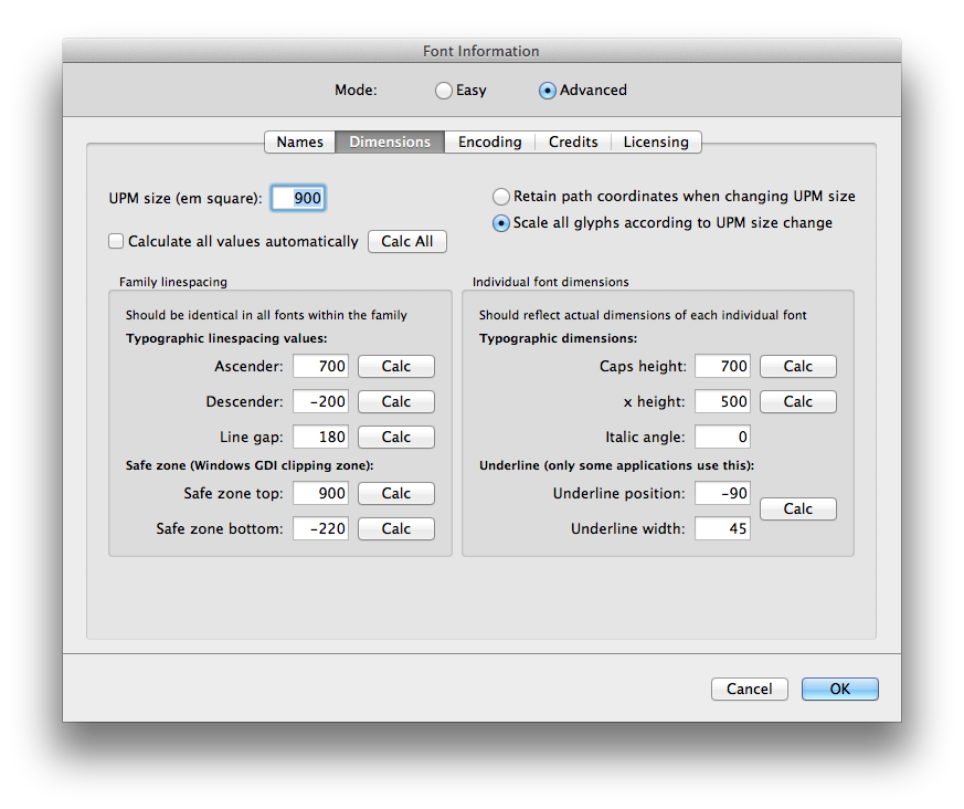
You’re not convinced, are you? Never mind, here’s what I’m doing: I started with a new Fontographer document, which looks a little like a cross between a spreadsheet and a hot metal typesetter’s type case. Yep, type design is a nerdy, technical process as well as a creative one. For this task I needed to set my font document’s metrics to the right dimensions. The first one I’ll work on will be the 9pt version, so I adjusted the dimensions to fit the nine pixels from top to bottom of the type body. In the Element > Font Info dialog, in the Dimensions part of the Advanced section, the overall em square is set to 900 (allowing 100 per pixel, in this non-standard font recreation method), with the ascender height set to 700 and the descender to -200. I wouldn’t normally futz around with this, but it ties everything together in the next step.
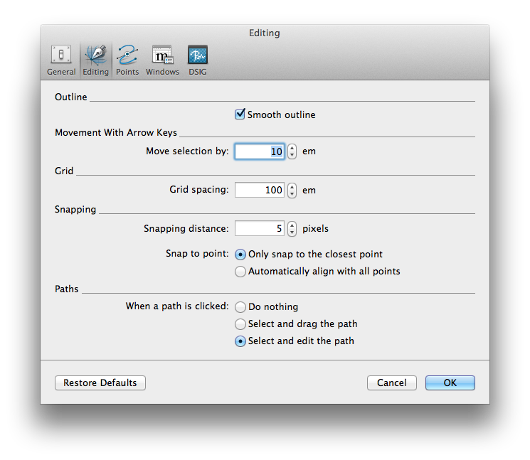
And the next step is… setting the drawing grid spacing in the Editing part of Fontographer’s preferences. By making this ‘100 em’, each new point will be forced to match up to the boundaries of the display pixels that will be generated later; it will snap to this ridiculously coarse – but perfectly spaced – grid.
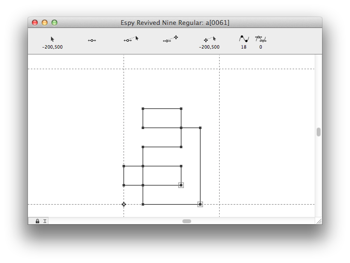
Confused? Fair enough, it’s a bit esoteric. Take a look at the example of one of the letters being drawn. I’m referencing a massively-enlarged image of Espy Sans 9pt so I can see the pixel construction of each character, and the Pen tool is being used to plot out the pixel shapes. The grid simply prevents me from accidentally placing a point slightly off where it should be.
Once a character (okay, ‘glyph’) is finished I set the right-hand sidebearing to be one pixel-unit off the right-hand edge of the shape, then move on to the next. Some sit below the baseline; the parentheses by the full two ‘pixels’, the @ symbol by one, so it’s important to watch for details like this.
Back in pre-OS X days having a hand-set bitmap for a specific size meant that that’s what would be shown. Now, though, the type is always rendered from the outlines, and sub-pixel antialiasing is the norm. The result is slightly soft fine detail but smoother-appearing curves and angled lines. This also means that there’s not much point in drawing custom bitmap fonts for normal use. If you do, however, they’ll be used in Photoshop when antialiasing is turned off. You’re unlikely to do that unless you want to build pixel-perfect artwork with razor-sharp small text for screen use, but for that, nothing beats a crisp hand-crafted bitmap. True, adding hints to the type is the modern solution, and that’s really the professional way, but that’s even more intense and obsessive than making the shapes in the first place. So nope, hinting is something I’ll consider another time.
I’ve worked my way through the nine, ten and twelve point sizes and produced working vector font files for both regular and bold weights across those three weights. Consider each ‘size’ (nine, ten, twelve) as separate related fonts; you are of course free to use them at any point size. Why not set them very large and bask in their retro pixel glory?
I have also generated them in webfont form, should you wish to use them directly in HTML pages. Each download comes with a demo HTML page with sample code to use in your web pages.
And finally, just because I can (thanks to the ’iOS Font Generator’ utility I made some years ago), I have also converted them into .mobileConfig files that can be installed in iPhones and iPads, so they can be used in any mobile app that offers font choices!
Download Espy Sans Revived
(TrueType for macOS and Windows)
Download Espy Sans Revived in webfont form
(.woff, .woff2 and .css files, plus a demo HTML file)
Working webfont example of Espy Sans Revived Nine with sample code:
Download Espy Sans Revived as mobileConfig files for iOS
(for use in iPhones and iPads)
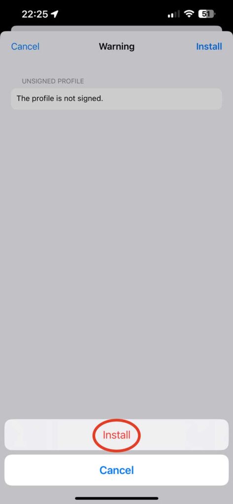
Installing these in iOS is simple: tap one of these links. You will be asked if you want to download a configuration file, then told that it has downloaded. Go to Settings > General > VPN & Device Management and tap the downloaded profile to install.
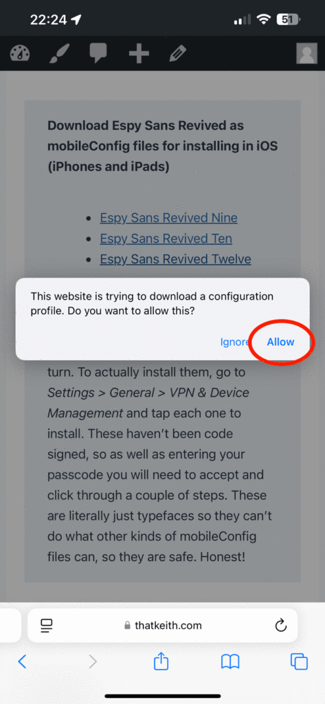
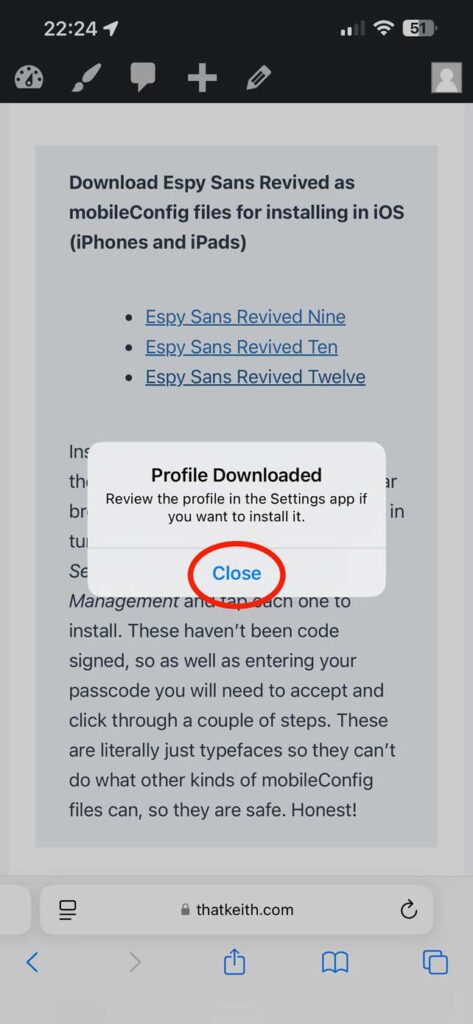
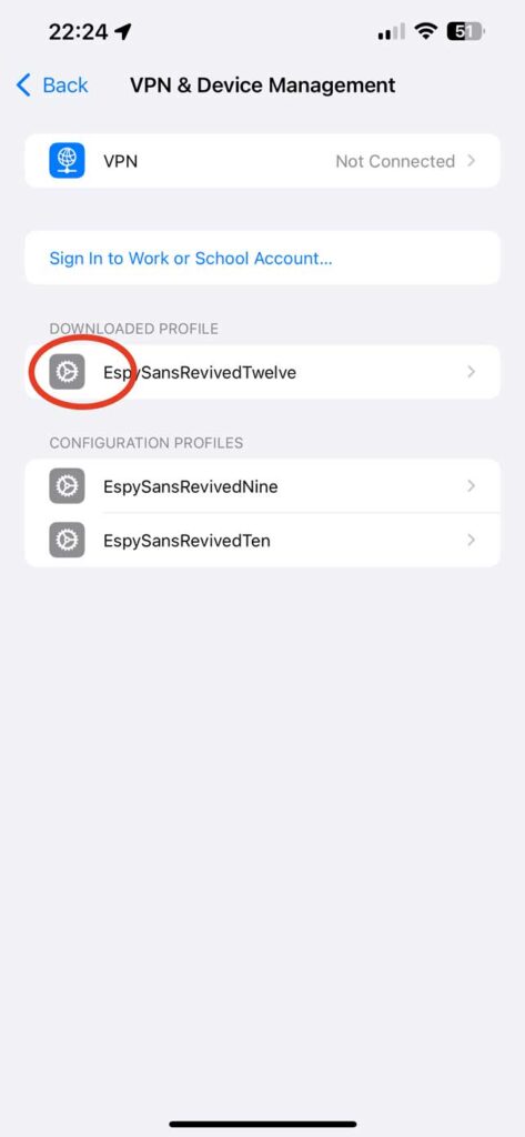
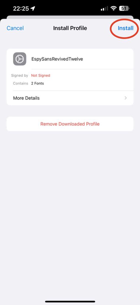
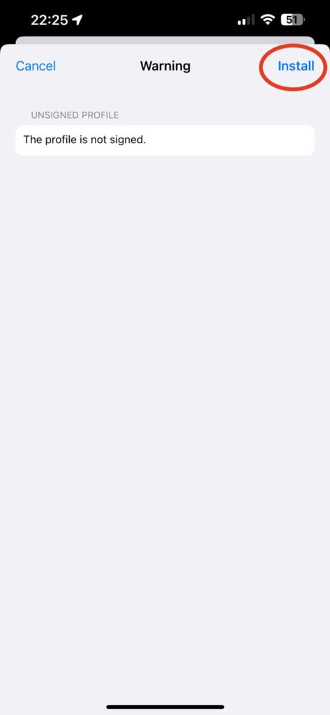
These haven’t been code signed, apologies – it’s a hassle. As well as entering your passcode you will need to click ‘install’ three separate times. These are literally just fonts so they can’t do anything bad to your device. Honest!





One Comment