Big Brother evil eye
The evolution of a graphic identity
There’s a well-known saying from early last century that travel broadens the mind, and this applies to graphic designers as much as anyone else. Every culture has its own graphic signatures; visual elements that are often missed when it’s your own culture, but stand out as identifying characteristics and sources of visual inspiration to outsiders. I don’t mean the nationalist aspects of banknote designs or the visual structure of national flags, although there are rich pickings there. Cultural differences and traditions lead to equally strong graphic developments. For example, whenever I spend time in Turkey, I’m fascinated to see the ways the ‘evil eye’ charm is used. This blue, white and black design is found practically everywhere you look: embedded into the surfaces around doorways and fountains, worn in bracelets and necklaces, hung from car rear-view mirrors, the helms of boats, and so on. It’s a manifestation of ancient beliefs that are found practically everywhere in the world: that there is such a thing as the ‘evil eye’, and certain practices can ward off the misfortune it brings.
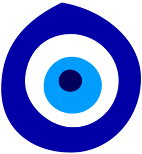
It isn’t just the eye emblem that’s part of this: one of the reasons that doors in Turkey and other parts of the Mediterranean are painted blue is, apparently, because it’s considered a traditional good-luck, trouble-blocking colour. However, the nazar boncugu or nazarlik (or “nazarlık”; love the Turkish dotless lowercase ‘i’) is the most explicit example of this kind of belief. The idea (at least as has been explained to me) is that if bad luck comes around, the nazarlık will attract it, like a lightning rod for ill fortune, and prevent it from causing harm. If the nazarlik is found broken, it’s because it did its job. Like other superstitions, there’s more than a little self-justifying, closed-loop logic going on here, but for most people in Turkey, it’s similar to our ‘bless you’ reaction when someone sneezes, or crossing our fingers for luck: far more cultural habit than actual belief.
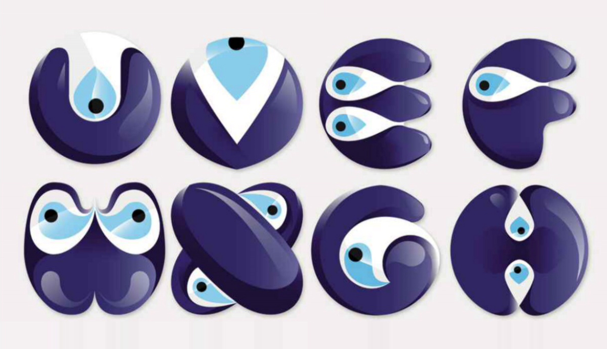
The nazarlık bead or pendant is traditionally made using a specific recipe that’s itself based on superstition: a combination of molten glass, iron, copper, water and salt, crafted by traditional glass workers. As this is normally made from opaque coloured glass, it has a certain overall lustre, but it’s pretty distinctive even as a simple flat print. It has also been coopted in a number of different ways by designers, and the Nazar Type project by Mesut Ugurlu, an art director from Istanbul, is a great example [1]. In this, he twists the core elements of the nazarlik into letterforms, one for each character of the alphabet, including five Turkish accented glyphs.

We do have a very modern equivalent, of sorts: the eye logo from the Big Brother reality TV show. It’s a potent symbol of national obsession, and it draws from the same ancient core concepts of the eye image as a point of power, as well as the Orwellian Big Brother concept itself. It’s been a strong enduring logo concept, although the graphic itself has been modified every year for each new series.
The first Big Brother eye was a stylised close-up photo of one of the contestants [2]. For the rest of the show’s run on Channel 4, the graphic was developed from that first snap. The one that was most like the Turkish nazarlik was from the sixth series, in 2005. It was blue, black and white, with a moderately malevolent air: a pretty decent kind of evil eye [3].
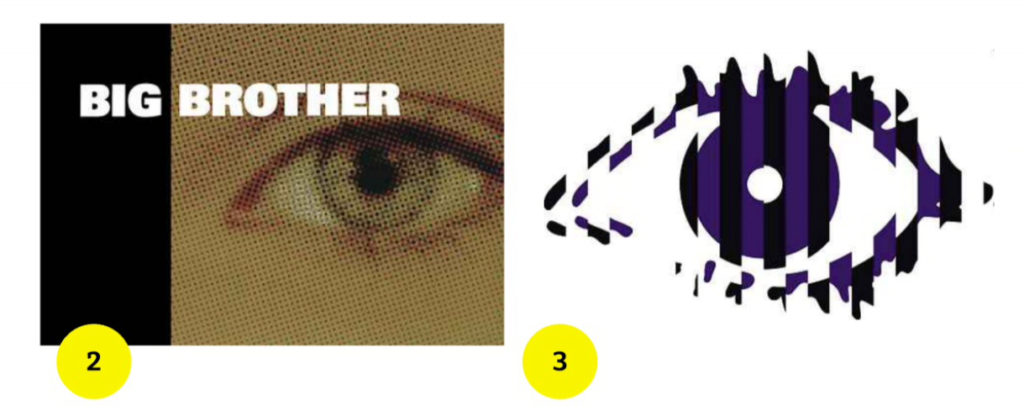
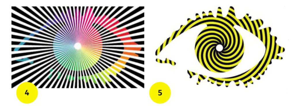
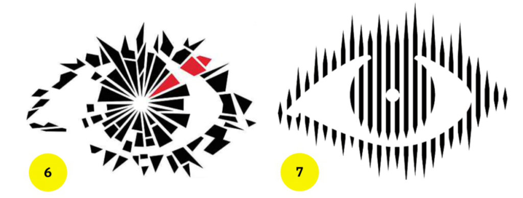
Other years played with the symbol in different ways. The problem with having a core design motif that needs to be both changed and kept the same year after year is that, eventually, you’re going to start running dry. At the very least some of them will look weaker than others: 2003’s rainbow splurge overlaid with a burst of black lines [4] wasn’t great and 2006’s black and yellow spirals were somewhat childish [5], but my least favourite is the shattered effect of the 2008 design [6] which felt derivative and forced. I know some people feel differently: according to the Radio Times, in 2011 this Big Brother logo was voted the best ever, so perhaps it presented itself better when animated. The one I dislike the least is the design from 2004; the black and white vertical stripes that looked like something made from old Letratone sheets [7].
When Channel 5 took over the franchise in 2011, the logo changed into to something with horizontal and vertical symmetry [8]. The Radio Times web page that lists all the Big Brother logos (bit.ly/rtbblogos) describes it as alien – a fair call. As a standalone graphic it’s not as compelling, but it’s being used in a different way: built from plastic patchwork parts in 2012 [9], and from collaged doors and TV monitors for the 2013 show [10]. It’s less useful in pure static logo terms, but that’s not necessarily a prime concern in the dynamic world of TV.
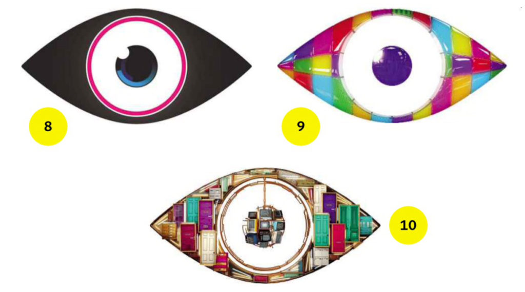
The Big Brother eye graphic has been changed every year, going from the original pseudo-halftoned photo to that ‘alien-style’ design. Turkey’s blue, white and black nazarlık, on the other hand, has stayed essentially unchanged for, well, the best part of 3,000 years, as far as I’ve been able to make out, not counting design experiments such as Mesut Ugurlu’s Nazar Type. I’m not sure what this proves other than the enduring effects of superstition and tradition on visual form, but it’s a U striking difference. I wonder what Mesut might do with the BB logo if Channel 5 gave him the chance to rethink it once more?
