Hanging in the (white) balance
White balance can make or break a shot, so take the time to understand its foibles
When is white not white? That’s a trick question, by the way. I’m not about to try and prove that white is black, but this is a serious issue. What colour something is – or, more precisely, what colour it appears to be – depends entirely on the viewing conditions. By this I mean the light source. On its own this is a little ingenuous. The colour of something is determined by what wavelengths of light it absorbs and what it reflects, so that’s something more absolute. But if the source of light isn’t perfectly balanced; if it has more red or more blue, for example, that affects the appearance of everything.
Most digital cameras are set to adjust the white balance of shots automatically. Move from a sunny exterior to a room lit entirely by tungsten lightbulbs and the shots will be more or less corrected. It may not be exactly right, but it won’t be bad for snaps, most of the time. If you want more control when you take photos you’ll need to find and learn about the white balance options.
 |  | 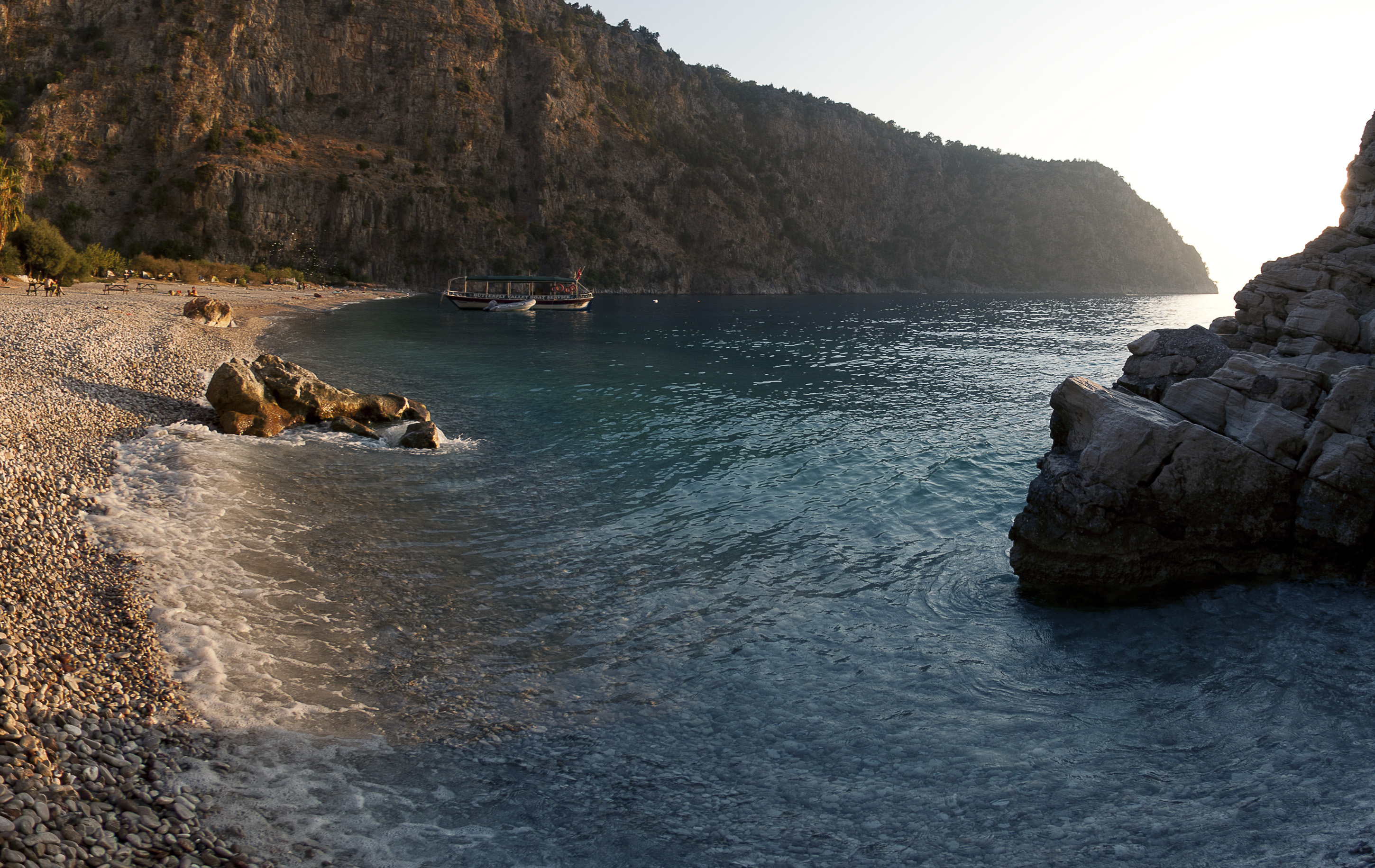 |
| (1) The original beach shot was too warm. The feel of the late afternoon sun is good on the rocks, but it dulls the blue of the sea. | (2) Using the Levels dialog’s Gray Point tool on the side of the boat corrects the image but loses the warm sun feeling. | (3) Masking a corrected layer to reveal part of the unmodified version beneath gives the best of both worlds and achieves the feeling of the original scene. |
Compact digital cameras can be fiddly to deal with, but digital SLRs normally have a dedicated white balance button somewhere on the body. Press this and roll a dial to cycle through white balance presets, pick a specific colour temperature directly (white being measured in degrees Kelvin), or use a shot of your own as something for the camera to use as a white sample. Get it wrong and your photos may look oddly green, blue or red, depending on the mismatch. Get it right and the results will be a (fairly) precise rendering of the scene as you perceived it, even in extreme conditions.
This didn’t happen back in the days of film. Then, shooting photos in tungsten light was best done either with tungsten-specific film or with filters to help balance out the colour bias. Other light sources needed different film or filters to balance correctly. It was a major pain in the ASA, frankly. This could be used to generate interesting colour effects, but the point and problem was that what we see was (and still is) not always captured as we expected.
This ‘as you perceived it’ point is crucial. Our eyes and brains are incredibly good at adapting to the colour bias of whatever light source we’re using. We don’t generally notice how much red a standard incandescent lightbulb produces; we have an impressive natural ‘auto white balance’ adjustment built in that compensates for all sorts of extremes. You can see this in action on a bright day if you lie back in the sun with your eyes closed for a while. Although you’re not actually looking at anything, your eyelids lets some light through, filtered to a strong red through skin and blood vessels. You adjust for that even though you’re not ‘seeing’ anything in the normal way. When you open your eyes and look around everything will look dramatically blue-tinged for a few moments until your eyes’ auto white balance gets things back under control. Judging colour balance subjectively by eye can be a hit-and-miss affair, which is why you should check things with white balance and grey point tools.
If you capture your photos in RAW format this records the unmodified data recorded by the camera’s sensor. White balance is just part of how that is interpreted when this is converted to some kind of bitmap image, so you can do your fine-tuning – or major adjustments if necessary – after shooting. It doesn’t really matter if the white balance is set wildly wrong, although it will make judging the shots on the camera’s LCD screen a bit difficult. If you capture in JPEG format you’re committed to whatever settings were used at the time. You can adjust things later, but there can be quality issues to face.
But most of us don’t want to deal with the post-processing hassle of shooting in RAW, or our cameras may not give us this option, or perhaps we’re given snaps that others shot. Or we just got things a little wrong and have a TIFF, JPEG or PSD that’s poorly white-balanced.
 |  |  |
| Selecting things you assume are white can produce subtly different results. Here, the shirt cuff and the sleeve are similar whites, but they are not identical, and the white tiles and walls aren’t really perfectly neutral. The original image is on the left. | ||
There are a number of different ways to deal with this. The first is to force the image to open as if it was in Camera Raw format, regardless of what it really is. That’s quite simple; all it takes is setting the Format to Camera Raw in the Open File dialog. Whatever it is, this opens it in the Camera Raw processing window, where you can play with the White Balance control or try custom Temperature and Tint settings. That’s the closest you’ll come to true RAW-style colour correction without an actual true RAW-format original, but there are numerous other ways to go.

One that I have used a lot in the past is simply using the Levels adjustment controls. Whether done from Image > Adjustments > Levels or as a non-destructive Adjustment Layer, the Gray Point sample tool will rebalance the image to make whatever you click on be a neutral hue. As long as you have something in your image that you know should be pure white or untinted grey, clicking on that will alter the red, green and blue channel strengths to meet that demand. Watch out for making harsh, extreme changes though, as this can be quite heavy-handed.
Another method is the Photo Filter dialog, which simulates the effect of shooting through a coloured lens filter. The first set of filter options are three warming hues and three cooling ones, labelled with the equivalent traditional filter codes. There are also some stronger filter colours if you prefer, but go easy. A trick for using this dialog to balance out a colour cast is to click the Color chip to open the Color Picker, click in your image to sample the hue that you want to neutralise, then change the Hue value (the first number field) to be 180 degrees different (plus or minus) from the number you just got. So, if you sampled a hue of 25 degrees, the opposite hue will be 205. To fix a hue of 190, use 10. Using the chromatic opposite of a hue as the photo filter colour will neutralise it. The Preserve Luminosity option stops the virtual filter from darkening the image as it would, annoyingly, in real life.
Yet another method is to fill a layer with a full-strength opposite hue (again, sample the colour to remove and set the fill colour to be 180 degrees away from this on the colour wheel) and set the layer’s Blending mode to Hue. Set the opacity fairly low and it works nicely. Use a layer mask to apply this selectively.
But there’s one thing to keep in mind. However you choose to play with white balance, remember that the colour of light is part of our subjective appreciation of a scene as well as a technical issue. If you balance the light from a photo of a pub interior so it is perfectly white, the place will feel cold and harsh. You can kill the warm glow of late afternoon light the same way. Don’t always go by precise technical perfection, even if that’s what it takes to create a perfect neutral white. Sometimes things really should be a little warmer or colder than the tools say, just to give the right underlying feel.