Microsoft logo design history
Back on August 23rd (note: this was written in 2012) Microsoft announced something new. It wasn’t software, and it wasn’t hardware: it was a new corporate logo, launched officially as it opened its new store in Boston, Massachusets. Technically it appeared in July on new keyboards and mice, but a slight fudging of the unveiling is not the point. This redesign is the first one for a quarter of a century. Sure, there have been Windows logo redesigns a-plenty – we’ll look at that in a minute – but the identity for Microsoft itself, not Windows, has been all but sacrosanct since 1987. The core visual identity was nailed down back then, and through everything that’s happened since, good and bad – Windows 3, 95, NT, XP and Vista, assorted Office versions and assorted court cases, Xbox, Zune, and so on – the ‘Pac-Man’ identity, so called because of the cut in the letter c, remained. But it wasn’t always like this.
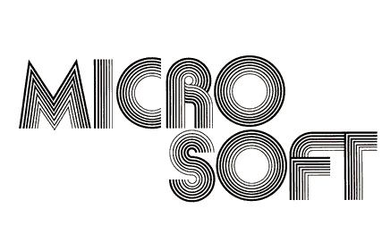
Before 1987 Microsoft had dabbled with a couple of different designs, or three if you count something spotted in a 1982 issue of Creative Computing. The first logo was from 1975, and boy, did it ever look like it:
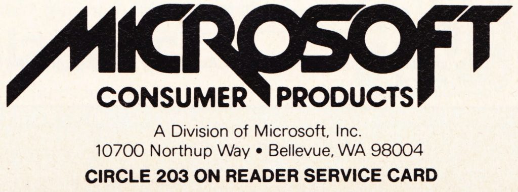
Both the far-out concentric lines and splitting the name across two lines was to be very short lived; the same year ushered in a new design (2) as a single word and with a funky O, nicknamed the ‘blibbet’:
This lasted until ’87, a twelve-year stretch. When the change was announced there was some resistance to losing the blibbet, but, whatever you think of the Microsoft’s logo evolution, you’ll probably agree that the Pac-Man design was better than what it replaced:
(That third design in 1982? That was used in a classified ad, and it looks something like a retro cross between the Metallica and Anthrax band logos. It probably got its creator a major rap over the knuckles for ignoring corporate identity guidelines, but yep, it was technically from Microsoft. Ouch.)
I’ve no idea what fonts were used for the early designs, or even if they were from regular fonts at all or rather the product of a drawing pen and steady hand. The Pac-Man design from 1987 used a very tightly set Helvetica Black Oblique. (I know most places say Helvetica Bold, but it’s much heavier than that.) The new font uses Segoe instead, the Frutiger-inspired font family thats been the standard face for the company’s advertising for the last few years. It’s a clean, clear sans serif design that’s, well… perhaps a little boring. Would you disagree? I mean, it’s competent and unfussy, serious but not old-fashioned – a professional, safe implementation. It’s a well-designed typeface, but in the way it’s used: dull.
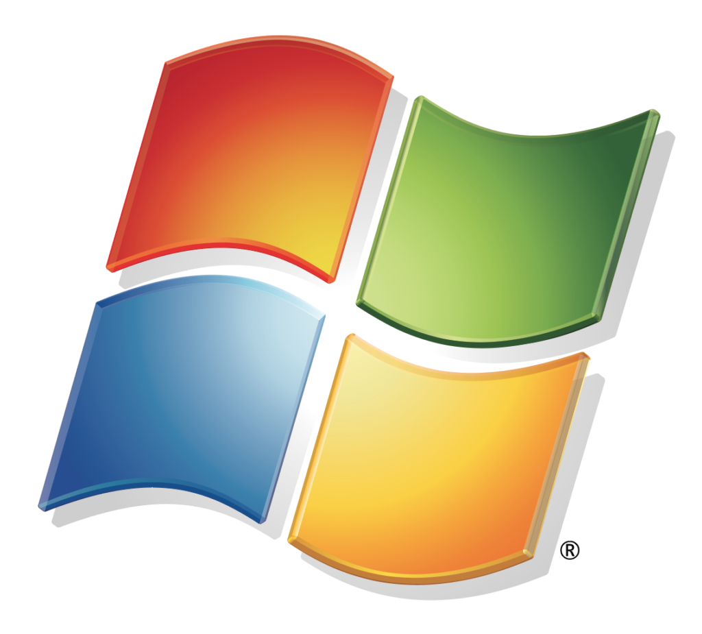
Along with the type there’s a separate graphic part of the logo, a symbol that’s clearly derived from the Windows logos that have been morphing about since Windows 95. This is the first time there’s been anything other than type as part of the Microsoft company logo, discounting the funked-up parts of letters in the first couple of examples. Now there are four squares in four colours, the famous red/yellow/blue/green hues that say “Windows” the world over:
But wait, what? This isn’t the Windows logo, this is the Microsoft one. And guess what? There’s a new logo for Windows 8 – and it’s dropped the four colours from its set of squares, using just a flat light blue colour (which is sometimes translucent) in the new, flattened-in-perspective windowpane graphic. It’s almost as if someone had sat up, straightened their corporate-approved tie, and said, “Hey, you know what would be really crazy…?”
What’s a little curious about the Microsoft logos, new and old, is that there’s precious little information about who designed them. The long-lived Pac-Man design was created by Scott Baker, but there’s not much more detail than that. The new Windows identity was created by Paula Scher of design heavyweight Pentagram, but remember, that’s not the Microsoft identity. I’m still not sure where the core Microsoft logo came from – or even if it was developed inside or outside the company.
What I am sure about is that I’m not alone in being underwhelmed by this design. There’s a lot of argument about this online, but Sagi Haviv (sagihaviv.com) said in Mashable.com that it “simply isn’t distinctive enough”. He feels that it is too generic and that it represents a big missed opportunity. Andrew Kim actually goes a big step further, not in criticism (although he’s not a fan of either the old or the new look), but by putting his creative where his mouth is even before the new design was revealed. Earlier this year he took three days out for a personal experiment, and – purely as a personal project, totally unconnected with Microsoft – created a new brand and message for the company. (But remember, not actually FOR the company. Ahh, words.)
As part of this he lists the ‘big three’ tech giants and what the public thinks of them, a good foundation for any branding rethink. Microsoft was “outdated and slow, corporate, conservative,” as well as being about gaming and Kinect. Apple was all about design and engineering, and had a conflicting balance of ‘huge and controlling’ and ‘friendly and easy to use’. Google was “the search engine, right?” Also ‘don’t be evil’ and a cool place to work. From this Kim decided that “Microsoft needs to be a brand that represents the future”, and doing that would involve displaying itself as something slightly aggressive, promising to deliver the future today, something ‘almost science fiction’.
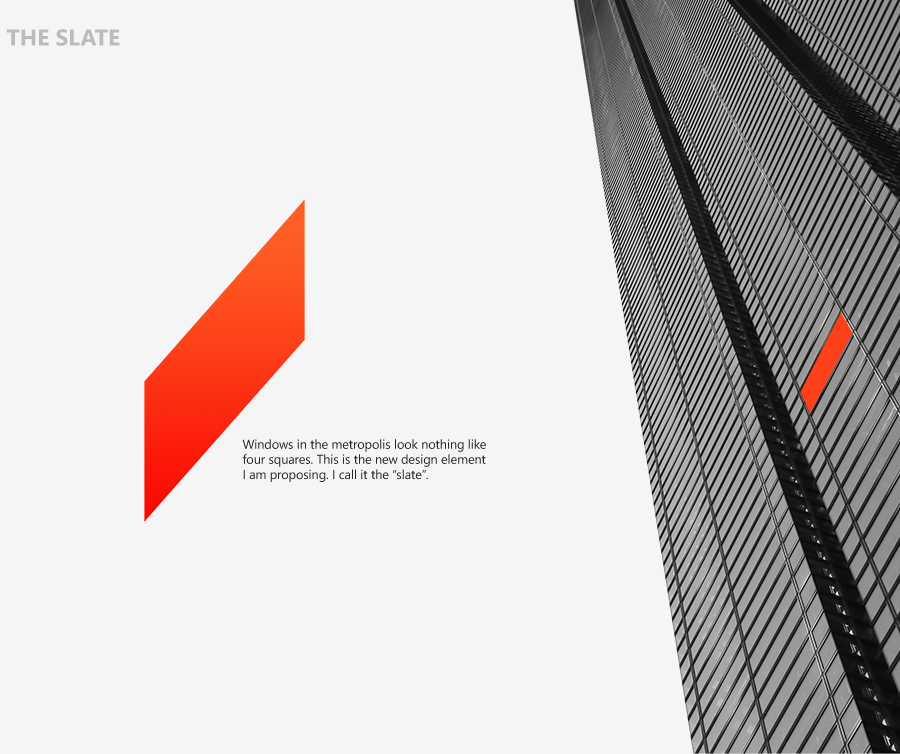
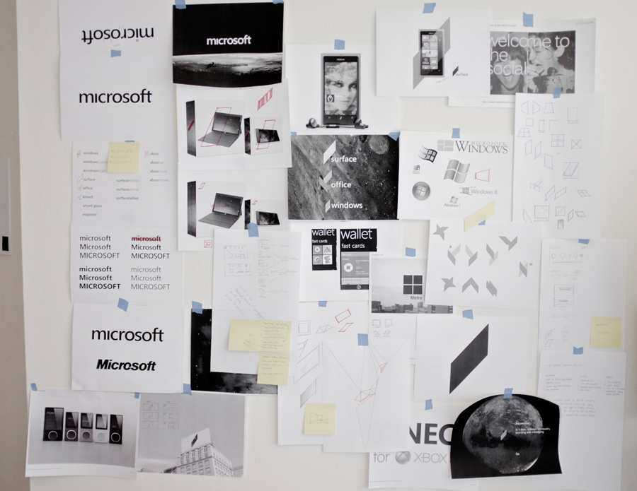
His designs are a strong visual representation of this thinking, and his sketches give a snapshot view of the process. The rhomboid shape he calls the ‘slate’ (like Microsoft’s so-called iPad killer of the same name) was developed from a window seen at an extreme angle, then rationalised. Curiously, this is very similar to Pentagram’s design root and subsequent development of the Windows 8 graphic, although for me the fake one, the ‘slate’, is rather more graphically interesting.
The logotype is a strong bit of typography, with the near-obligatory tweaks that change it from mere typesetting to graphic. It’s more tightly set than the new real logotype, and it definitely benefits from this. The font is the same (taken from Microsoft’s packaging design standards), but it feels much more powerful here because of the combination of three things: the dot-free i, the tighter letterspacing, and the shape-unifying lowercase ‘m’. Interesting how small changes make a big impression, isn’t it?
Although Kim’s work was purely for personal development it got a lot of attention from creative and business quarters. He blogged about the project on his MinimallyMinimal.com site, and you’ll probably get straight to the post by searching in Google for “the next Microsoft”. Which is itself a good measure of the level of attention it’s had. As for Microsoft’s new identity, I’m sure it’ll last a long time – but what the company got is not particularly exciting or forward-looking. To paraphrase the old saying about IBM, nobody gets fired for buying safe. But I think the company needed something better. Like this.








Thankyou! Bookmarked