Flipback books: new direction or dead end?
We tend to take things such as book formats for granted, never really thinking about them as we read them and make content for them. There has been essentially no serious change, no innovation in the core standard design of books for centuries, unless you count the development of perfect binding and the paperback.
Not until the eBook, of course. That’s turned around in just a few years from being an ultra-niche product for geeks to a fully accepted way of reading. Sales of eBooks have overtaken traditional book sales in parts of the world, and the format looks set to eclipse the printed book as a mainstream product, especially for genres such as fiction. What can printed book publishers do to challenge the dominance of the eBook? One publisher seems to think the answer is… the printed book.
Hold your incredulity for a moment and take a look at the evidence. How can you make a book more attractive to potential customers than an eReader? How about make it smaller, compact enough to fit in your pocket, and make it easier to use with one hand? Price it to compete and get it out everywhere, and it just might work. Or that’s the thinking, anyway. Publisher Hodder & Stoughton has teamed up with Dutch printer/publisher Jongbloed bv to produce something they call the Flipback, a curious rethink of the traditional book format that’s proclaimed to be ‘the next little thing’. (Actually, in Holland where it has been available since 2009 they’re called dwarsliggers, in Spain they’re librinos, and in France they’re point2, but in the English language market Flipback is the term.)
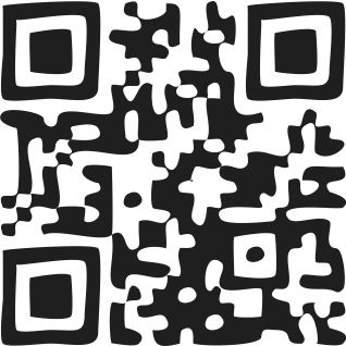
Marketing hype aside, Flipback books are something that is really quite new. They are pocketable, and because it is flipped on its side compared with a normal book format the pages are turned vertically rather than across. You can see this in action at bit.ly/flipbackbook1. The paper is ultra thin, under 30gsm, to pack more sheets into the space, and it is surprisingly easy to hold in one hand as you read. I’m sure there are prior examples of some of these features before, but the combination of the vertical page turning, a free-swinging outer spine and sewn signature binding is the point here. Oh, and that Bible-thin paper that’s used for the pages, something that Jongbloed has used in Bible printing since the 19th century. The Flipback design concept is protected by copyright, so any publisher interested in using it would need to do a deal with Jongbloed and probably Hodder as well, which might put a bit of a chill on the format’s chances of a wider uptake.

With a Flipback book what you get is something that is tiny, no more than half the height of a small paperback, and in landscape format. The cover lifts up and away – and it folds right out of the way; it isn’t even attached at the spine apart from along the back edge. The sewn signature binding coupled with this absence of a traditionally-attached cover strip at the spine makes it possible to open the book out practically flat. What this gives us is a vertical double-page spread that pretty much replicates the text and page area of a single traditional paperback book page. But don’t look at this as just getting back where we already are; the vertical spread is easy to hold in one hand while reading, leaving the other free to, say, hold onto a pole in the Underground or on a bus. Basically, this is designed to be a commuter-friendly book format. So that’s how I used it.
The vertical page structure took a minute or two to get used to, but it worked as billed. I found that in use the pages can sometimes be a bit of a fiddle to turn, and that’s not actually because they flip vertically. The slight difficulty I had is all down to what makes it possible to cram 600+ pages into something around a centimetre thick; the ultra-thin India paper stock that’s more commonly found in Bibles. This is impressive stuff, good old-fashioned airmail material, and considering the light weight it is surprisingly opaque. They are, however, not quite as opaque as some would like, as there is some show-through when type is only on one side of the page. It could be far worse, but it isn’t perfect.
The type handling is worth attention at this point. Fedra Sans is used for absolutely everything throughout every Flipback book. This ten year old typeface design has an exceptionally large x-height which makes it impressively clear at normal body text sizes. It is a lovely design and it would make a good choice for book typesetting apart from one thing. This is nothing to do with the font itself, mind. What I’m not so keen on is the leading used in these pages, which is a little tight for my tastes – particularly with a font with such short ascenders and descenders. It feels subtly cramped, which can affect the reading experience. Opening this up a bit would help, I feel, but the problem is that even a little extra here would also add noticably to the page count. A single Flipback page fits in a total of 19 lines of text at the moment; changing this to 18 lines by expanding the leading a tiny amount would boost ‘Tinker Tailor Soldier Spy’ (640 Flipback pages) by at least another 30. And once it starts to feel too bulky it looses one of the key selling points; pocketability. A tough call.
Both the marketing and the pricing – an undiscounted £9.99 per title – are based around these being a form of hardback book, but it was quite telling that anyone we asked described them as paperbacks. The covers are made from particularly stiff card but, despite this, the use of separate spine segments, and the traditional sewn construction means it still feels more like a paperback than anything else. That weakens the value proposition, as a marketeer might say, but it still has the unique selling point of its physical design format.
The question in my mind is whether the Flipback is ultimately a gimmick or a viable new book format. There are over 100 titles available in Dutch, but it doesn’t help that there are currently (as I write) just one dozen titles published in this format in the UK, and fifteen in Australia. Some of these are page-turner classics – John le Carré’s Tinker Tailor Soldier Spy and Stephen King’s Misery are two great ones for this format, and there are modern best-sellers such as The Cloud Atlas… but that is a short list. I bought three titles (ker-ching) and I’ll take a couple of them on holiday. I won’t have a Kindle with me but I will have an iPad and a solar charger. The trouble is, sand, sea and hot sun are not at all good for gadgets. (My iPad shut down from overheating earlier this summer, in UK sun!)
The future of mainstream publishing is, I believe, digital. But there’s plenty of room for alternative takes on the book, and the Flipback is one. I don’t expect to see it grow out of its niche, but then – does it have to? Design isn’t about one size fits all, it is about the right solution for a specific challenge.


The protection by copyright of the “Flipback” is simply scandalous: this print format, derived from traditional manuscript form, is used in India since the 19th century and is still used there for popular printing of devotional books. It is called ‘pothi’ form.