Microsoft Word is the worst writing tool
Hands up who uses Microsoft Word?
Hands up who *likes* Microsoft Word?
I asked those two questions in a talk I gave at The Future Of Text symposium in October. Almost the entire audience raised their hands at the first question, but hardly anyone did at the second. I wasn’t at all surprised. In fact, the rest of my talk would have been slightly scuppered if everyone had kept their hands up, but I knew that wasn’t going to happen. Word is ubiquitous; it is the most widely-used word processing tool by a huge margin. In the business world the Office triumvirate of Word, Excel and PowerPoint utterly dominate. But people use Word – let’s focus on that, although a fair bit of my beef covers the full software suite – mainly because other people use it, not because it is, in itself, a great bit of software. It isn’t loved, and it is rarely even actually liked.
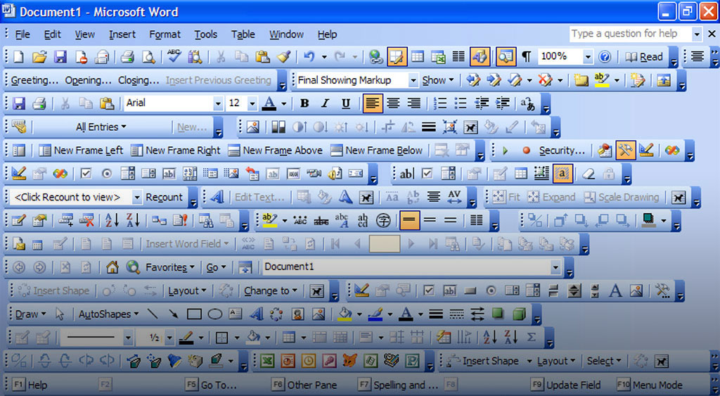
It is a great example of the ‘pack ’em high’ approach to interface design. Each new version brings in a raft of new features, crammed in like tabloid journalists at a society wedding. It’s how the marketing works: “this version can do another 100 things, which automatically makes it better!” Except this ‘more and more’ ends up becoming less and less, as most people struggle to manage fairly basic tasks when using it. When Microsoft launched a version with restyled ribbon bars? I was constantly being asked for help by colleagues, mainly because what they knew from the previous version no longer applied.
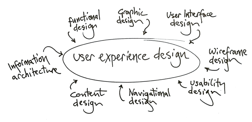
User Experience design, UX for short, is the science and process of creating things – not just digital products, although that’s where it’s normally considered – that support the user and work the way things should, according to what they want to do at a given moment. It encompasses user interface design (UI) but it’s far, far bigger than that. Understanding what people need and how they need to achieve it is the secret to designing something they will want and like.
Here’s what a great many people want to do most of the time that they’re using Word: they want to write. They want to get their thoughts and ideas down in words, organised to make everything as clear and logical as necessary. And when they’re in the flow of writing they generally won’t want to think much about applying visual structure.
There are, by and large, three different kinds of word processor user:
- Those in business (writing business reports, plans, and so on)
- Those in education (essays, dissertations, and the like)
- Professional writers (creating content for newspapers, magazines, books and online)
Two out of three of those have one primary need when writing; to know how many words they’ve written so far, yet for years this feature was a clunky afterthought tucked into a modal dialog hidden in a sub-menu. In 1995 I got so frustrated with this that I made Wordless, a bare-bones word processor that gave me a live word and selection count as I worked. Live word count in word processors is pretty much universal these days, but it took two years of badgering Microsoft product managers before it was added to Word in the Office 98 suite. Unfortunately, at the same time the software also gained Clippy, the anthropomorphic paper clip helper that distracted people the moment they seemed to be getting on with something. It was a user experience all right, but not a good one.

Since then Word has been through a number of UI design as well as internal structure revamps, but having tried each new version I find it hard to believe there’s been much serious UX design thought applied. Or perhaps it’s just that Microsoft doesn’t care much about anything but the business market? There’s evidence for this, starting with Rick Schaut, a long-time member of the Word development team, who has said that “the needs of most Word users aren’t the same as the needs of professional writers.” In other words, Word is not made for professional writers. Bet you didn’t see that coming!
“The needs of most Word users aren’t the same
—Rick Schaut, Microsoft Word development team
as the needs of professional writers”
It’s not that I think we shouldn’t have features to help us control how our words are presented. That would be an odd stance for a designer. We just need them to stay out of the way of the writing process. I’m not alone in this thinking by any means; Charles Stross has written some lovely posts on this. Look for his ‘Common Misconceptions About Publishing’ collection in the ‘Charlie’s Diary’ section of his Antipope.org site.
There are dozens of alternatives to Word. The open-source Office alternatives are generally built to look and act very much like the Microsoft standard, but there are better options too. Scrivener, iA Writer, Ommwriter, and many others show that, even in this genre, which must be practically the oldest software category around, there’s plenty of room for new design and interaction ideas. Hell, I’ve been helping a friend for some time now on a major word processor design rethink, but that’s something for another time.
It’s a good idea to stop being distracted by the presentation details of what we write, as we write. But it’s still useful to be able to mark something as a title, for example, or add emphasis in some way. So how *should* we add some kind of structure to our words as we write them? Without cluttering stuff up or going all proprietary? There is actually an answer to this, and it’s more of a process or method than a specific bit of software: Markdown.
Markdown uses the kind of natural formatting found in plain-text email messages, stuff we do pretty much by intuition. It was, in fact, created from exactly that concept base by John Gruber back in 2004. Markdown works in plain text, using style markers that are easy to understand as you read and can be converted to correct XHTML when required. If you want to emphasis some text, wrap it in a pair of asterisks. Want to make some text into a headline? Put one or more hash symbols in front of it. Make lists? Start each line with an asterisk. There’s a little more, but that’s the basic idea. The other idea is that Markdown’s markup code doesn’t get in the way of reading. I’ve used it here a couple of times already, and it’s pretty unobtrusive.
Markdown is made for text-to-HTML conversion, as MarkdownGuide.org explains, and it’s a great example of keeping structure separate from style. But why not use it for more than just web output? ByWord, another alternative word processor, has full markdown support, so you can set up structure – not styles, remember – as you write, if you need to. It’s designed with good UX principles in mind. And of course it has live word count – but so does everything these days.