Design a new character for a typeface
Designing the character behind the face.
 Of all the design discipline specialities, typeface design is probably the most monastic. Creating a new font takes skill, serious attention to detail, and a perseverance that a medieval monk would respect. Not only do you have to consider the aesthetics of stroke weight, overall form, and the effect that has on the ‘colour’ of text on a page, you need to get the technical details right so everything Just Works no matter what combination of characters someone tries.
A typeface is a potent blend of creative and technical effort, slow-cooked over days, weeks, months or more. Sure, the time taken to create a font doesn’t necessarily dictate the quality. Charles Schultz knew this when he had Lucy tell Linus, in a Peanuts cartoon strip decades ago, that ‘great art takes at least one hour’ (dismissing his 45-minute crayon masterpiece in the process). But this stuff does take time, believe me.
If you’re interested in making a font yourself don’t let me put you off. It is a strangely addictive process, as long as you have time for it. And the right tools. You can use Adobe Illustrator to get things started, at least as far as working out character shapes, but don’t think for a minute that that’s the right software for creating a real font. There are two applications that you should look at; Fontographer and FontLab. Thanks to a handy acquisition some years ago both are developed and sold by the same company, Pyrus. Curious, especially as both appear to be in active development. Fontographer appeared to be in limbo for a while there but version 5 came out recently, while FontLab remains pretty damn good at what it does too. This is almost like Adobe keeping and improving both Illustrator and FreeHand – but so far it seems to work.
The approach both applications take is logically similar; a gridded window (much like old cases for metal type) shows the characters. Double-clicking one opens it in a new window, with various guides showing the baseline, x-height, cap height, left and right ‘margins’, and so on. Draw from scratch, maybe tracing over imported sketches, or copy-paste from Illustrator. Working up a collection of reusable parts to merge is a good idea, as is testing character sequences to help get the metrics (spacing, etc.) right. Export your efforts as a regular typeface and try it out for real. Easy, sorta.

Stop here though, drop the idea of making a new font for now. here’s a creative type challenge with a difference: design a new letterform, a brand-new character for the alphabet. Yes, a 27th letter of the English alphabet. This is quite different from designing a typeface; instead of coming up with new ways to show the same underlying shapes you get your teeth into creating a new shape. If you’re up for it, start by looking at the various different ways specific letters are handled in different typeface designs. There are so many different variations on each core letterform, but in fact most of the differences boil down to decoration and style variations. Don’t get me wrong; type design is demanding and creative, but for this you need to look beyond the rigours of type family forms. Think about the characteristics (sorry about the pun) of letters.
What’s interesting about trying to come up with new shapes is suddenly seeing how many letters are essentially transformed versions – rotated and/or flipped – of other ones. Not literally, not in terms of how they came about, but effectively, graphically this is definitely the case. Think of the letter M; a 180-degree spun W. And the N is just a Z turned 90 degrees, which is itself a hard-cornered and mirrored S. Other shapes have elements added or removed, like the A and V, the L and T, O and Q, and so on. So how do you come up with a new shape? Try doing the flip & turn thing with other letters, and also see what happens if you add or remove bits from the shapes. Illustrator is your friend for this, although you might find your ideas progress faster and more freely with pencil and paper at the beginning. For bonus points give it a name and a sound. Will it be a new consonant or a new vowel, or maybe a new kind of punctuation? Google ‘interrobang’ for something along those lines.
The challenge isn’t quite as easy as you might think. For starters, if you design a new letter you really should tackle both upper and lower case forms. And you should avoid shapes that are already used as non-alphabetic characters or appear in other languages. But never fear, here’s a method that can help: in Illustrator, Type a single letter P, set it large and in a simple sans-serif font (the default Myriad Pro will do nicely) then choose Type > Create Outlines to convert it to outlines instead of being actual type. From there you can use the Pathfinder or Pen tools to cut it up.
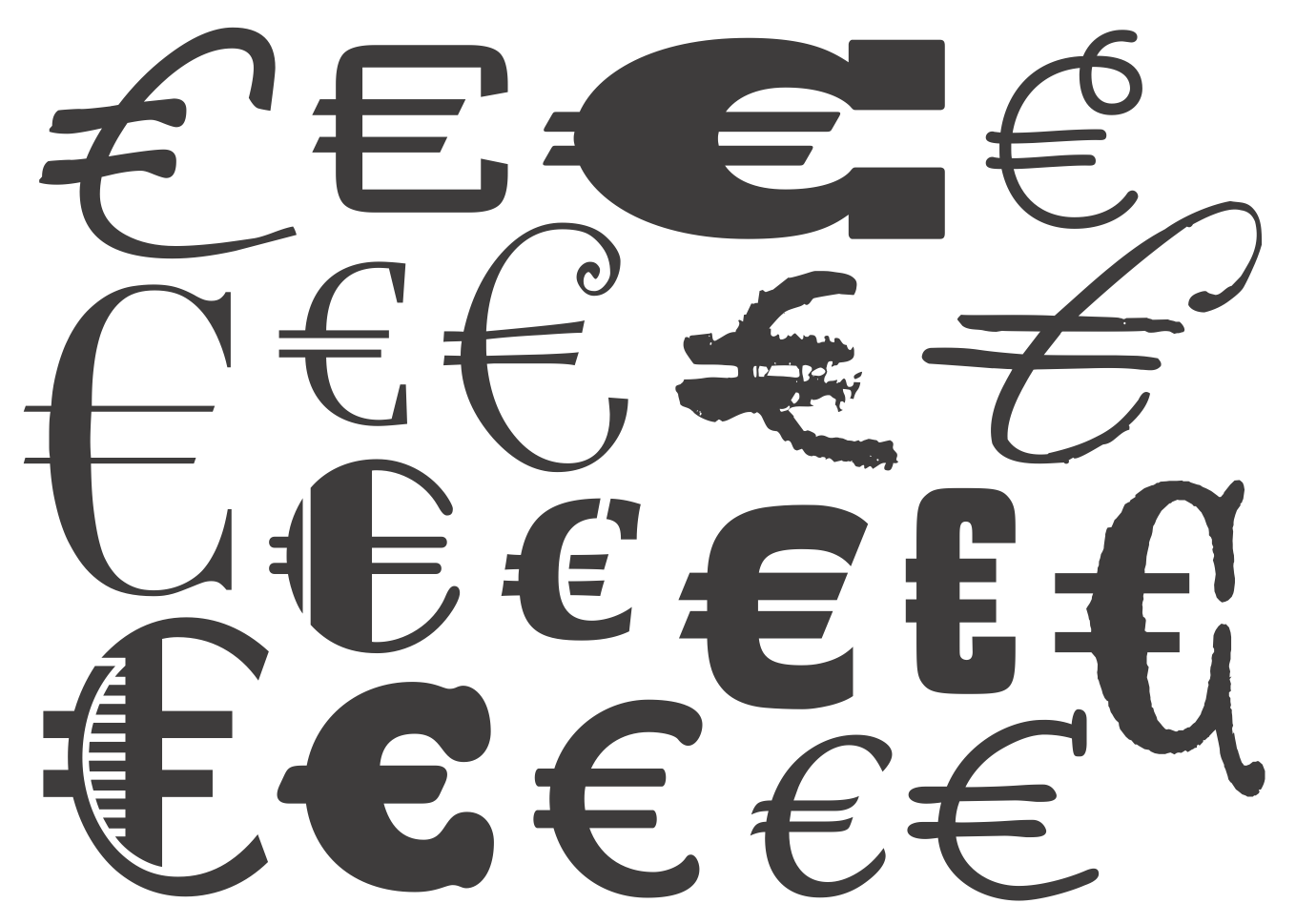
Before you ask, nope, there’s not a lot of direct practicality in this exercise – other than getting you looking more closely at type shapes and appreciating the idiosyncracies of individual character forms, both in the abstract and as presented by different specific typefaces. You can’t really drop a new character into our language on a whim. However, this isn’t entirely the abstract concept it might seem. A new character was introduced quite recently, around the turn of the century, and although typing it on our UK or US keyboards means including the option (alt) key, we’ve pretty much accepted it without fuss. The euro symbol – that stylised C with two cross-strokes – is a thoroughly modern creation. It is a totally new character that’s been assimilated and accommodated through sheer necessity. It replaced the ‘international currency’ symbol, an effectively obsolete item that looked like a smallish circle with the extremities of an x projecting around the outside. I doubt you’ve ever seen it; unless you have some pretty old (20th century, before Mac OS 8.5) fonts installed you probably never will.

The design of the euro (which by the way really is supposed to be written uncapitalised) is both simple and somewhat fiddly. The official design is more than just the part-circle with two middle strokes; the right end of those strokes and the top part of the curve are cut with a single specifically angled slice, the left of the strokes are cut with parallel angled ends, and the bottom end of the curve is cut vertically. That is the euro design as released by the European Commission, and that organisation’s intention was for that precise monoline-sans shape to be the only way it should ever be used. I believe the correct phrase is ‘damn arrogance’. The original designers didn’t appear to understand the difference between the design of a core letterform and the design of a particular typeface – for a spirited discussion of this point see bit.ly/fontshopeuro. Of course, type designers soon produced their own euro symbol versions designed to fit properly with whatever visual style their font designs required. If this hadn’t happened the euro symbol would have stuck out like a sore thumb almost wherever it appeared.
Anyway, that’s one real-world example of a totally new character being dreamed up. If you pick up this challenge we’d like to see yours, so tweet the images with #typedesign in the message and mention me – I’m @thatkeith.