What’s your favourite font?
I was asked this after I first wrote about rebuilding the Espy Sans pixel typeface family. It’s a tough question, how long have you got?
So, my favourite? To be honest I’m not sure I actually have one – or rather, not just one favourite, although I do have a shortlist. What I’m also sometimes asked is what’s the ‘best’ font, and that’s even more of an impossible thing to say. It’s a little like asking who’s the best guitarist: you can’t just pick one, it’s really a matter of taste and appropriate style. Django Reinhardt, Jimi Hendrix, Peter Green, George Benson, Doc Watson, Jimmy Page, Prince – the more you think about it, the longer the list gets. (In 2008 someone actually made an impressive stab at it and come up with a top 100, at https://www.digitaldreamdoor.com/pages/best_guitar-all.html.)
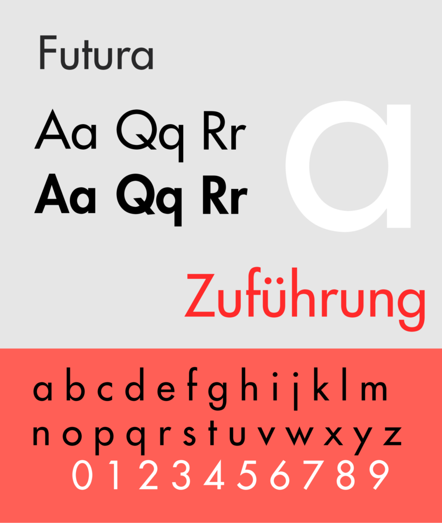
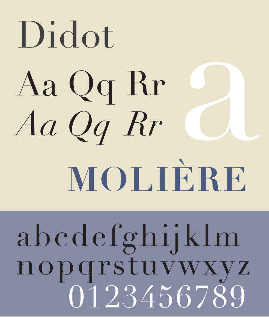
Like musical styles, different typefaces suit different moods. It’s easy to group things into broad genres or categories. Not so much the traditional type classifications of Transitional, Garalde and the others; those don’t mean that much to most people. Think of what a typeface conveys: Futura for clinical precision, Gill Sans for 20th-century Englishness, Didot for a kind of timeless French purity, and so on.

When it comes to actual projects, however, it’s not that simple. All the other elements involved in a layout complicate matters by adding their own influences to the mix. This means that picking something appropriate can seem difficult. But sometimes it’s mainly because we overthink things and don’t relax enough to see new ideas. As an experiment, I once edited the classic final shootout scene from Clint Eastwood’s ‘For A Few Dollars More’ to have a different soundtrack. Instead of the tense, minimalist notes based on pocket watch chimes, I ran it with a hard rock track, specifically the first part of AC/DC’s TNT. It wasn’t what Sergio Leone or Ennio Morricone planned, and it definitely changed the feel of the moment – but oh boy, it was still effective.
The point there was that you should be ready to try out things that may seem disconnected, that may not seem instinctively right. Push at the boundaries. David Hillman did exactly that in 1988 when he redesigned the Guardian newspaper. Of all the things that he introduced and developed, the two-font typographic masthead was the one that caused the biggest stir. I know it wasn’t the kind of drama that Neville Brody was causing, but mixing Garamond Italic with Helvetica Black in this way was, at that time and certainly in that context, close to revolutionary. It quickly became a bit of a type trick, a thing that many designers did when they were pushed for time and/or ideas. I experimented with it myself, although in my defense I was a student at the time.
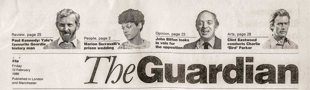
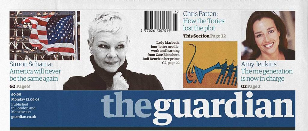
In 2005 the Guardian’s masthead was redesigned as a one-font, two-colour affair, but Hillman’s work was a design milestone that used those fonts incredibly effectively. (The Guardian published an article about these two Guardian redesign changes in 2018.)
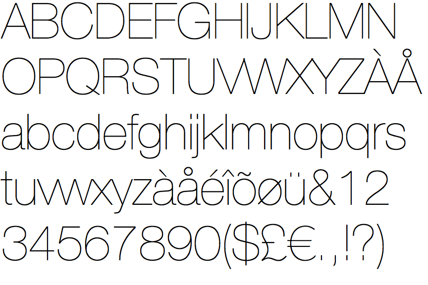
I know what many of you are thinking. “Why Helvetica, the most boring font in the universe?” It’s true that it is quite passive, almost personality-free, but that’s not necessarily a bad thing. If you’re setting the title for a poster or a big magazine feature you’ll probably want something with a bit of pizzaz and you probably wouldn’t choose Helvetica. But when Hillman set out the groundwork for his Guardian redesign he was establishing a rigid grid-based layout system, and he needed a typeface that would work well with that and also not load too much of its own message and personality into the newspaper’s headlines. There were a few different families that would have sufficed, Univers for one, but Helvetica fit the bill and got the part. Today, when I need to present words in a visually expressionless manner, I generally turn to Helvetica. The Neue family, to be precise, as the slightly revised letterforms are a little more consistent and the extended range of weights is always helpful. I’ve even taken to using it when I write articles: today’s Retina screens are sharp enough to do it justice at body text sizes, and it’s both compact and legible in the Light weight at 10pt. The Ultra Light version (below) risks disappearing at body text sizes but it’s an interesting option for headline size elements where the more typical ‘headlines are bold’ choice would feel overly bulky.
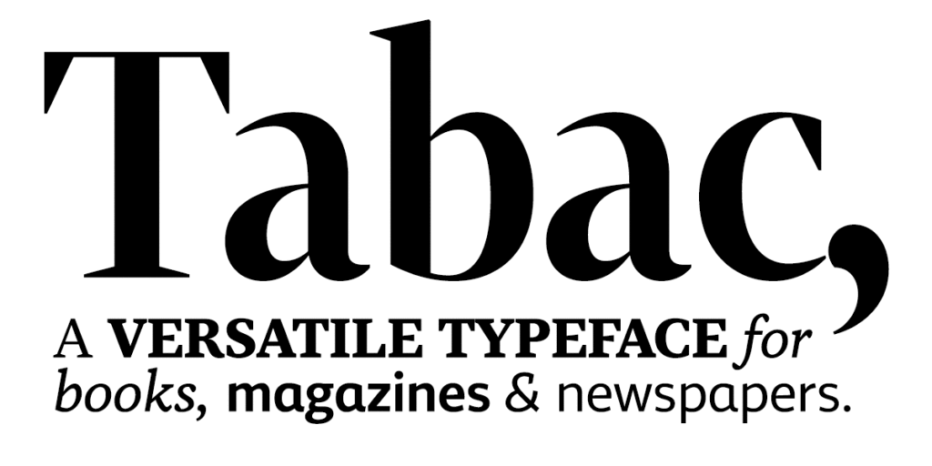
When it comes to type with less of a deadpan face I do keep changing my mind. I am very partial to the choice of Tabac that MacUser magazine used for the last major redesign of its life; it’s a versatile font with a lovely personality and, thanks to the well-balanced pairing of serif and sans variations, it gives an extraordinary range of options. It’s ideal for everything from magazine body copy to headlines. I don’t have a specific favourite font, remember, but it’s definitely in my shortlist.
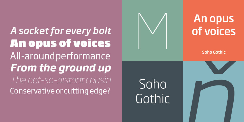
Soho Gothic is another powerful sans design that has a serif counterpart (‘Egyptienne’-style slab-serifs in this case) as well as a wide range of weights. The ultra-heavy weight is so chunky it’s like being run over by a dump truck, but it keeps enough of the family characteristics to charm you as it hits. Tough to use, but tough to beat in the right setting.
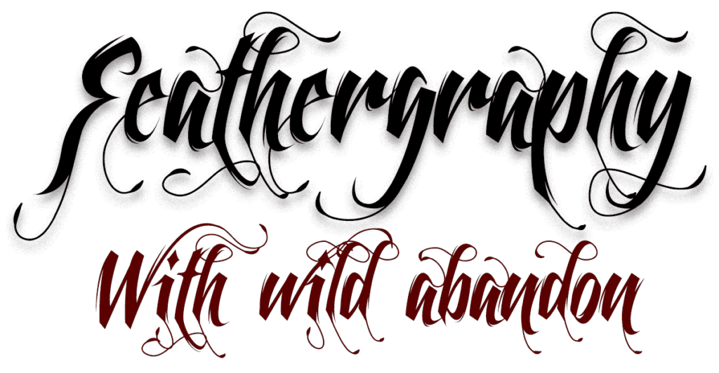
For a typeface that is even tougher to use you can’t get much more challenging than Feathergraphy, by Mans Greback. I’ve only managed to use it once, but I do still love its gloriously mad calligraphic extravagance.
I’ve been using Soho Gothic and its sibling Soho in some digital design projects, and I do love its versatility. It has – please excuse the dad-typographer pun – character, while maintaining a calm, consistent clarity across the full extremes of weights, from thin-and-crispy to ultra-heavy.
I’ve also been enjoying using Gotham. This is the sans-serif font that took on a very modern American feel in 2008, thanks to its prominent use in Barack Obama’s campaign artwork. There’s no corresponding serif variant, but it has the same weight range as Soho – pin-sharp thin through to overweight ultra – with slightly more conventional forms that feel derived from Victorian wood type. (Parts of the heaviest designs of Gotham are somewhat reminiscent of Antique Olive Bold. I’m not sure if that’s good or bad, but it works.)

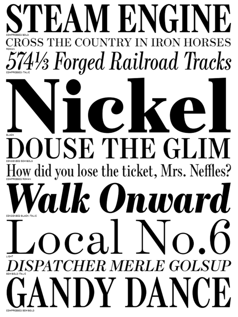
But no font is good for everything. I’m partial to a little Scotch Roman from time to time, pun most definitely intended. Monotype’s Scotch Roman in particular is a great example of this early 19th century style. It’s similar to Didot, Walbaum and the other ‘didones’ but with more traditional woodcut-like serifs: elegance rooted in authentically retro tradition.
But then again tradition can be overrated. Berthold’s Barmeno and the very similar FF Dax are great up-to-date typeface designs that seem to be lasting past the fad phase. Dax has even survived use in David Cameron’s 2005 leadership campaign and briefly in the Conservative party’s logo, although it was quickly replaced with the clumsier Lucida Sans.
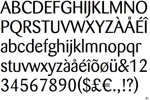
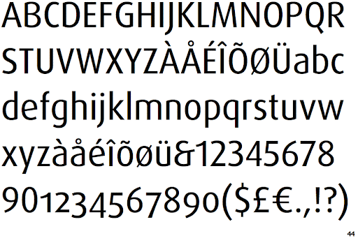
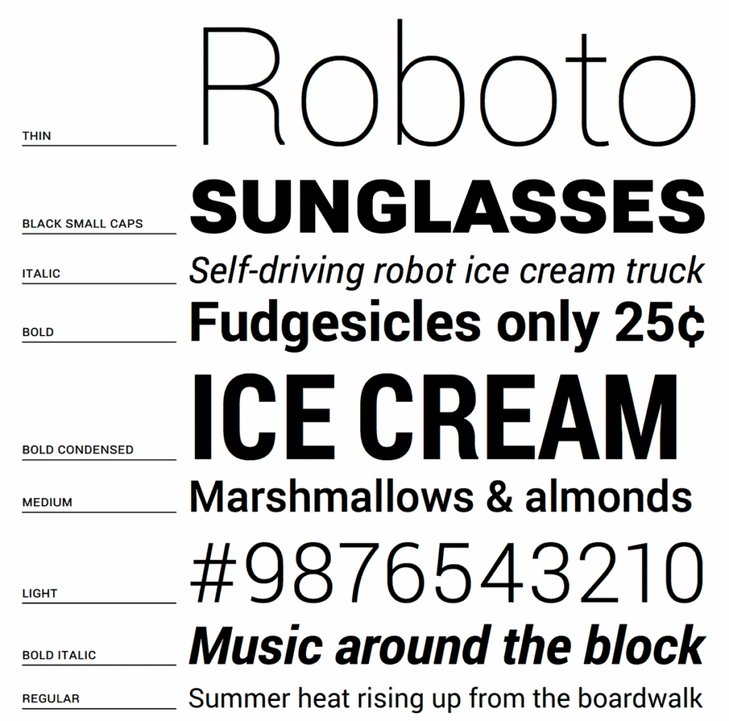
There are always new designs to try, too. Roboto, the font used in some Android devices, is a little like Univers, but with a touch more humanity. It’s also free, from bit.ly/androidroboto, and there’s a Roboto Serif option too. I’ve not put it to work yet, but it looks worth trying.
The list goes on; Gill Sans Bold Extra Condensed, for example, a rather compact sans serif display font with pleasing humanist qualities, and Sabon, Perpetua and Joanna…
So, back to the original question: what’s my favourite typeface? I warned you it’s never a short answer. Were you sitting comfortably?