Creative cubist collages
Producing images by assembling many different shots can create eye-catching results, and can be done in many different programs. It also draws on concepts and techniques that originated with the Cubists over a century ago.
Kit required: Adobe InDesign (or any DTP, graphic layout or bitmap editing application), multiple photographs of a scene
Goal: To produce a large and obviously composite image from multiple photos
The concept
Composite panoramic photography, ultra-wide views stitched together from multiple photos, is growing in popularity, but it requires fairly specific equipment and software to do it with real precision. Panographs, on the other hand, are made with a rather more cavalier attitude to classic photorealistic perfection. These are composite images too, but ones made with visible seams and differences between the individual shots used as part of the final effect. Individual photographs are collaged together to produce a final larger artwork, with the different photos being distinguishable, to a greater or lesser degree, in the end result.
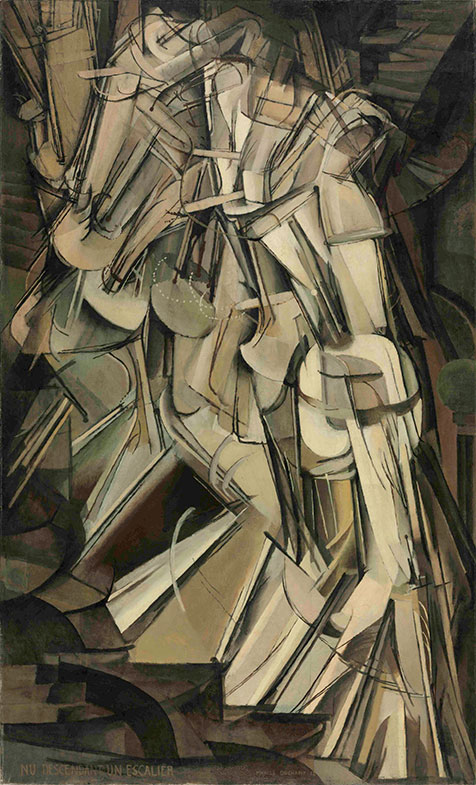
David Hockney used this technique with polaroid photos a few decades ago, and it also echoes the work of cubist painters almost a century back. See Picasso’s Le Guitariste or Marcel Duchamp’s Nude Descending a Staircase, No. 2, among many other examples. Among other things, these experiment with capturing time and narrative within a single final image.
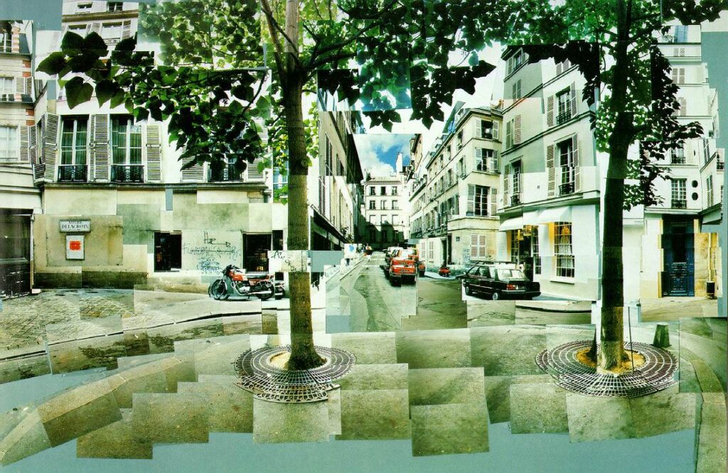

Panographies – the results of the kind of image collaging that Hockney in particular was exploring – can be used to show a wider view than with normal lenses, but the possibilities that the collaging process offers go much further than that. You make them simply by shooting overlapping images and putting them together. Depending on the effect you want, you could tilt your camera more as you move across the scene to create a sense of movement, zoom in to enlarge a specific area, take shots at different times of day, move around to capture more viewpoints than can be seen from one spot, and so on. Fitting these image parts together can be challenging. In particular, the higher or lower you look in the scene, the harder it will be to assemble the shots in a manner that doesn’t look strangely fractured in the final composite result, but don’t be put off by this; capturing views looking high up and low down will give you the maximum flexibility.
The method
You can use whatever kind of camera is convenient; DSLR, mirrorless or smartphone. This generally works well with moderate wideangle lenses, somewhere around 18-35mm in traditional camera terms. Different scenes may suit slightly different zoom levels, but there’s generally a ‘sweet spot’ between extreme wide angle shots (which cover so much that they make overlapping angles jump awkwardly) and being zoomed in a lot (which requires a large number of shots to cover the scene).
The following steps are done using Adobe InDesign, but this can be done using other DTP or graphics tool such as Affinity Publisher, QuarkXPress or Ilustrator, Photoshop, and even Apple’s Pages in layout mode. Alternatively you could do this on your kitchen table if you print them out, although you won’t be able to scale them easily or play with transparency.
Interactive?
As well as producing a PDF or flattened image of your panographic collage you can even generate the final result as an interactive VR-style scene that someone can drag around to look at. This will mean either using Exif Fixer (https://exiffixer.com, one of my own utilities and web services) and posting to Facebook or similar, or using VR tour-building software (https://krpano.com, https://pano2vr.com, https://3dvista.com, etc.) and putting it on your own web site. As always, experiment and test before suggesting anything as an option to a client!
Planning and shooting

Pick your scene and think about it as a broad view, a wider vista than you can capture in a single shot. You may prefer to fix your exposure, if your camera allows this, so that you don’t end up with lighter and darker overlapping shots. However, the effect of different exposures can work well in this overtly patchwork aesthetic, so try leaving the camera’s controls on auto – the opposite of what’s normally done for precision panorama photography.
Make sure you capture a generous number of images so you have a good selection to choose from. You’re unlikely to use everything you shoot, but you’ll find it useful to have different ones to choose from. As you go, don’t worry about rotating the camera around a single point in space, or even standing in the exact same spot. Capture beyond the area that you want to cover in the final result so you’ll have flexibility when it comes to cropping the composite panographic image.
Preparing Photos

Take time to optimise each shot in Photoshop or your preferred editor. (Here, DxO PhotoLab is used to process the camera’s RAW files.) Don’t worry about making each shot balance perfectly with the next, rather concentrate on making each one work on its own. If you shot with the exposure controls on auto you will probably see some extreme variations of lighting. If it feels too strong then adjust in your image editor, otherwise just go with it.
Setting up

We’ll use Adobe InDesign for this, as this is more ‘object oriented’ than Photoshop, and it can work with many large image files without becoming a memory hog. Begin by setting up a landscape orientation A4 page and placing a single image. Scale this so it’s relatively small (for example 45x30mm) and choose Object > Fitting > Fill Frame Proportionately.
Sizing images
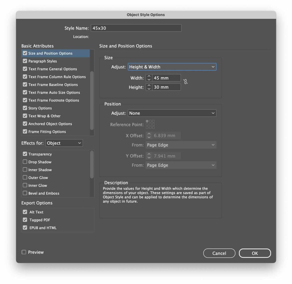
You may choose to scale things later, but it is important to start off with all of your images scaled to the same size on the page. InDesign can help simplify this using an Object Style. With your single image selected on the page, choose Window > Styles > Object Styles. In this floating window, click its menu icon and pick New Object Style.
In the Size and Positioning Options section set the Size Adjust option to Height & Width, then in Frame Fitting Options enable Auto-Fit, ensuring Fill Frame Proportionately is picked. Finally, name this new object style and click OK. Now place another image and click the Object Style name to make it resize automatically.
Laying Out
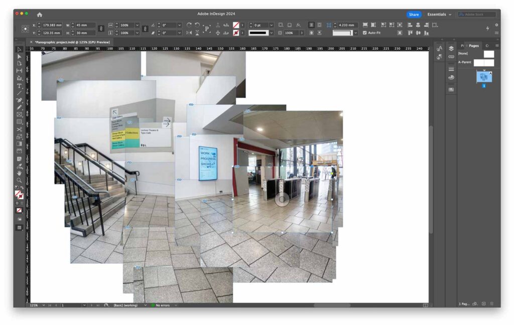
Once you have some images placed and scaled, try aligning them to make a larger image. Starting with the centre area of the scene, find significant parts of the image and work with those. Don’t worry much about fitting every image element together across the shots. You’ll find it hard to align things at the upper or lower ends of the scene; straight lines will be tilted more and more extremely. You can crop the worst offenders out at the end, but do your best at this stage.
Tilting Images
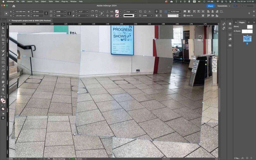
You may need to tilt some of the photos as you go towards the end of a large sweep, especially if the camera was turned as you went when you took the shots. With the right subject, this can be very effective, but you’ll probably have to practise visualising this when you take your shots in the first place.
Setting opacity

Try dropping the opacity of one or more of the images to blend the images together; with InDesign, select one or more graphics and choose Object > Effects > Transparency. This can be surprisingly effective with the right set of images.
Feathering Edges
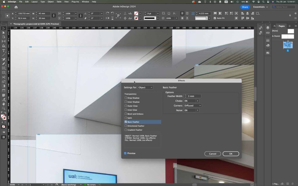
Although you shouldn’t concern yourself too much with blending images together as seamlessly as possible, sometimes using feathered edges can be a useful technique. It is particularly effective with scenes with cloudy skies, but it can help patch in sections with all sorts of subjects. Go to Object > Effects > Basic Feather to experiment with this.
Reshaping Images
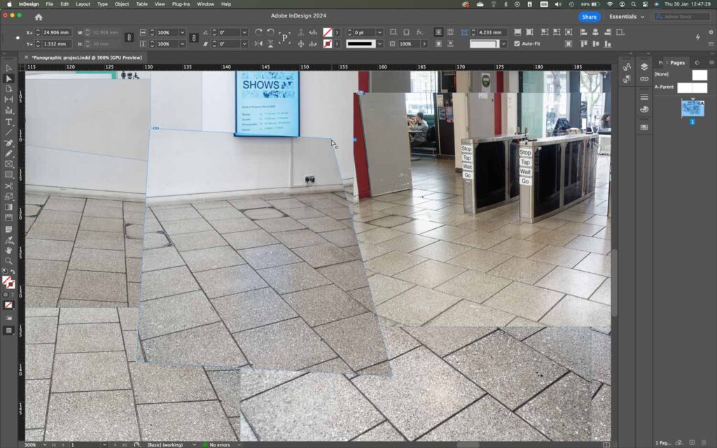
Sometimes it may be necessary to crop or even alter the shape of the graphic frame itself (or in Photoshop just mask or delete parts of an image layer) so that the image is cropped to remove distracting image elements. This goes beyond the simple concept of using same-size rectangular photos, but it can lead to a more classically cubist effect if done carefully.
Resizing The Page
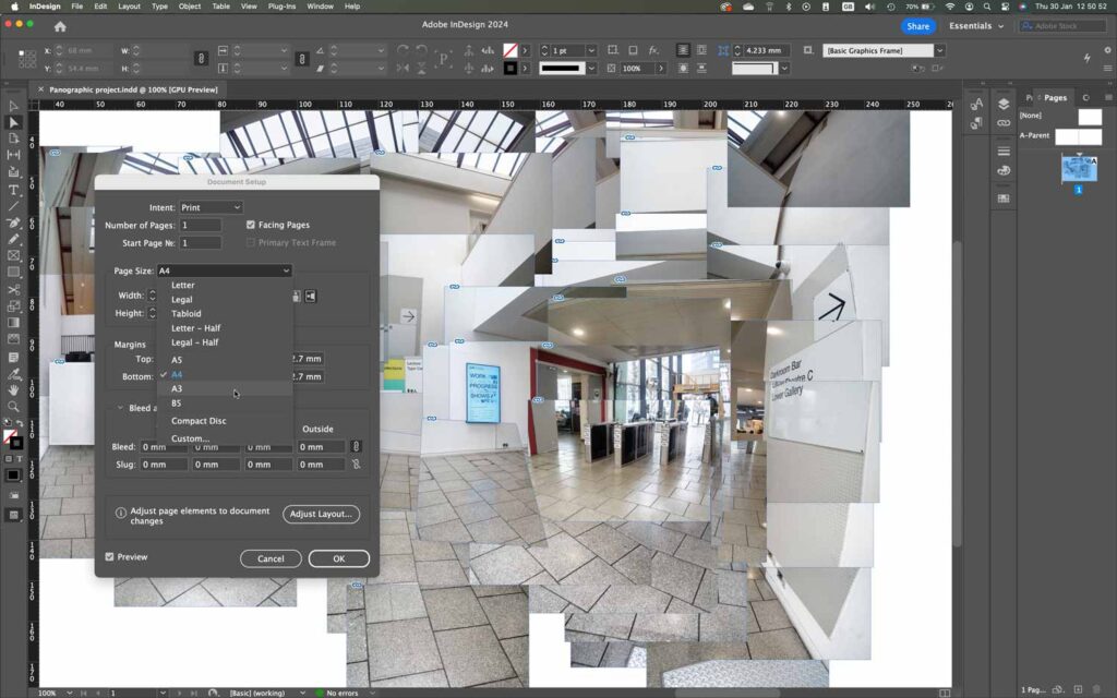
You’ll probably find that you misjudged the page size you’ll need for this project. In InDesign, Affinity Publisher, Pages and similar programs just set the document size to something larger. In Photoshop, increase the canvas size to give yourself lots of room. Photoshop’s memory usage will go up a lot, but you can always crop it down afterwards.
Image Adjustment
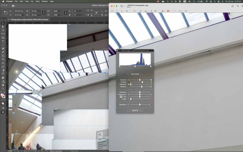
At this stage you may find that some of the exposures are just too dark. In this situation you should perform whatever kind of adjustment you prefer to these images. If you’ve been assembling in InDesign just update the linked files, or select the problem image in the layout and choose Edit > Edit Original (or Edit With and pick your image editor) for the updating to be automatic. Even the Preview app’s Adjust Color feature can work well. If you’re using a less-capable layout tool go edit the original manually then re-import.
Final Touches
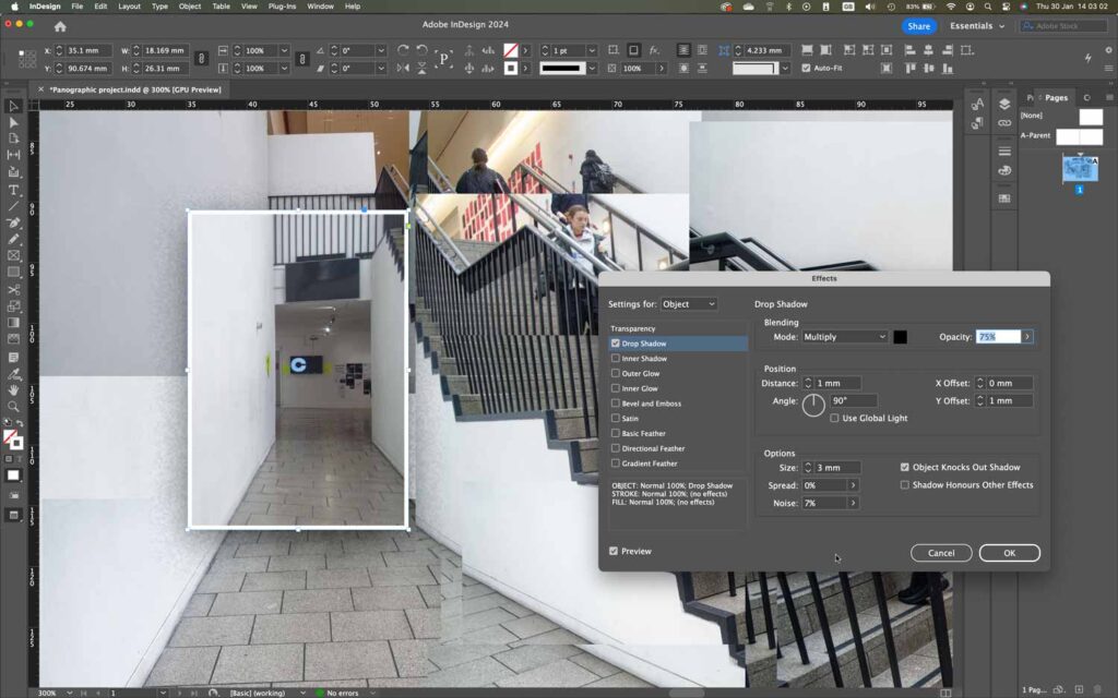
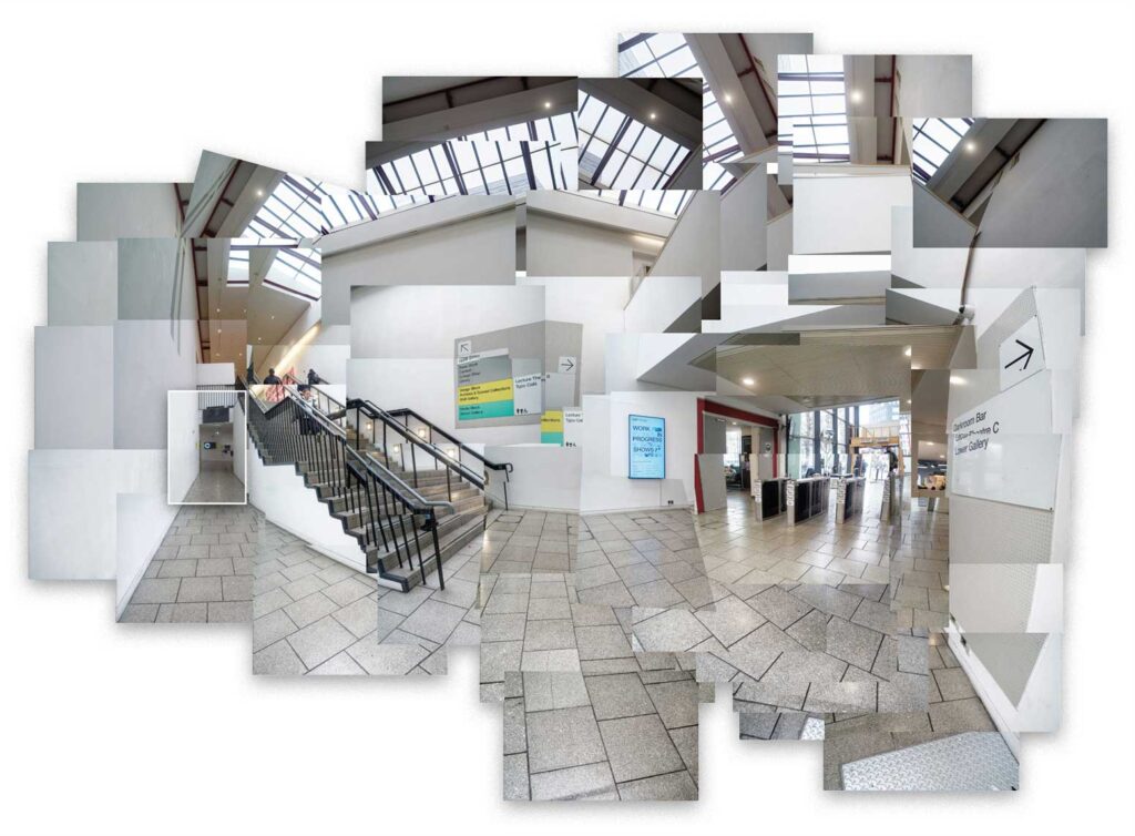
Don’t forget that you have far more options at your disposal than just rotating and sending things forward and back. This cropped view shows a glimpse of the exhibition space at the end of the passage, and it is picked out with a shadow and a white stroke.
Exporting
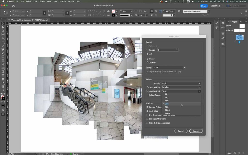
Export the final arrangement so it can be used in other page layouts or shared online. You can export from InDesign as a PDF, but you may find it simpler to produce a JPEG image: choose File > Export and pick JPEG form the list of formats. If you just want to share this in social media the default 72ppi will be fine, but for better quality and detail, especially if it’s for print, set the Resolution option to at least 300ppi. Set Quality to High or Maximum as well.