Walk, Don’t Walk
The curious life and times of Ampelmännchen.
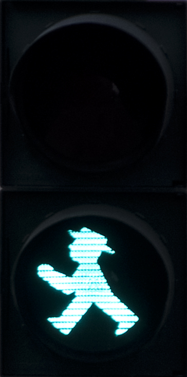
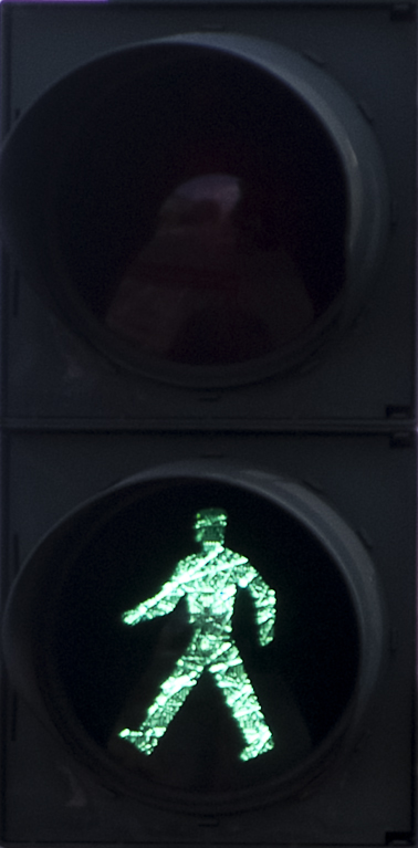
I’m in Berlin as I write this, and I’ve noticed something curious about the pedestrian crossing signals here; there are two distinctly different kinds in this city. Both are the expected red and green silhouette variety, but the ones in what was the GDR-controlled East Berlin are curiously more personable than the more generic kind found in most of West Berlin. A little digging and asking around turned up a huge amount of fascinating detail.
| East Berlin Ampelmannchen Stop | East Berlin Ampelmannchen Go |
|---|---|
 |
 |
| West German Ampelmannchen Stop | West German Ampelmannchen Go |
|---|---|
 |
 |
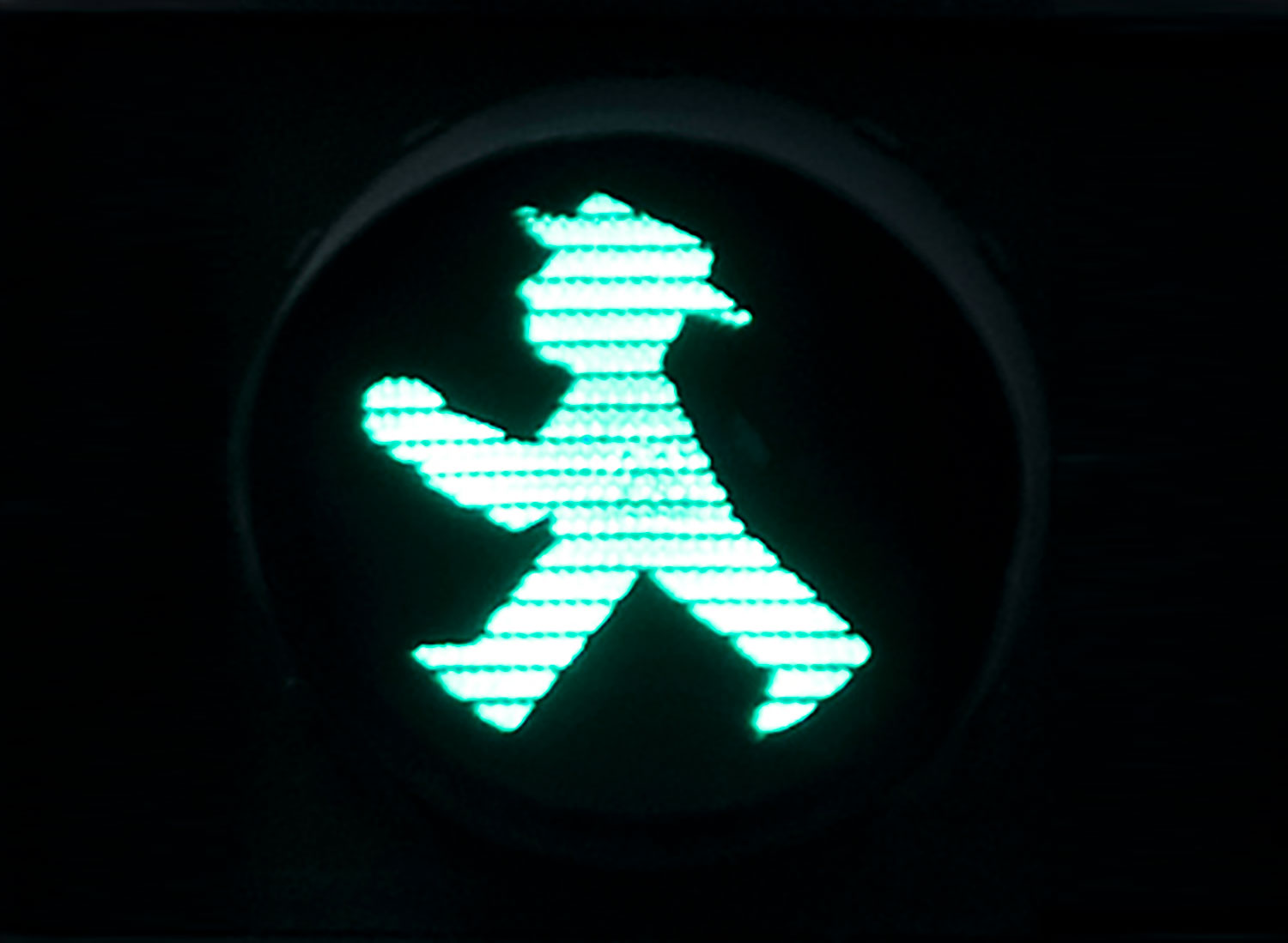
The name of this character is “Ampelmännchen”, which means “little traffic light man”. Strictly speaking this is the generic German term for any pedestrian crossing character, but it is often used to refer specifically to the East German design. This was introduced in 1961 – October 13th to be precise – as part of a proposal for redesigning traffic lights. The man behind it, Karl Peglau, was a traffic psychologist rather than a designer. His main idea was to redesign the shapes of the regular traffic light signals themselves, using a horizontal bar for Stop and a vertical bar with a point for Go. This had a lot of support, and it actually makes a great deal of sense, but it would have meant replacing all existing traffic lights… so, unsurprisingly, it never happened. However, his pedestrian signal ideas went ahead. The Ampelmännchen shapes were apparently drawn by his secretary, Anneliese Wegner, following his instructions. The perky appearance of the walking character is particularly noticable, and the wide-brimmed hat is a strong characteristic of this and the arms-outstretched standing figure as well. The East German Ampelmänn wasn’t initially talked about much, but eventually it appeared in road safety education, comic strips, TV animations, games, and even in stories for radio. (No, I’m not sure how that last one works either.)
 |
 |
| These official Ampelmann graphics were provided by AMPELMANN GmbH to replace the original images that were based on less accurate drawings from public domain sources. | |
After the German unification in 1990 the East German Alpelmännchen nearly disappeared, another victim of graphic standardisation, but public protests prevented this. In the late 1990s Peglau described the design as having ‘an aura of human snugness and warmth’ and ‘representing a positive aspect of a failed social order’. These are surprisingly emotive words for a pedestrian crossing signal graphic, but remember this little silhouette has enough fans to force the government to back down on plans to remove it. Today there’s a pigtail-sporting Ampelwoman too, and the Ampelmännchen designs are a major part of Berlin’s tourist sales as well as its pedestrian control equipment.
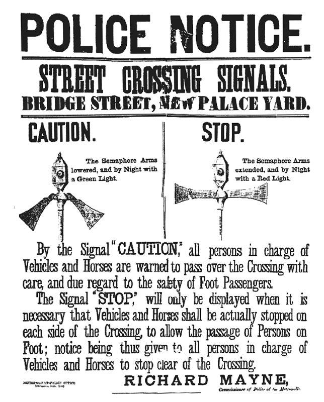
Sometimes this kind of design research can really open your eyes to things you normally take for granted, and it turns out that pedestrian crossing signs are rather more curious than most people realise. The very first pedestrian crossing signal in the world was installed in Westminster, in London, in December 1868. This was a semaphore-like set of arms assisted by gas-lit green and red lights at the top, operated manually by a policeman rotating a handle. This must have been one of the least sought-after postings in the police force, but it didn’t last long; just one month after it was installed a gas leak caused an explosion, injuring the policeman and putting an end to pedestrian crossing signals in Britain for half a century.
By the 1920s pedestrian crossing designs were being tried again in some London boroughs, and by the 1950s the ideas were being adopted in countries all over. Today they vary far more across the world than regular traffic signals do, even though they are described as the ‘international pedestrian symbol’, which to me sounded at first like a distinct standard. Berlin’s East/West variation is a product of the city’s unique political situation through the late 20th century, but in different countries the pedestrian crossing character has been developed in many different ways.
Monaco’s is one of the simplest; the standing figure has the barest hint of arms at the sides, and the walking version appears to have a chunky cape. Thick open shapes allow more light to be shown, but it is somewhat on the blobby side. France’s design is slimmer but equally odd; the standing figure has arms and a single pogostick-like leg. The walking version looks more like it is in mid-disco pose than walking across a street, but it does the job.
Britain’s designs are quite unremarkable, but Holland’s crossing signal graphics are peculiarly pixellated; they look like characters from a 1980s video game. Poland’s are also seriously simplified, being made from disjointed rectangles with a floating circular head. At the other extreme there are a couple of particularly illustrative designs; silhouettes that are perhaps a little more visually descriptive than is needed for quick recognition. Mallorca includes dotted lines to indicate the crossing boundaries, while Belgium has two figures together, a woman with a skirt and bob-style hair, and a jaunty male figure with, appropriately enough, a Tintin-like quiff in the walking version of the sign. I wonder, is that an accident or a Hergé-influenced design statement?
| Belgium | France | Holland | Mallorca | Monaco |
|---|---|---|---|---|
 |
 |
 |
 |
 |
All these signs are essentially just variations on a single theme, showing a standing and a walking figure (or multiple figures, thank you Belgium) to demonstrate what people should be doing. The pictogram is standardised as an abstract concept, they’ve simply been interpreted in different ways by different national standards design committees.
For the majority of us outside of Germany, the most iconic crossing signals are those text-only “Walk, Don’t Walk” displays that are an international image of American city life, thanks to various Hollywood movies. These were even pastiched as “Don’t Walk, Boogie”, a major disco compilation album in 1979.
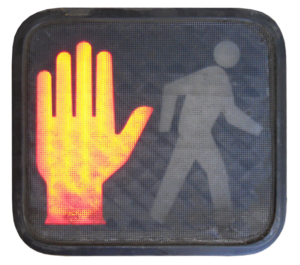
We’re all familiar with these signs, but outside of movies they’re not as common as they used to be. Most American cities are leaving these signals in place ‘for the rest of their useful life’, but in 2003 New York City began a wholesale programme of replacing those textual signs with pictogram signals. The US version still diverges a little from the international norm, showing a red hand rather than a standing figure for the Don’t Walk signal, but it makes just as much sense. Well, except for December 2010 in Spokane, Washington, when one of these lost a part of the illuminated hand, leaving just the middle finger sticking up in a well-known gesture.
| Don’t Walk | Walk | Er… |
|---|---|---|
 |
 |
 |
There are reports of other problems with these signs. These modern replacement signals are LED-lit, which makes them much brighter and cheaper to run than the old lightbulb-lit signs they replaced – some say too bright – and they don’t rely on the ability to understand English words at all. However, it turned out that the new signs themselves had a much shorter life cycle than the old variety; in early 2010 in New York many started showing both signals at the same time or flickering between each one at high speed and have had to be replaced.
Before I sign off I want to air a pet peeve: there is a kind of pedestrian crossing sign that I loathe: the “XING” sign that seems to be everywhere in America and, I’m told, in Newcastle and perhaps other places in the UK too. This freakish hybrid of words and graphics is the worst of both worlds. Replacing the word ‘cross’ in ‘crossing’ with a letter X to represent a cross actually makes something that doesn’t read well both visually and textually! It must have been a committee decision, but whatever designer first saw the proposal should have killed it outright. The East German Ampelmännchen has real character, even the old “Walk, Don’t Walk” signs have history, but all forms of “XING” are, from a graphic, typographic and information design standpoint, just abominations.



My Grandfather Alex Heron came up with the idea for the North American red hand while working for the City of Westmount, Montreal. They were looking for a bilingual sign as both French and English were spoken there so the US Walk /Don’t walk was no good. He looked at the European symbols but they didn’t want a green light that might confuse car drivers so they needed two very different symbols. He said that the idea came from a policeman that directed traffic on his route into city hall.