Dazzle and digital camouflage
Camouflage is the art and design of staying hidden. But there’s more to camouflage than blobs of muted green, yellow and brown – just look at the modern Marpat patterns and WW1 dazzle ship designs.

Seeing patterns in things is one of the most basic instincts we have. It is a survival instinct, something that helps us sort relevance from randomness. Pattern recognition is a fundamental part of how our brains are wired. We use this ability when we scan pages of text, looking for certain words or phrases. Many animals use patterned markings to blend into their surroundings (giraffe) or stand out as a warning sign (wasp). Whatever they’re for, we identify and remember repeat structure and rythmns far more easily than chaos and discord.
Creating graphic patterns is also a universal instinct; we can see decorative pattern-making in every culture from the tattoos of Australia’s Maori tribes to the Rococo styles of the Late Baroque period in Europe. Man-made patterns are normally applied as decoration to make things more noticeable, but there is a kind of pattern that’s made specifically to do the opposite. Military camouflage designs are meant to obscure things and make them LESS noticeable; decoration intended to be missed rather than noticed. Of course, how effective that is all depends where the design is used; camouflage patterns for deserts would stand out like a sore thumb in woodland.
Camouflage as a widespread tactical design has only really been taken seriously since the beginning of the 20th century, when developments in the accuracy and range of weapons made it increasingly easy to select targets from a distance. One slightly conflicting problem with camouflage designs is that while it has to make the wearer less noticeable it also has to identify them as belonging to a particular side when the wearer is actually noticed, or they risk becoming a target by their own side. Almost since camouflage first became widespread this was recognised as a serious design issue, and the patterns and colours used have been under regular scrutiny and review by every military organisation.
What most people think of as camouflage, the muted green, yellow and brown abstract organic blobs and stripes applied to vehicles and clothing is just one of the many different design efforts that have been tried over the years. There are many different colour schemes and designs, and the newest to come down the military catwalk is from the US Marine corps.

MARPAT, short for Marine Pattern, uses a peculiarly digital structure based on micro-pattern pixellated shapes rather than the chunky macro-patterns of most other designs. This is similar in some ways to the modern German ‘Flectarn’ camouflage design, but that uses a softer dithering style of pattern to reduce edge visibility. (Curiously, Flectarn was tested by the Dutch army and apparently rejected for being too aggressive – a slightly odd reason given the organisation’s role.) The US MARPAT designs are developed from research into fractal pattern generation, and they are meant to simulate the ragged, dappled patterns and textures of natural environments. What looks like harsh, unnatural pixellation close up appears far more natural to our eyes from even short distances away. Colour variations have been made for different environments, from desert to woodland to jungle to ice and snow, and different military branches have their own named versions: NAVPAT (general naval design), CADPAT (Canadian), and so on.
Although the precise construction of the MARPAT graphics is patented it is actually really simple to create this general ‘pixel camouflage’ look using far simpler processes. In this instance we’ve taken a photo of trees in the early Autumn, with large and small detail captured in the snap, although most similarly-textured images would do. In Photoshop, use the Mosaic filter (Filter > Pixelate > Mosaic). The best cell size depends a lot on both the source image detail size and resolution, but here I’ve used 20. Straight away this is clearly going in the right direction, although it is far too delicately varied. The patterns we’re emulating are normally made with a palette of four to six tones, so choose Image > Adjustments > Posterize and set the number of colours to four. (You’ll quickly spot that this gives four tonal levels rather than just four colours, so combine things as appropriate when selecting areas in the next step.) The actual hues that you get are likely to be wrong, but all this takes to correct is using the Magic Wand tool with the Contiguous and Anti-alias options unchecked. Click on a colour to select it everywhere, mix a new one, then use Edit > Fill to flood it into the selected areas. If you copy each colour into a new layer as you go you’ll find it easier to chop the pattern up into new arrangements. You may find that the process has made a pretty good pseudo-MARPAT design without further work, or you may prefer to start creating repeat-patterns with parts of the result. It won’t be the precise patented design structures found in combat zones, but it will have the right general look and feel and you can tailor the colour scheme to the design project’s requirements. Digital clubbing camouflage, anyone?
Digital camouflage in three steps:


Anyway, that’s where this design concept is going today, but some of the older forms of camouflage design can be even more fascinating. There are many ways that pattern-based camouflage has been used, but none are as strange as the British ‘dazzle ship’ designs of World War I and, to a lesser degree, World War II. These were abstract, clashing geometric decorative designs that were applied to battleships in order to confuse viewers – particularly U-boats using optical rangefinders. Although this dazzle paintwork is sometimes described as camouflage, this actually wasn’t intended to hide anything the way regular camouflage designs are. Instead, it made it hard to determine important aspects such as shape, distance, speed (false bow waves were sometimes included) and direction (bow-shaped designs often appeared near the stern). The slow torpedoes of the day were aimed where the ship was going to be rather than were it was at the moment of firing, and if that was hard to work out it probably would miss.
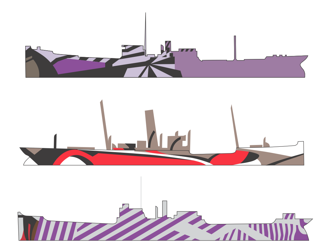
This dazzle idea was invented in 1916 by a Norman Wilkinson, a British marine painter and naval commander, taking inspiration from Cubist and Vorticist paintings. The Vorticists were the English equivalent of the Italian Futurists, and Edward Wadsworth, a leading Vorticist artist, supervised much of this dazzle ship work.
The development of radar in the 1940s made dazzle ship graphics less relevant, but it still crops up here and there. Dazzle ‘camouflage’ is used today on speed cameras in Austria to mask which way they are facing, and in 2008’s Switched On London festival the HMS Belfast was lit up with projected dazzle patterns. Oh, and of course there’s the Orchestral Maneuvers in the Dark album, Dazzle Ships, designed by Peter Saville in 1983 after seeing Wadsworth’s 1919 painting ‘Dazzle Ships In Drydock At Liverpool’. The original is in the National Gallery of Canada, and you can see it at bit.ly/dazzleships.
It seems almost impossible to find colour images of the original WWI designs, but they used colour as well as black and white. Red, green, yellow, purple – it must have been a riotous sight when fleets set sail. The graphics shown here are from original WWI ship painting plans and show intended colourways as well as the graphic shapes themselves.
Making your own dazzle ship-style graphics is simple. The underlying principles are diagonals, zig-zags and arcs, combined using sudden changes in the patterns at seemingly random points. Use these to give impressions of different planes or facets on flat surfaces to break up physical lines and shapes. Make artwork for print using Illustrator’s vector tools or use Photoshop to mock up dazzle designs in photos of existing objects.


Dazzle or some combination of dazzle and op-art would seem a natural device for making clothing to make heavy people appear slimmer or very slim people appear more substantial.
That’s a very good point! Horizontal stripes are said to make people look wider, and the right cut or combination of clothes can make a big difference to someone’s apparent weight and bulk. But it could easily be taken too far; particularly dazzling patterns in clothes would also attract more attention in day to day life.