Tasty cross-processing treatments
Colour photography is all about reproducing the colours that were in the original scene… except when it isn’t. It may seem a little perverse if you spend your time trying to capture sharp, detailed, accurate photos, but flaws hold an intense fascination for many people.
The rise of Instagram turned an interest in funked-up photos into a worldwide craze. People all over have been using this to turn iPhone snaps from regular photos into treated wonders. The number of people using this was near 100 million when I first wrote this and is now around 2 billion, which means a hell of a lot of square, strangely coloured images. Don’t get me wrong, Instagram snap photography is fun – I just think it’s also a bit of an odd craze.
Before Instagram, Lomography was where the odd stuff was at. The Lomo name – ЛOMÓ in Russian – comes from Leningrad Optical Mechanical Amalgamation, or Ленинградское Oптико-Mеханическое Oбъединение. This organisation first produced a camera (a Leica copy) in the 1930s, and the Lomo Kompact Automat, or LC-A – which was a copy of a Japanese camera – arrived in 1982. These Russian-made film cameras were originally intended to be used by every Soviet citizen, but their quirky, imperfect and slightly unpredictable output caught the attention of European hipsters in the early 1990s and they quickly became a cult hit around the world. See this Wired article on Lomo from 2009 for more.
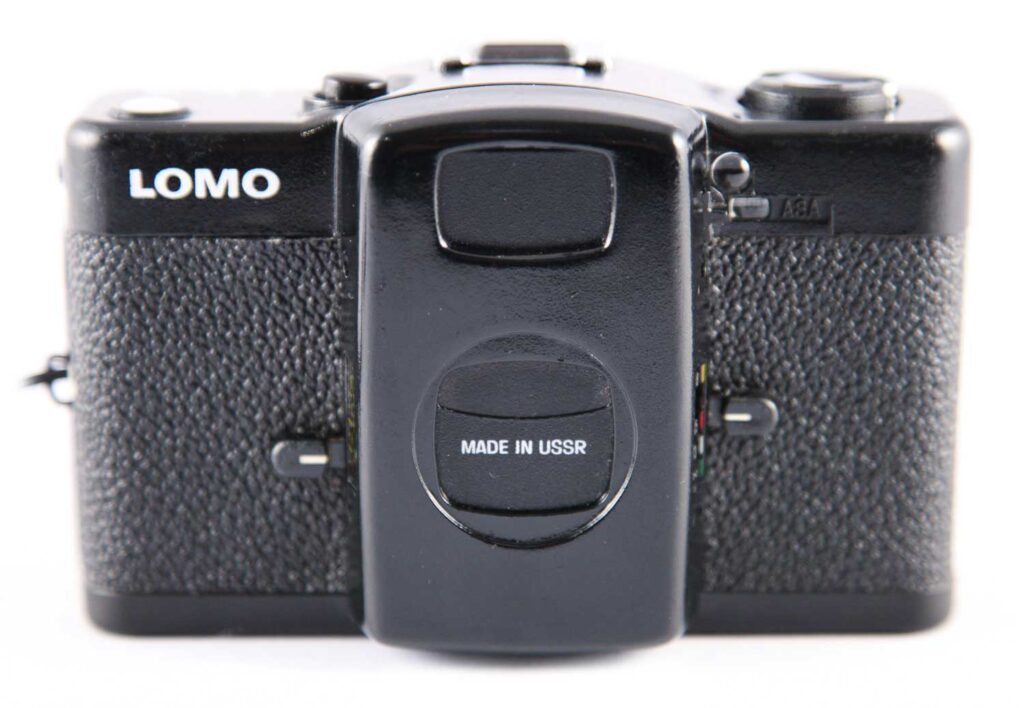
Today, the lomography.com fan site boasts thousands of photo uploads a day – not bad for a production method that uses old-school film and inconvenient chemical processing.
One technique that crops up with both of these photographic movements is cross-processing; simulated in Instagram, real with Lomography. Cross-processing is a photographic chemical mashup that mucks about with the colours in a photo as the film is developed. More precisely, it involves processing one kind of film in the chemicals meant for a different film. The exact results this gives depends on which kinds of film and chemicals are used, but the most popular one involves putting transparency (slide) film, which is intended for developing in E-6 chemicals, through the C-41 chemicals that are meant colour negative film. What this technique typically produces is a green or blue tinge to the deep shadows, reds that look somewhat bruised-purple, and a warm yellow cast to highlights. It’s a very striking look, and it’s been used in all kinds of places, from fashion to Hollywood movies.

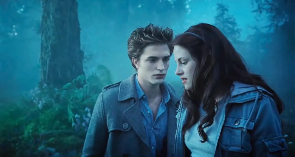
(True confession time: I actually saw some of the film Twilight when it aired on TV. I’m clearly not its target audience, but I was fascinated by the visual style it used. The whole thing – or at least the part I watched – was given a moderate cross-processed-like treatment by the post-production colour grading process; the shadows were a little blueish, skin tones didn’t have much warmth at all, and lips were almost the colour of congealed blood. Moody to the extreme, and it suited the story and overall genre perfectly.)
It’s not hard to do your own cross-processing. Hang on, let me clarify that: it’s really quite difficult to actually do your own colour developing, but it’s easy to have your film cross-processed for you if you go to a relatively professional photo lab rather than a high-street shop. Shoot on transparency film, have it processed as negative film, and the job’s done. Or do it the 21st-century way: shoot digital and cross-process your images yourself in Photoshop. Some like the unpredictability of the wet chemical and film method, but l have to admit I prefer having digital control and speed on my side.
Cross-processing images in Photoshop is best done in the Curves dialog. It’s a bit opaque, but it’s not really that hard, especially if you spot the Cross Process preset. Pick an image, choose Image > Adjustments > Curves, then just pick it from the Curves window’s Presets menu. Each of the RGB channels is given its own custom ‘curves’ adjustment that boosts or reduces it in the highlights and shadows.
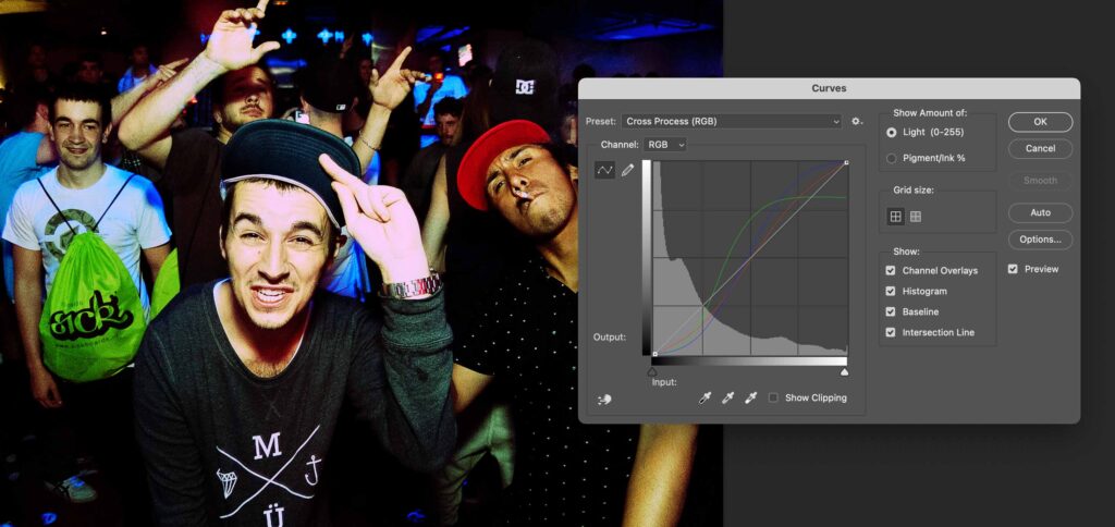
At this point, I’m sure you’ll agree that the effect this preset makes is a bit over the top: bright highlights are rendered a bit pink, while skintones and the midtones in general are battered about with rather more green than you probably expected. It isn’t that this effect is incorrect; remember, cross-processing output can be affected by the choice of specific slide film. The issue here is more that it’s a bit heavy-handed for most serious uses.
Fixing this is quite simple: in the Curves dialog, switch the Channel pop-up menu from RGB to Green and drag the right-hand point up to the top-right corner of the Curves histogram box. That fixes the over-pinkness of the brightest points. You may like the in-yer-face quality of the rest of the settings, but feel free to tweak the red and blue channel curves as well.
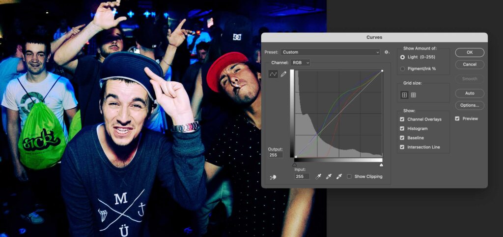
If you’d rather have something a little less glaringly treated you’ll need to come up with different red, green and blue curve adjustments. l’ve saved a particular set of curves as my standard lightweight cross-processing preset. It’s a bit difficult to list the values for this so, instead, you can download my presets and load them in the Curves dialog. Photoshop’s default location for Curves presets is in ~/Library/Application Support/Adobe/Adobe Photoshop 2024/Presets/Curves/ (or the equivalent year-tagged Photoshop folder for older or newer versions), but you can keep them wherever you like. Alternatively, look at the red, green and blue curve lines and the slight tweak to the composite RGB curve in this screengrab and remake them yourself. If you come up with something different that you like, don’t forget to save it as a preset so you can reapply it without having to make it from scratch each time.
Cross-processing isn’t the only mistake-based effect the film world has. Redscale is a lesser-known trick that comes from loading colour film back to front into the camera so the colour layers receive light in the opposite order to normal.
With the red layer getting the light first, this is what gets recorded most, and blue gets the least light. As with cross-processing the results can vary, but they’ll always have a strong red bias. The gentler versions of this look are reminiscent of old photos that have been in sunlight, although this effect doesn’t have the same loss of contrast. Stronger redscale effects are more dramatic, to the point of looking like garish mistakes when taken to extremes.
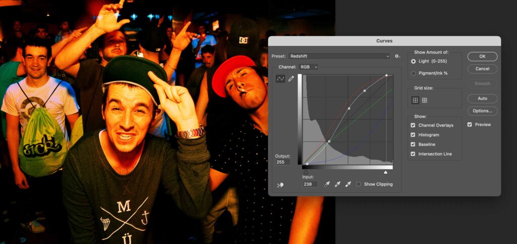
Want to try redscaling? There’s no Adobe preset for redscale, but faking this is pretty simple, as you’re really just simulating the over-recording of red, slightly underdoing the green and removing quite a lot of the blue. Grab my one-stop redscale curves preset from the same place as the cross-processing file and see what you think. This is definitely a more obvious effect, but it’s based on a traditional, if somewhat unorthodox, photographic method. And the best part of doing these things digitally afterwards is that I get to have my cake and eat it: I can use a shot untreated if I prefer and I can try different settings to find the best result, because I haven’t committed anything at the moment of taking the shot.


