Write like a pro. Always.
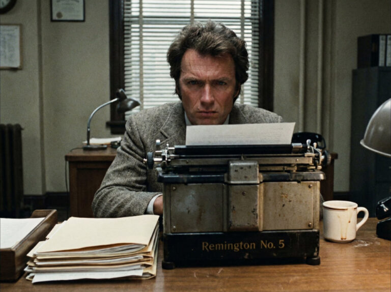
Do you double space between sentences? Or do you do a single space? Odds are, whichever you do, you feel surprisingly strongly about it. Odds are also that if you were taught to type on a traditional typewriter you had the ‘two spaces’ rule drummed into you. But what’s it all really about? Mechanical typewriters…