Graphic projections and new angles on perspective
WYSIWYG: What You See Isn’t What You Get!
One of the great advances in the Renaissance was the understanding of perspective. Not the experiential kind that helps us learn from our mistakes, but rather the ‘converging parallel lines’ kind that helps us replicate our perception of depth, the third dimension, in a two-dimensional image. This is a vital foundation for much of our understanding of how graphics can represent real-world things, but as artists explored various ways of representing scenes using realistic perspective, rather than the more symbolic and fanciful methods of medieval artists, they developed different ways of collapsing down the third dimension onto the 2D canvas. One of the more innovative Renaissance methods of dealing with representing space wasn’t all that easy to put into practise until very recently.
The challenges of capturing a broad scenic view in a not-so-broad canvas led to a number of geometric projection experiments, including one that now bears its name, vedutismo – as well as the name pannini – from Giovanni Paolo Pannini, not the panini sandwich. This progressively compresses the horizontal aspects of an image the further from the centre they are.
This painting technique was originally developed back in the 17th and 18th centuries, but it is used now in photography. The aim is to show a wider angle of view than is normally possible in a given space without resorting to the angle-stretching effects of ultra-wide-angle lenses or the spherical warping of fisheyes. It does alter the image a little, but it is possible to show even 120 degrees of view in a normal photo crop without attracting too much attention to the process itself. If you try to go past 90 degrees without help like this you’ll be struggling.
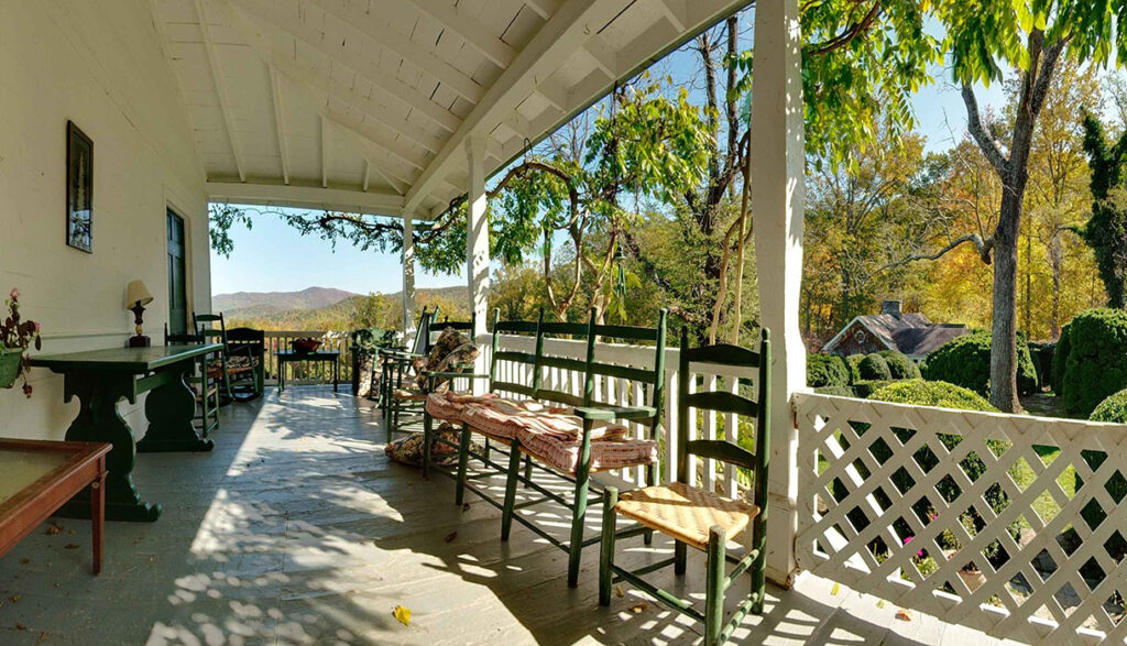
Today’s implementation of the vedutismo/pannini reprojection techniques is really very young, not that many years old. I use it as a part of my panorama production process when I want to create a wide angle image from my 360-degree panorama shots. It is an option in PTGui, my high-end panorama image stitching software, a few other specialist tools, and nothing else that I know of. It isn’t surprising that it is only really found in such specialist tools; it relies on having panoramic image content to work with in the first place. It also helps to have an obsessive compulsion to play with perspective – and yes, that probably says worrying things about me.
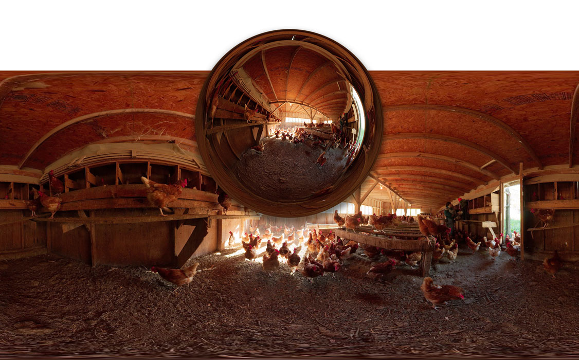
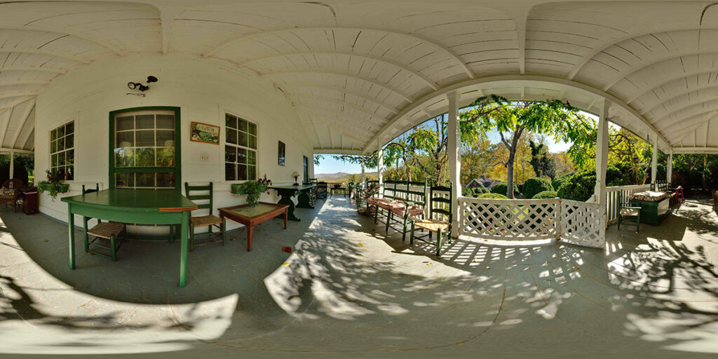
Vedutismo is one way to generate views from stitched-together photos that Photoshop’s Photomerge feature cannot achieve. If you’re able to make or obtain a full 360° panorama rather than just a composite wide-angle shot there are a number of other reprojection possibilities open to you. One particularly weird way of projecting a complete ‘spherical’ stitched panorama (where the photographer has shot all the way up and down as well as around) is actually the normal output from specialist stitching applications such as PTGui. This ‘equirectangular’ image shows an entire environment – all the way up, down and around – in a flat, two-dimensional rectangle. The nearer you look to the top or bottom, the more stretched-out the image becomes. The reason is simple; the top and bottom edges are analogous to the North and South poles; points at the ends of a sphere, but unwrapped and stretched out here to fill the full width of the two-dimensional image.
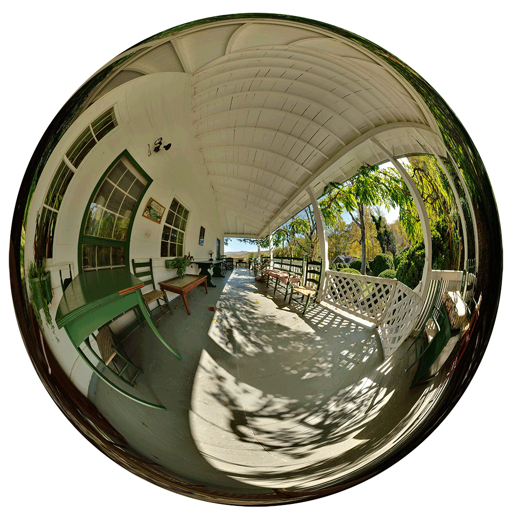
Pano2VR, another tool in the panorama photographer’s arsenal, includes specialist remapping output from panorama images, and some of the more esoteric examples include ‘little planet’ globe effects (angular remapping) and mercator. That one is possibly the best known way to represent the Earth in 2D map form, and the reason why people think Greenland is much bigger than it really is. One of the other remapping outputs it offers is ‘cubeface’, which chops up a spherical panorama into 90° view-angle squares. These are normally used for showing the scene in interactive form online, but they can also be printed out and assembled as the faces of a real cube. The result is quirky but delightful; a complete scene that you can pick up and hold in your hand, turning it over and around to see the complete vista.
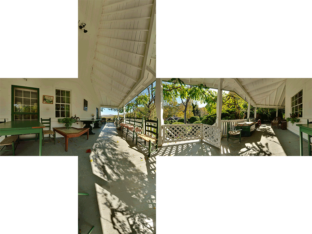
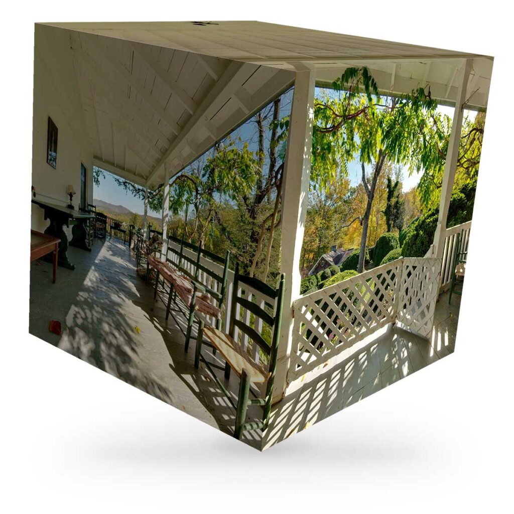
These reprojection outputs are easy to make provided you have the composite panoramic pictures in the first place, which can be a little more challenging to achieve. But fortunately there are other ways to play with perspective that don’t require becoming a specialist panorama photographer. Anamorphic projection is another form of experimenting with perspective that began in the Renaissance, but this has been used ever since. An early example is The Ambassadors, a famous painting by Hans Holbein the Younger, where a heavily distorted skull can be seen in extraordinarily precise, accurate detail when viewed from an extreme angle. In the early 20th century Marcel Duchamp and Salvadore Dali both experimented with anamorphic projection ideas. More recently, Kurt Wenner, Julian Beever and some other pavement artists have used this technique to create stunning tromp l’oeil images that fall into place when viewed from just the right angle. What looks like a stretched-out smear from one location looks totally convincing from another.


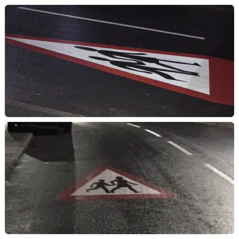
But this isn’t just a fine art and illustration technique; it has also been used in advertising and signage for many years. Signs painted on roads are generally stretched out so they look roughly normal when seen from the driver’s point of view, even though from the side or close up they look oddly stretched. Look for words or other graphics on the road and note how the shapes are distorted so they look correct from an acute, driver’s-eye-view angle.

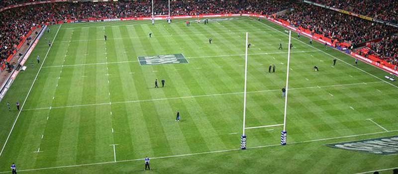
Another far more commercial use of anamorphic projections can be seen on the pitch in many sports matches; the Six Nations rugby tour is a good example. The sponsor’s logo (RBS in this case) is painted onto parts of the pitch, but in a particular distortion that matches up with the point of view of key TV cameras. That means that when that is seen in homes and pubs around the country the graphic appears with no parallax distortion. More than that, it even seems to stand up off the ground in comparison to the regular pitch markings. The effect is slightly peculiar, but it is also quite effective: a subtle ‘virtual reality’ feeling produced by nothing more than paint on turf and our own mental interpretation of shapes.
In the image below, a sponsor’s branding that was painted onto the grass for an American football match is being removed. This is viewed from off to the side of where the camera view would have been, which reveals the fairly extreme distortion used to correct the view for the TV audience.

On UK TV, Channel 4’s creative station identity animations have, particularly around 2005-2012 or so, shown the iconic ‘4’ made from disassociated, spatially separate parts. These are also forms of anamorphic images, just 3D rather than 2D in content. Watch how the ‘4’ shape comes together as the viewpoint moves through each scene:
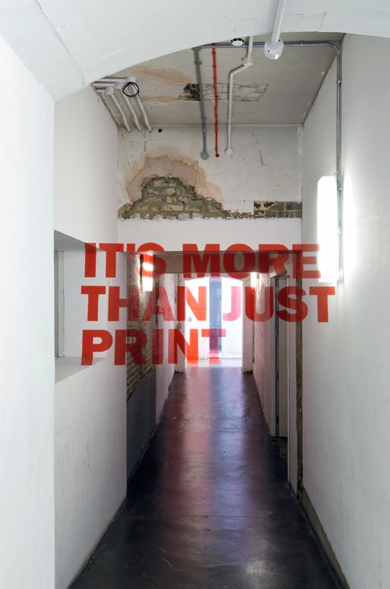
Okay, so how do you make this kind of graphic? To do it in print onto a single flat surface that’s easy; just skew and stretch the type or graphic in whatever software you’re using to create the final design; Photoshop, QuarkXPress, Illustrator or InDesign. Hans Holbein would have been jealous at how quick and simple it is. Dealing with the kind of anamorphic projections used to wrap graphics and signage across three-dimensional shapes is a little more involved. Search online for ‘anamorphic typography’ for examples before trying to have a go yourself. The original shape will be broken up across different surfaces, but when viewed from the right point they all fit together to recreate the design.
You may be able to get away with patience and a steady hand, but it will be much easier if you use a projector to cast your graphic along the surfaces from the actual point of view of your intended audience. Take photos as well for later reference, and also go trace the lines of the image directly onto the surface – no matter how oddly stretched it might seem. It will feel all wrong from any point of view other than where the projector was, so make certain that was in the right spot. Then simply paint, draw, cut or whatever else it takes to render your graphic onto or into the surface.
This video reveals how the above image works in real life. It was a collaborative art piece created by Joe Egan and Hunter Thomson for their final major project at Chelsea College of Art in 2010. Now go grab a projector and start anamorphing!
